
BCAA
First established in 1906 by a group of motoring enthusiasts who would help each other when their vehicles broke down, the British Columbia Automobile Association (BCAA) is a comprehensive insurance and roadside assistance provider, serving 1 in 3 households in the province.
- Typeface
- BCAA Sans, BCAA Serif
- Comissioner
- ReThink
- Year
- 2022
- Styles
- 5 Weights, 10 Styles (Sans); 2 Weights, 2 Styles (Serif)
- Coverage
- Adobe Latin-3
- Classification
- Sans Serif Serif
- URL
- bcaa.com
- rethinkideas.com
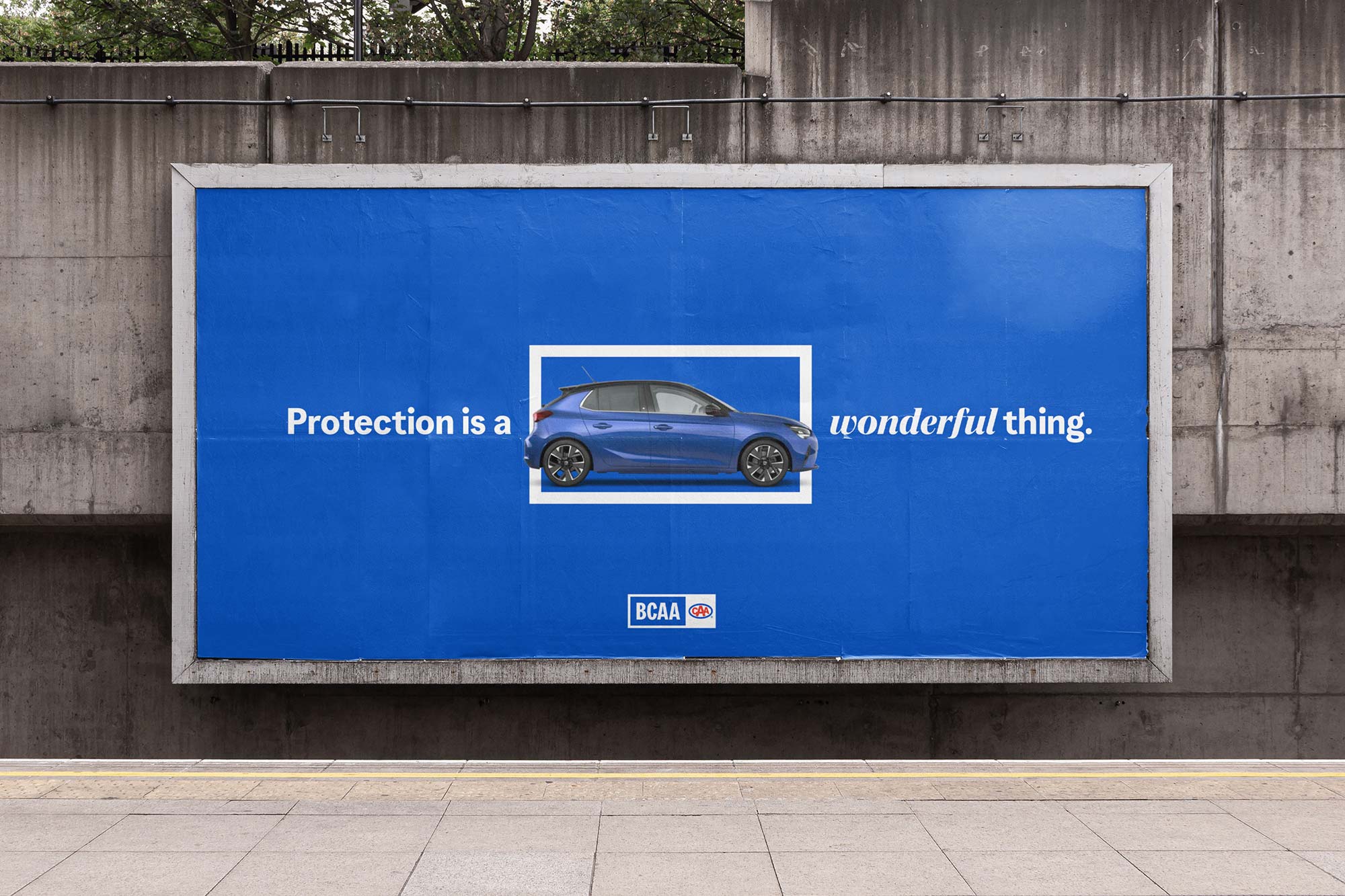
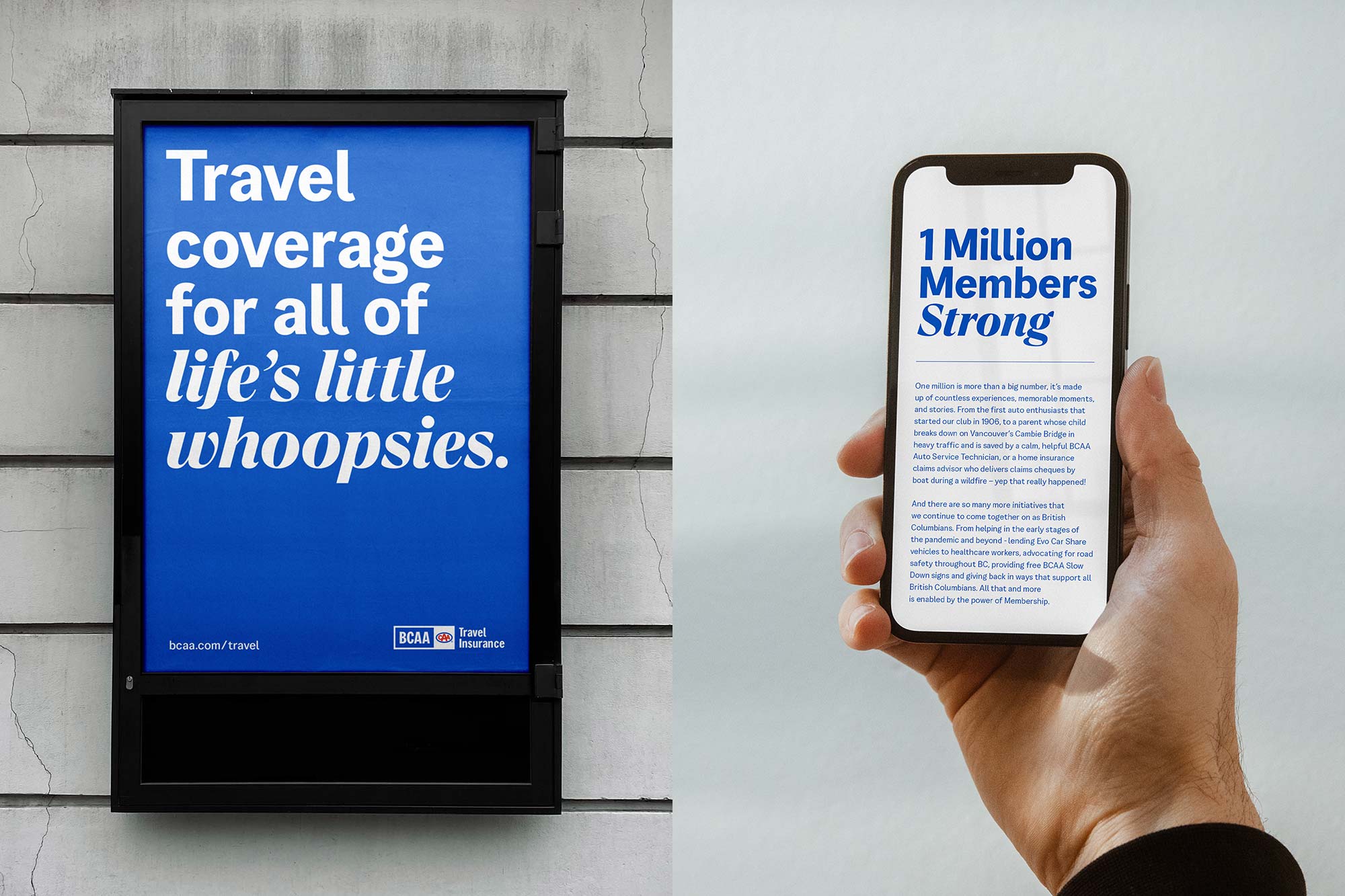
Working with Vancouver based agency ReThink, Colophon developed a custom Sans and Serif typeface that would help revitalise BCAA’s image and unite the multi-stream brand family which spans home, car, travel, and small business insurance, Evo Car Share, roadside assistance and full auto repair.


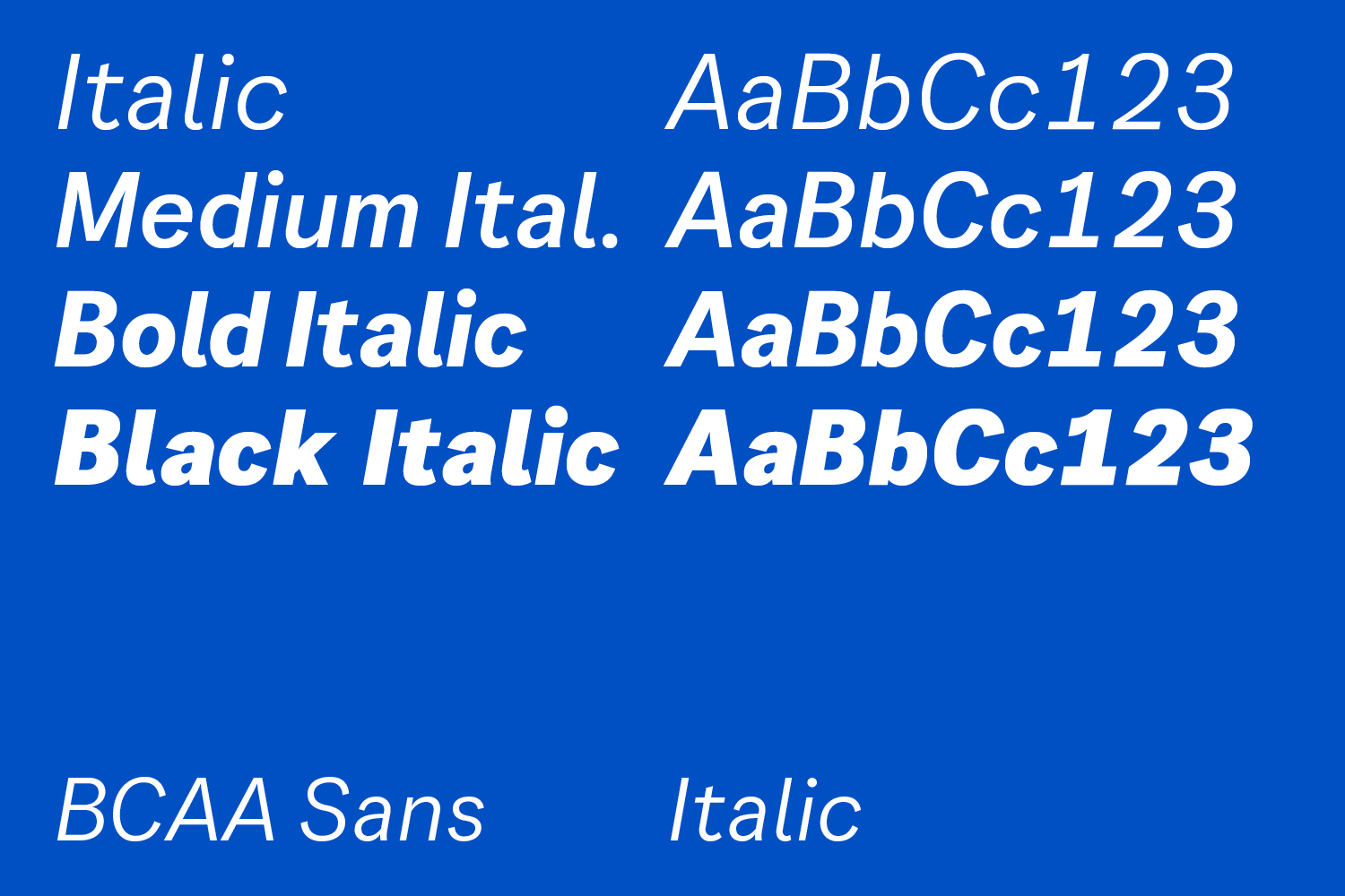


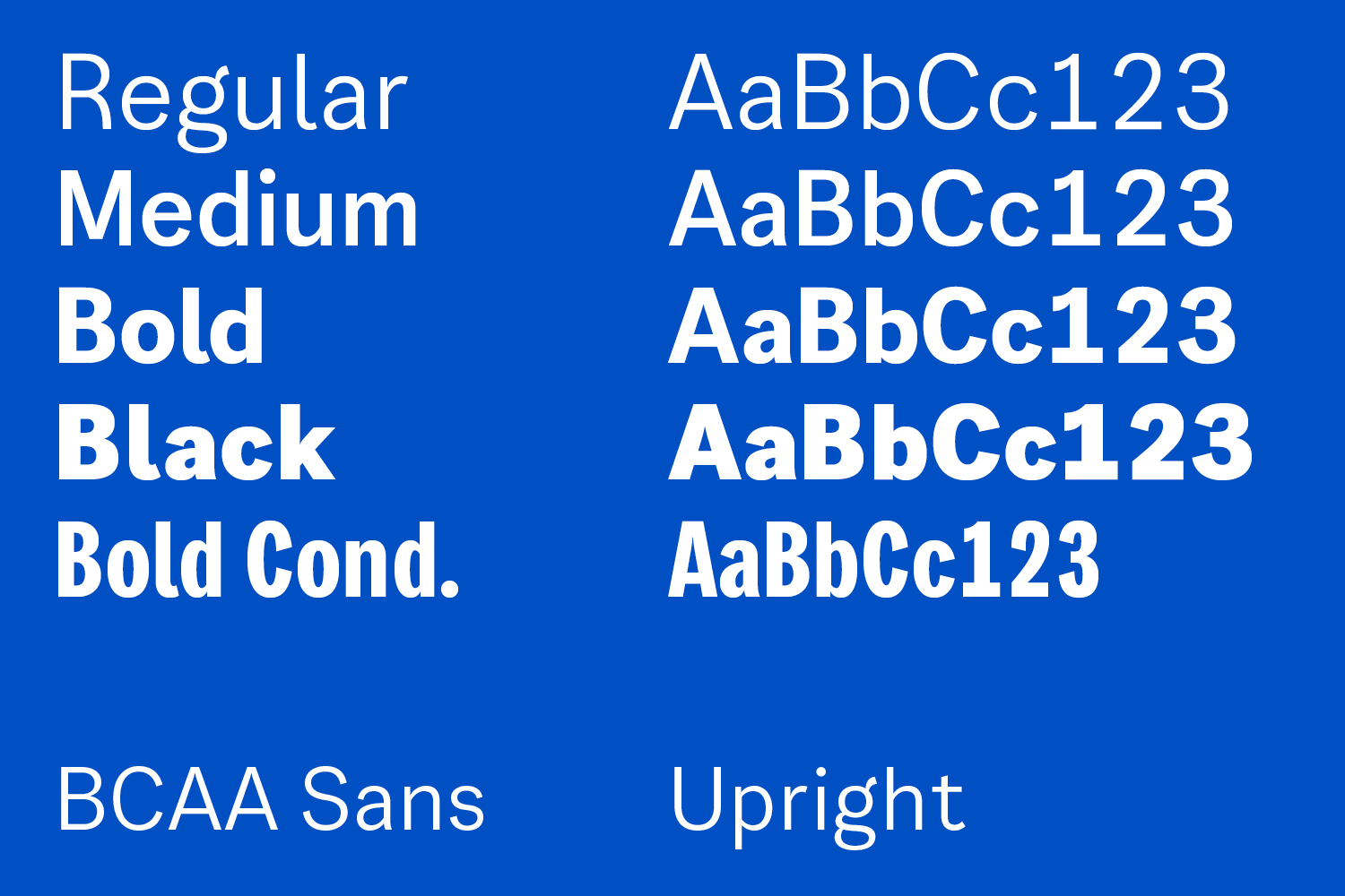
An expansive nine-style Sans family — Regular, Medium, Bold, Black, all with corresponding Italics, and a Bold Condensed headline style — forms the core typographic voice of BCAA. The relatively high contrast level of the Bold Condensed style, which would become the basis of the updated main and sub brand logo, was designed to match the box surrounding the new wordmark. The contrast also allows for movement and expression in the narrow forms and a loose curve tension brings an approachability to the otherwise straight shapes.
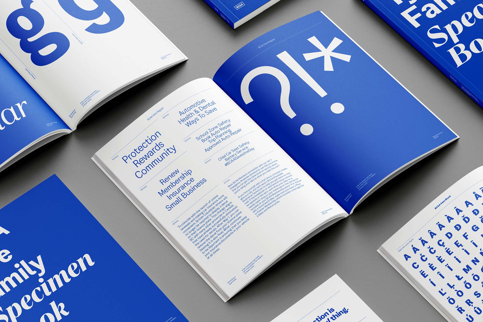
Intended for use as a workhorse typeface, the corresponding Proportional Sans family uses the same metrics and design sensibility as the Bold Condensed. Expressive moments include the curved leg of the “R”, the gestural ear of the “g”, and the flick on the “l” — which has a dual effect of increasing legibility and adding character. Round punctuation and titles bring a friendly aesthetic to the design.
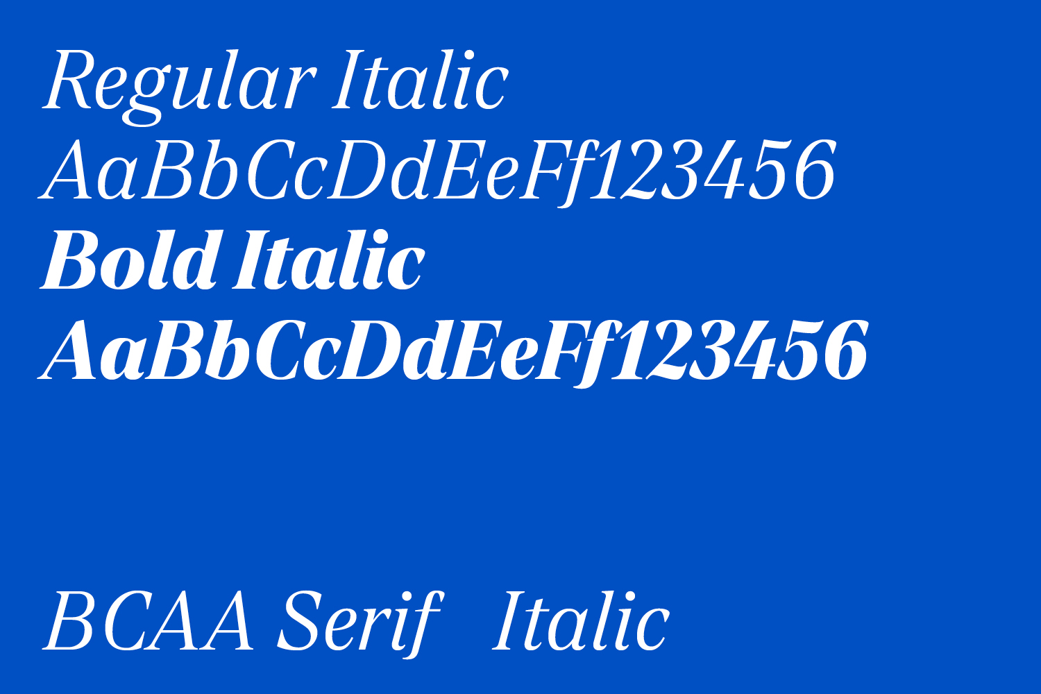
The additional Serif Italic design adds a sense of movement, emphasis and intention to the design system. While the type shares an x-height and overall aesthetic proportions as Sans design, the Serif has unique stylistic elements to increase expression at key moments. The Serif Italic is weighted similarly to the Bold style of the Sans, with a slightly heavier design to counteract the white space created by the high contrast.

The Transitional Italic design contains a multitude of unconventional moments. The entry strokes have a predominantly flat appearance in contrast to the gestural flick of the exit strokes, and more handwritten-inspired gestural moments are found in the “v”, “w”, “z” and “s”. The ball terminals contain further idiosyncrasies; a mixture of classic ball terminals and contemporary angled variations with long sweeping curves create open forms. All sharp terminals are chamfered to bring a softer appearance.
The multifamily type stack creates a dynamic visual language that expands across the entirety of BCAA’s communications, ranging from the expressive Serif Italic and Bold Condensed to an ownable yet highly legible Sans.
With thanks to ReThink for the images.
Recent Custom Projects
View all

