Booking.com
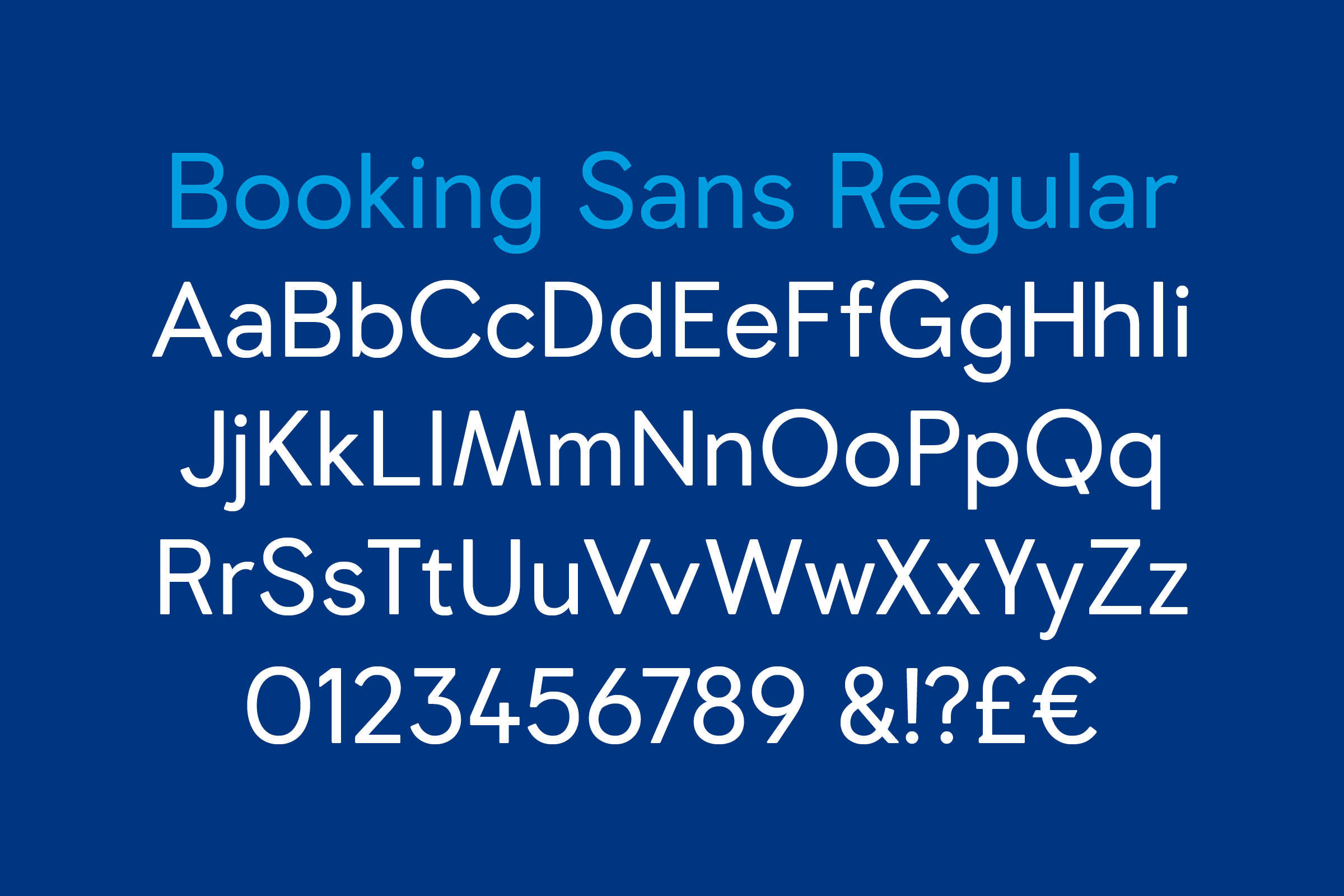
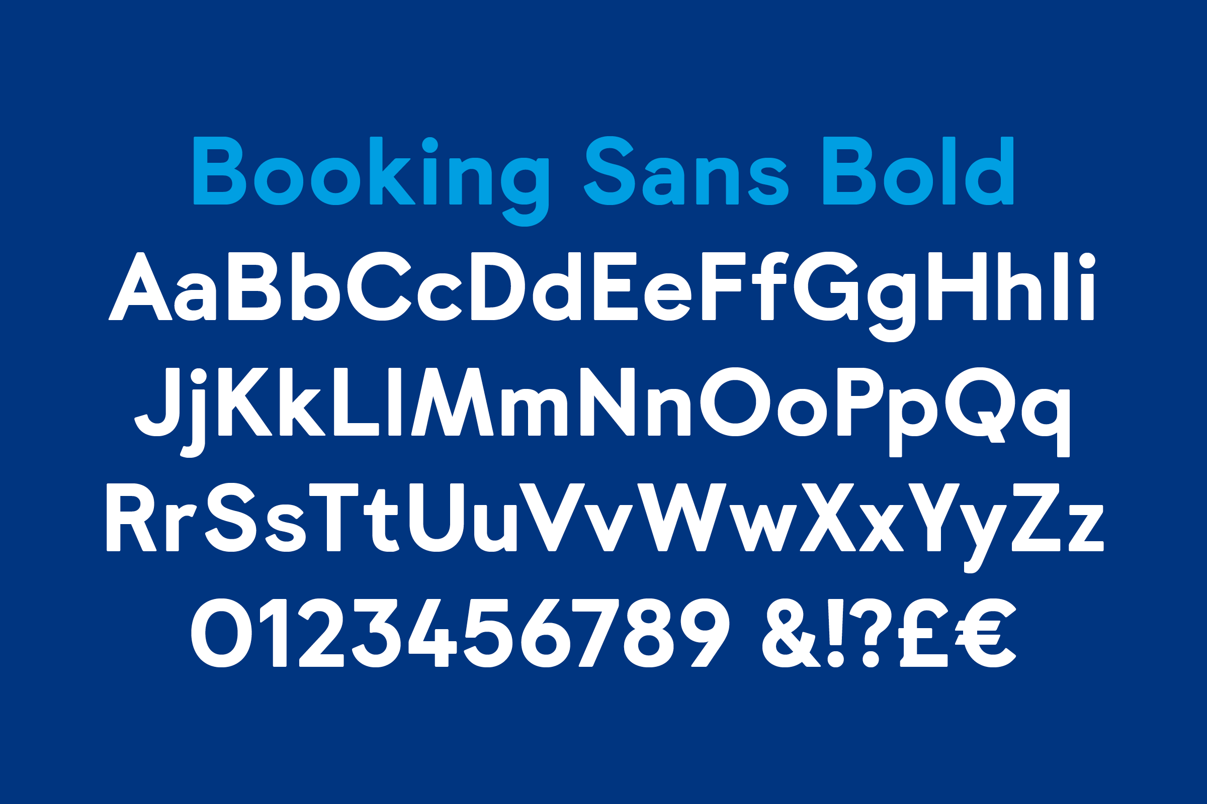
We were commissioned by Wieden+Kennedy Amsterdam and Holland-based Booking.com to create a corporate typeface for the company’s ever-growing accommodations platform. With the brand’s global presence, we looked beyond the company’s Dutch heritage, and then beyond its immediate European marketplace, and ultimately attempted to zoom out as far as we could while still remaining Earthly.
- Typeface
- Booking Sans
- Comissioner
- Joseph Burrin at W+K (NL) for Booking.com
- Year
- 2015 — 2016
- Styles
- 2 Styles: Regular, Bold
- Coverage
- Latin 3
- Classification
- Chamfered Edge Sans Serif
- URL
- booking.com
- wk.com
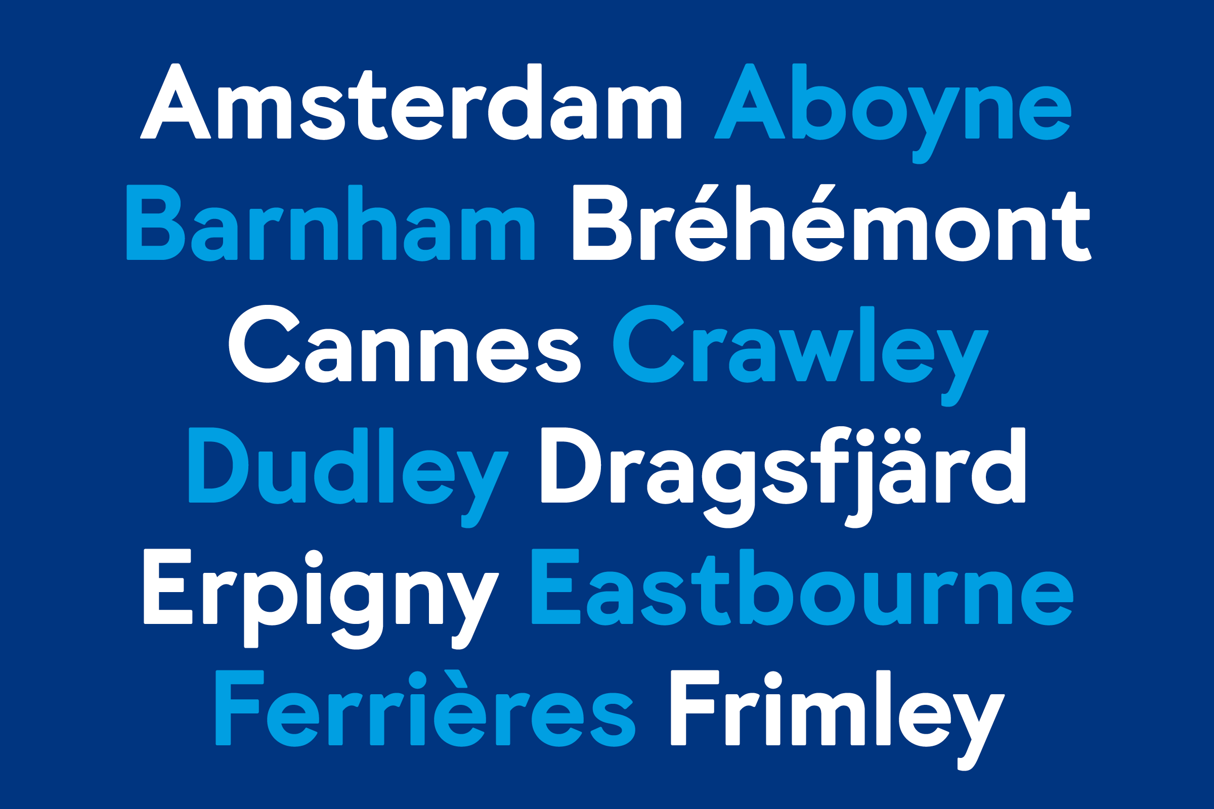
This Powers-of-Ten-like exercise left us looking at the earth from afar, almost as a letterform unto itself, and acknowledging its perpetual tilt toward the glow of the sun: precisely 23.4371°. Our proposal to the commissioners included the use of this measure as an organizing principal for the construction of the type, beginning with a single Bold display weight for use with a specific forthcoming campaign, and subsequently tackling the Regular / Text weight several months later.
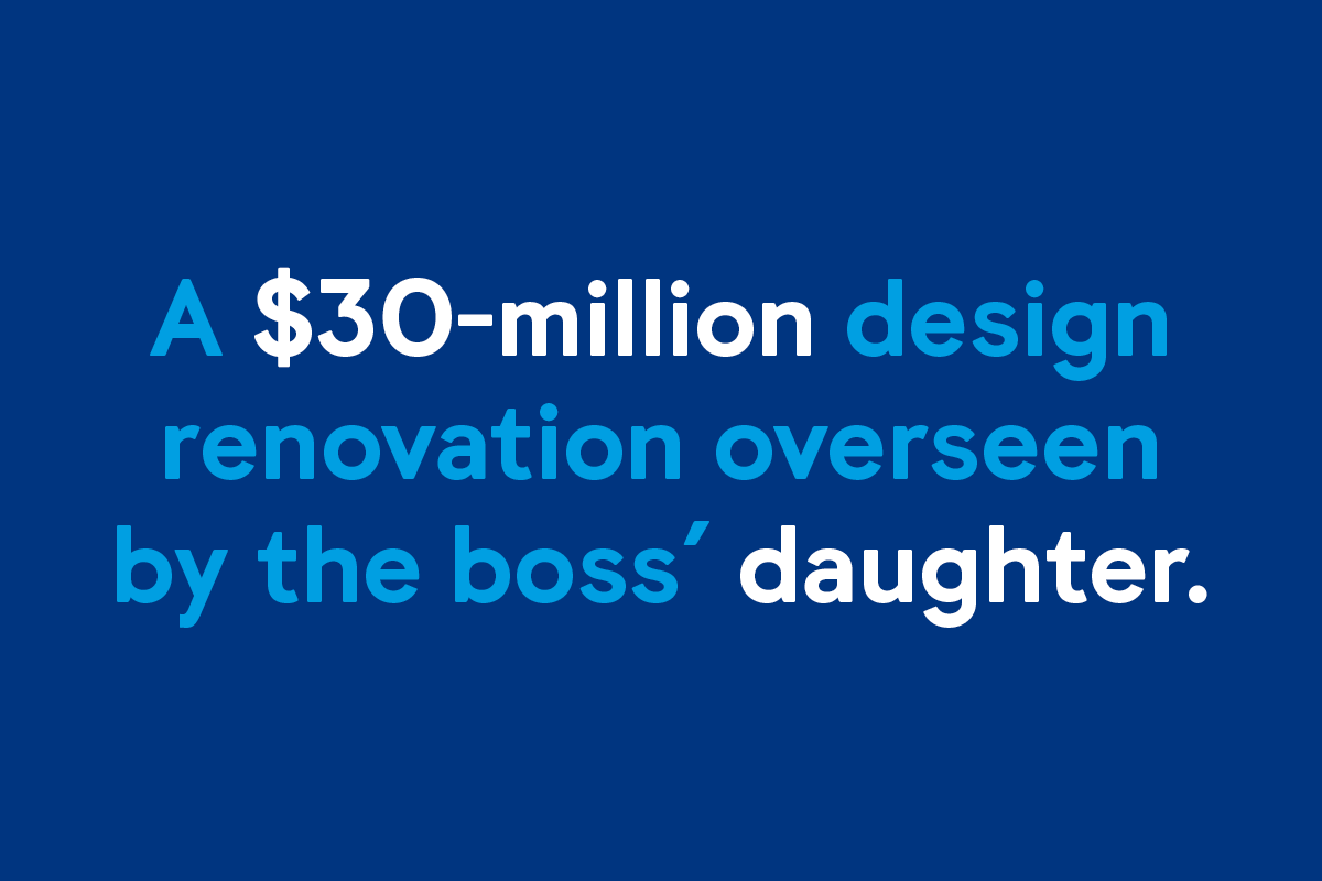
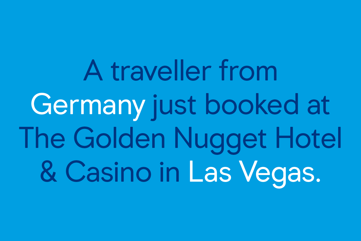
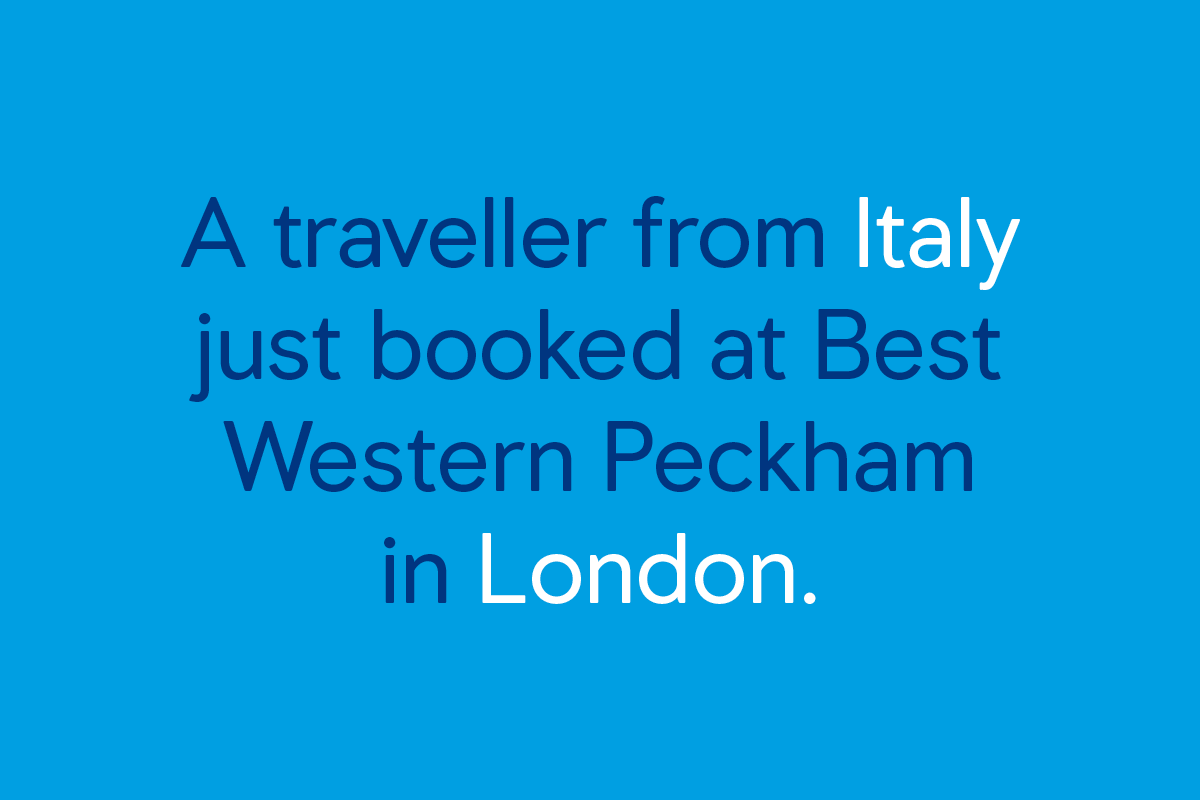
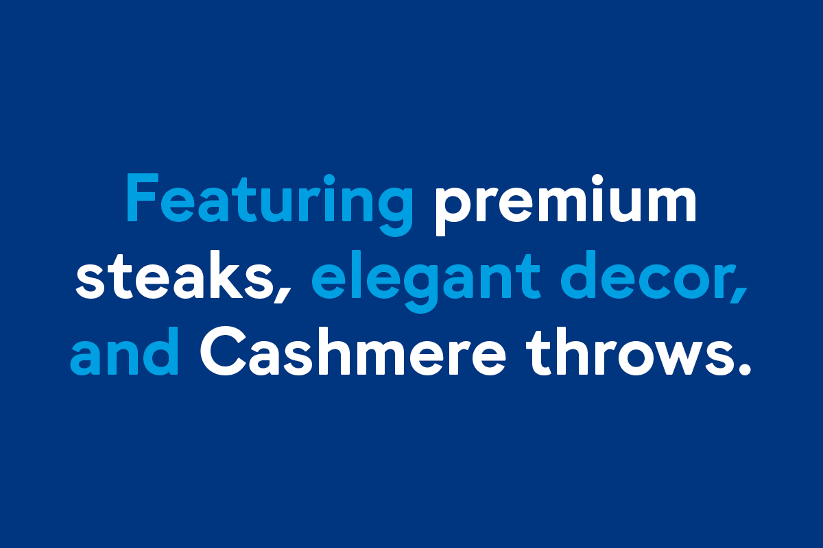


Spanning both large- and small-scale print use as well as digital applications, the type’s holisitic mathematics never seek to overshadow legibility or affability — the latter achieved here by the subtle rounding and softening of 90° corners across the type.
)
)
Similarly, the 23.4° axial tilt metric can be seen shaping the pinch between bowl / stem (a, b, d, g, p, q) and arm / stem (m, n, r, u); acting as a cutting tool to define slopes and terminals (f, j, r, t); and actually forming the infrastructure or skeleton of certain letterforms or parts thereof (M, Q, R, V, v, W, w, Y, y).
In imbuing the type with an organizing, mathematical-conceptual underpinning, we structured the project in such a way that Booking.com’s new corporate typeface ultimately borrows rationale from the very planet it encourages its users to explore.
