
Burger King
Burger King is a multinational chain of Hamburger fast food restaurants, renowned for the ‘Whopper’ burger. Embarking on the first full identity refresh in two decades, this aimed to support its mission to transform its business and achieve the highest standards for food quality, sustainability and restaurant experience. JKR Global were commissioned to create a brand world that consumers would connect to, and to reflect this new positioning through a full new suite of brand elements.
- Typeface
- Flame
- Comissioner
- JKR, New York
- Year
- 2020
- Styles
- 3 Styles, Flame Sans, Flame Serif
- Coverage
- Adobe Latin-2
- Classification
- Sans Serif Serif
- URL
- burgerking.com
- jkrglobal.com
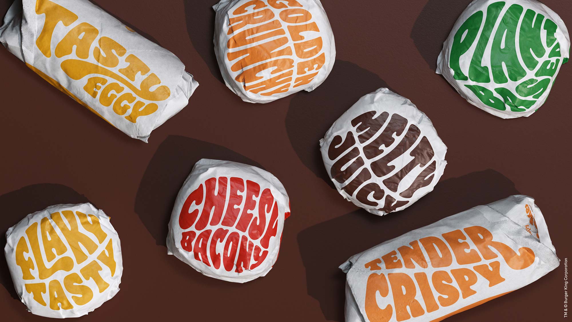
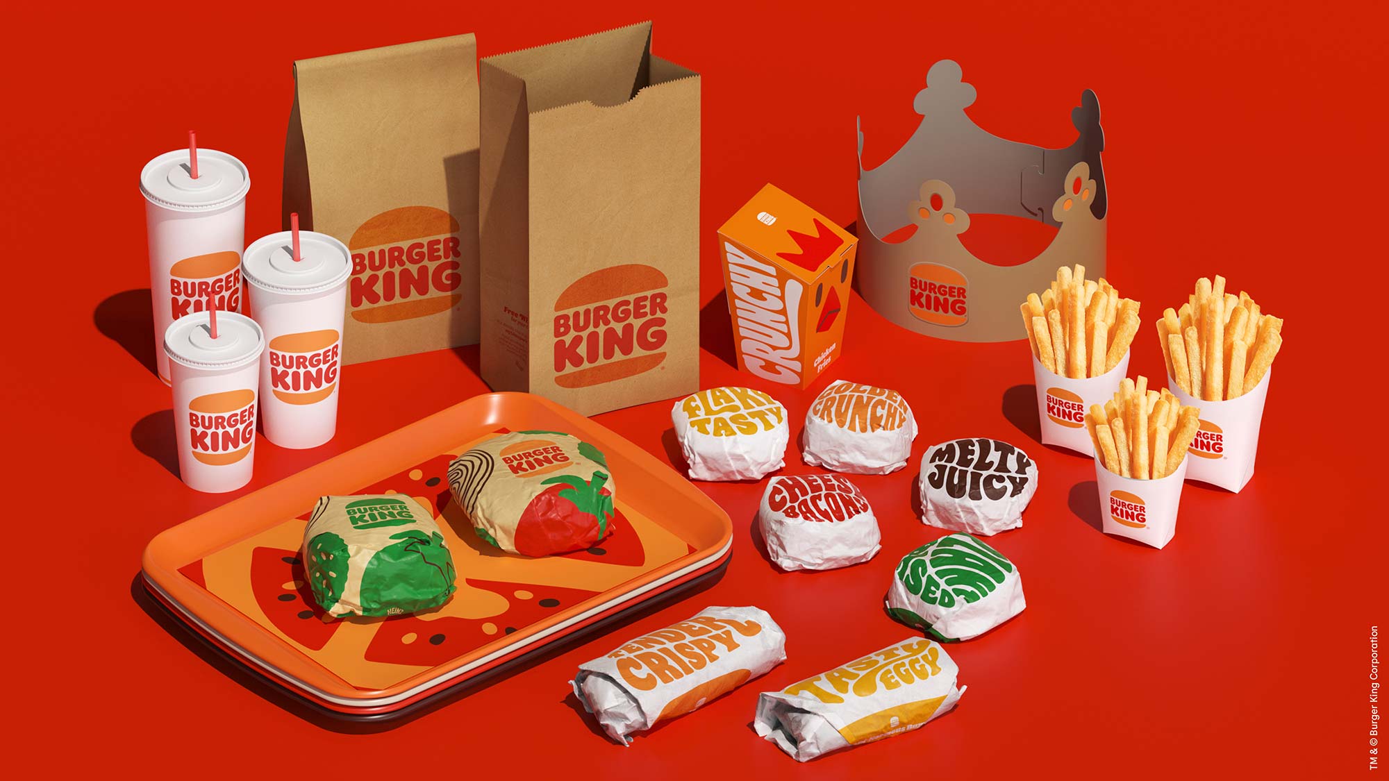
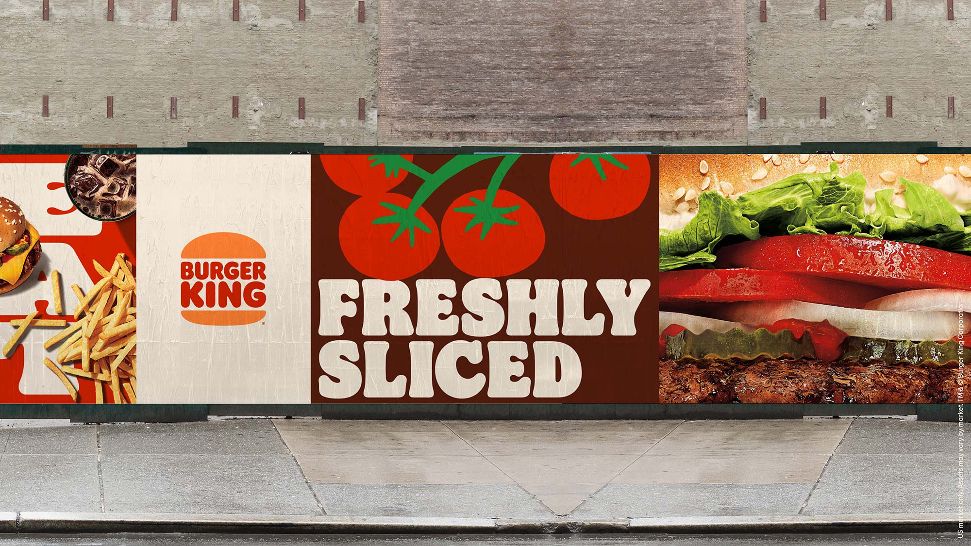
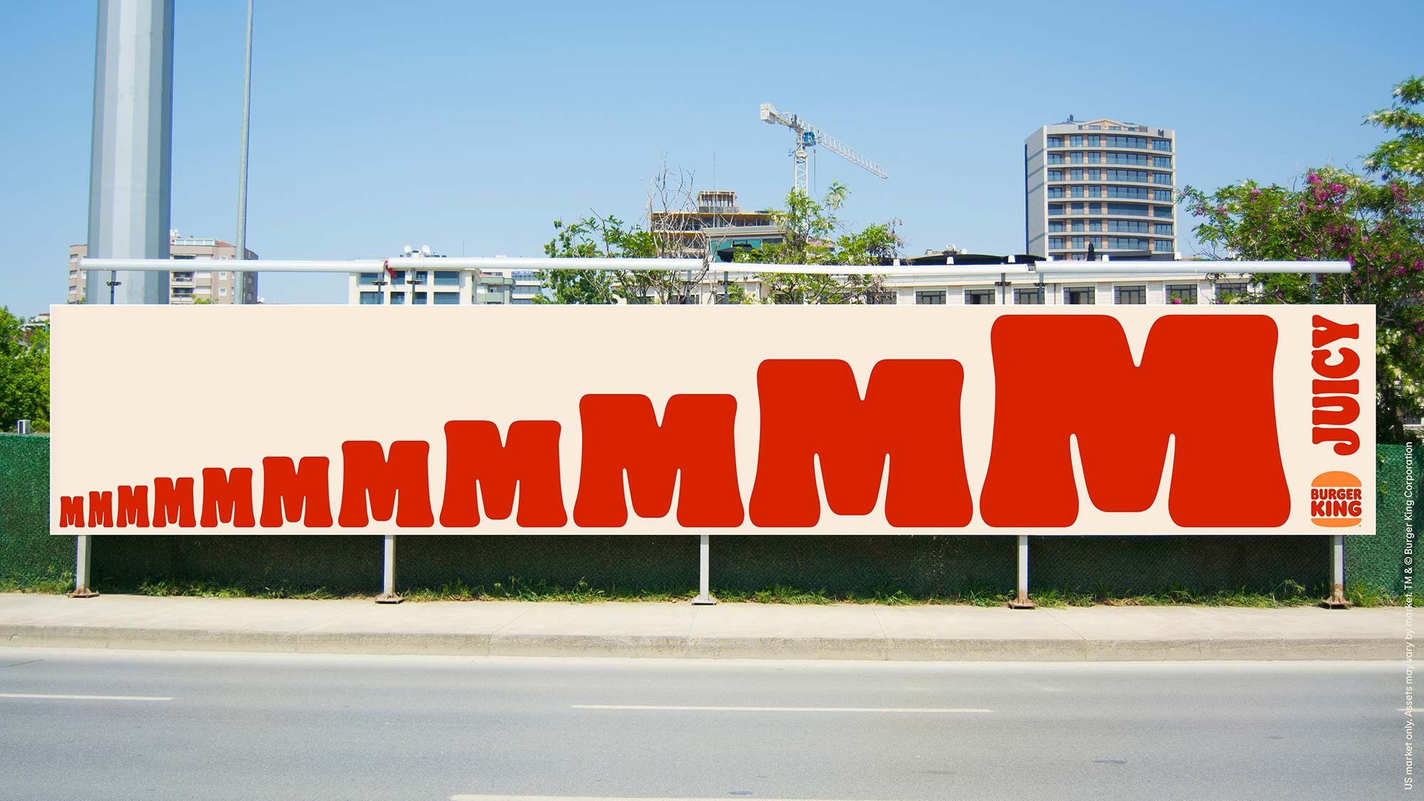
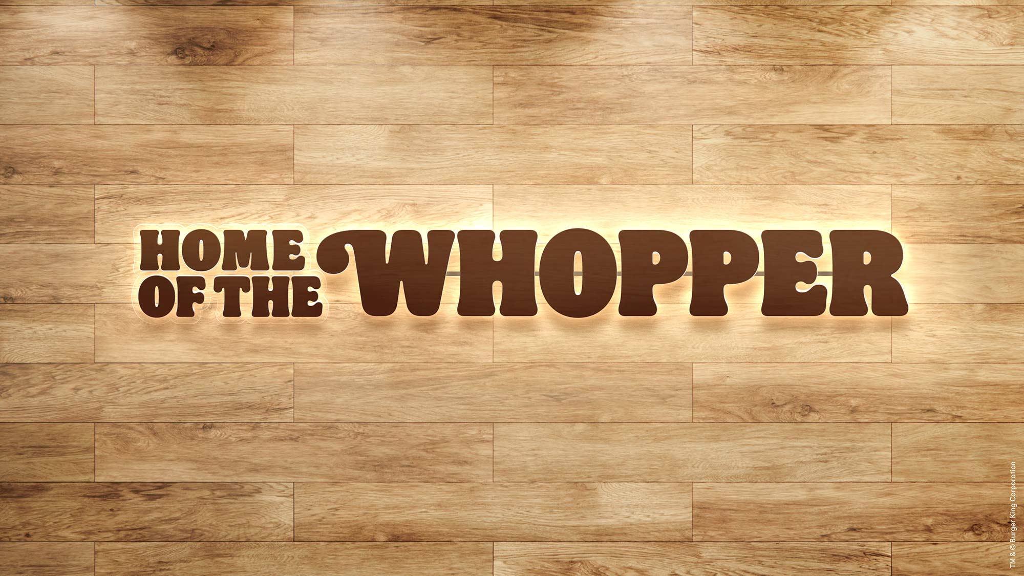
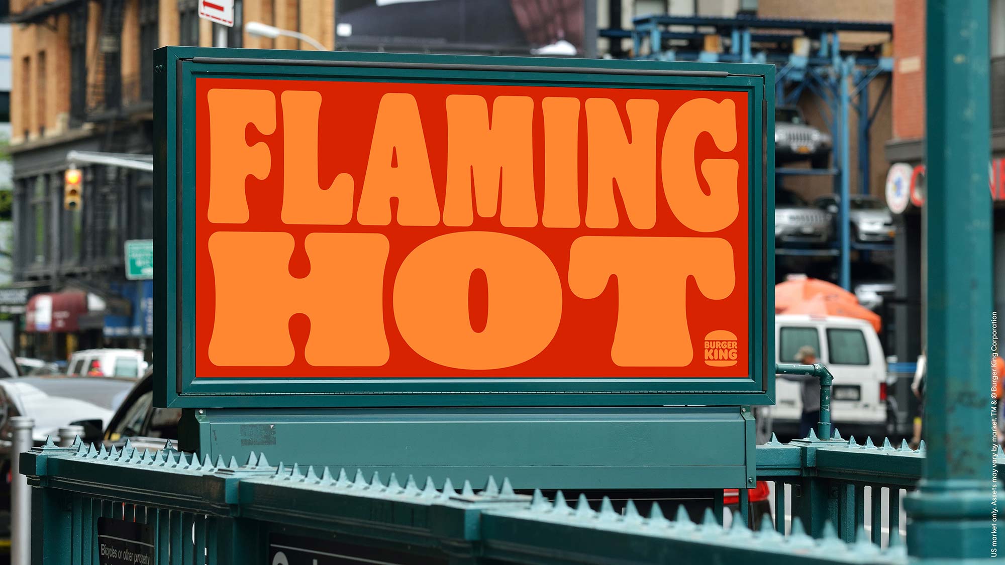
In close collaboration with JKR Global, Colophon developed two type families set over three styles. ‘Flame’; a soft and juicy Serif was presented in two weights, Bold and Regular, whilst ‘Flame Sans’; in just a Regular style, is a flared Sans-serif to be utilised where small typography was required, such as menu boards and packaging.
)
)
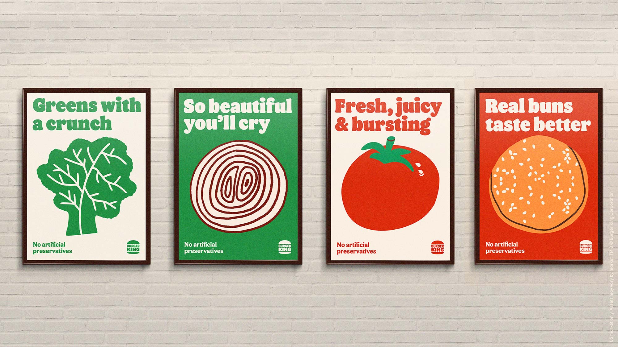
The strokes of Flame aim to evoke the natural and organic shapes of food, whilst maintaining playful elements. JKR dived into the archives of marketing materials from Burger King, allowing Flame to reference past branding work, whilst stepping into a more contemporary light. This research helped to inform production of ligatures and swashes that allowed Burger King to elevate certain key phrases and product names, and will aid to future proofing the usage of Flame. For smaller type sizes, Flame Sans became a robust solution whilst maintaining a sense of gesture and expression through flared stroke endings and chamfering.
Colophon also produced a limited variable font, that allowed the application of the typeface to be adjusted to fit into different formats and applications. This also became a key asset for animation, where the variable font technology could be utilised to create seamless animation transitions without the loss of brand equity, and retaining optimized proportions and form when the width of letterforms were increased.
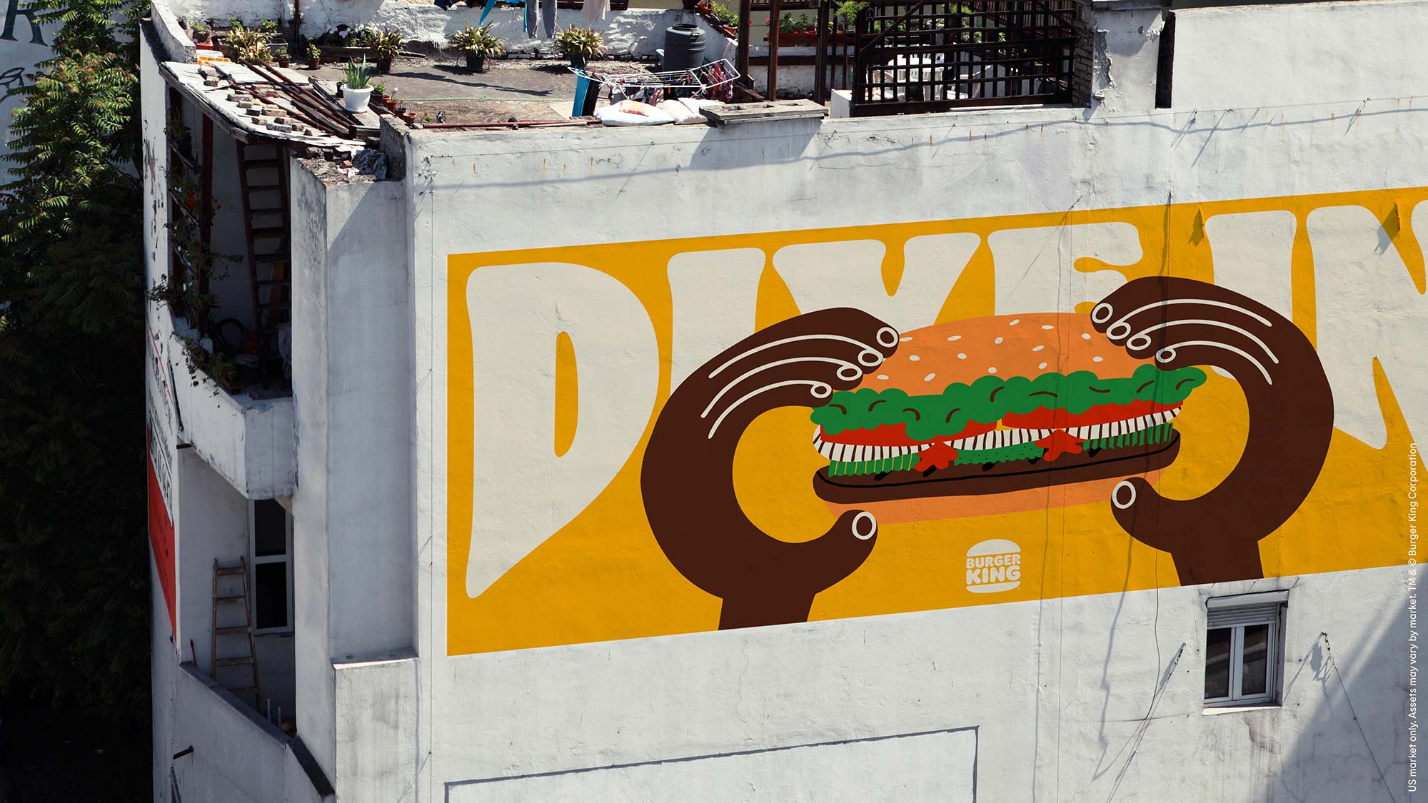
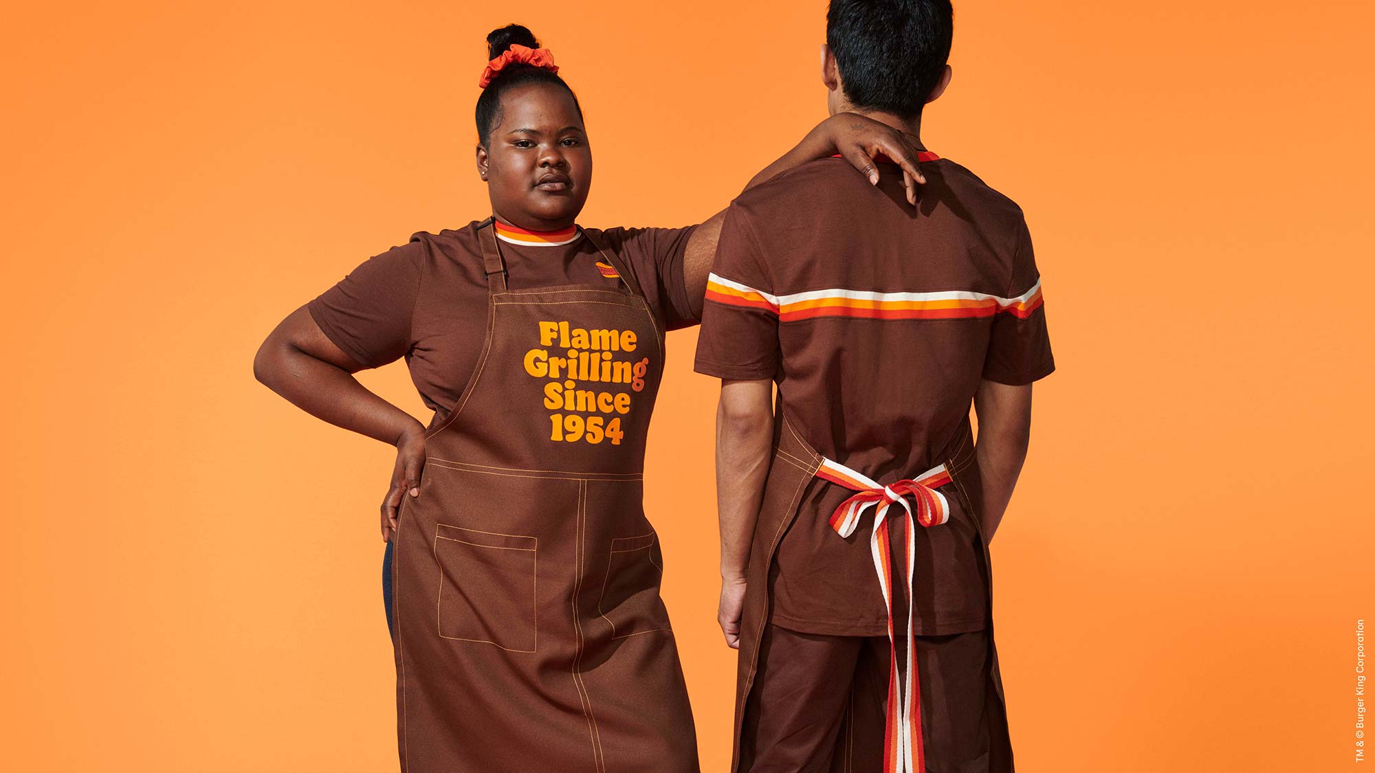
JKR partnered with Cachete Jack to provide illustration that conveyed a playful irreverent personality. This was then able to be paired with the type, and utilised with a selective palette of colours that referenced the food, namely Firey Red, Flaming Orange and Barbeque Brown. All these assets were designed to be digitally-centric, and move with changing consumer behaviour onto digital-based platforms.
Recent Custom Projects
View all

