)
Coal Drops Yard
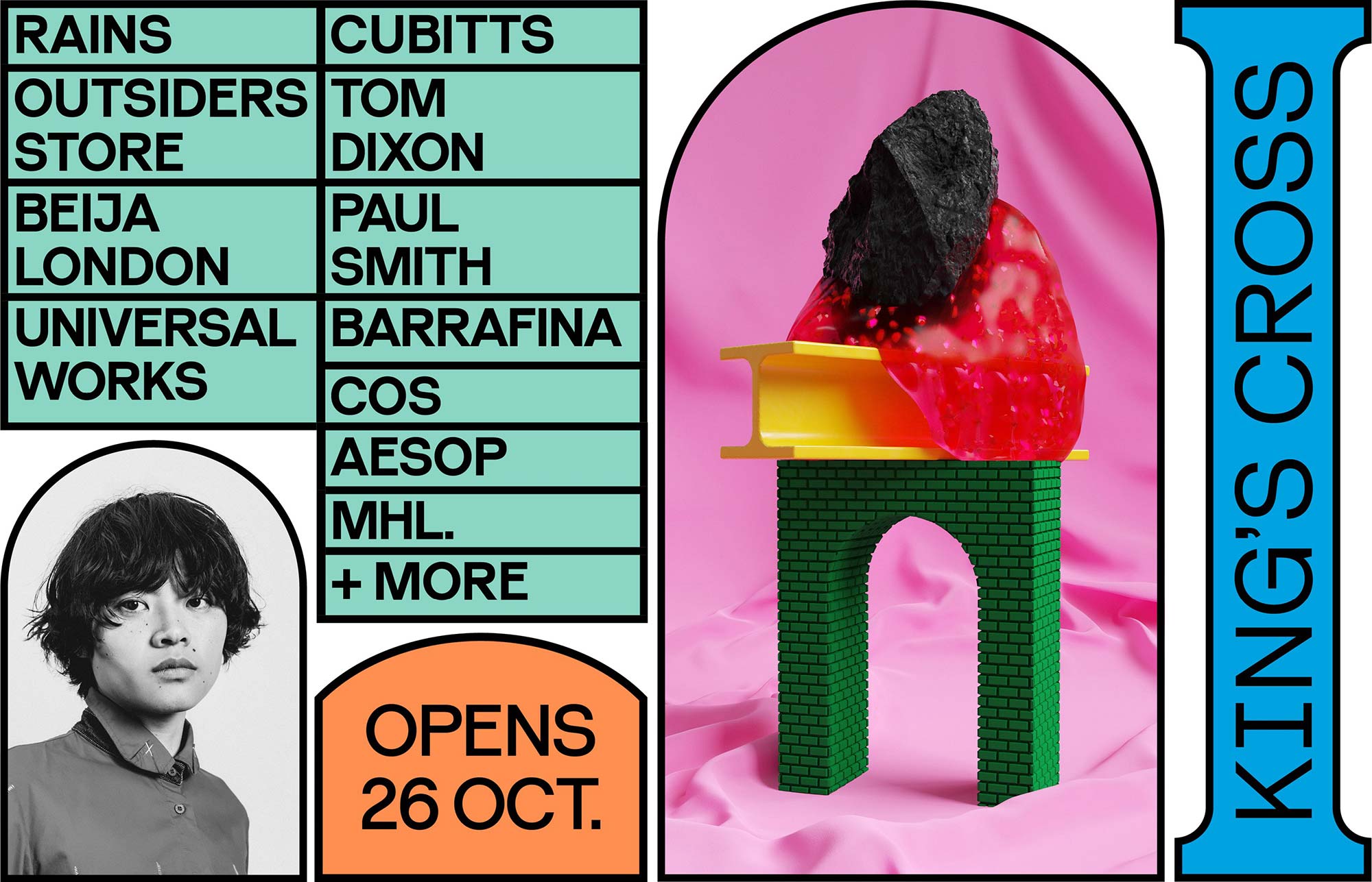
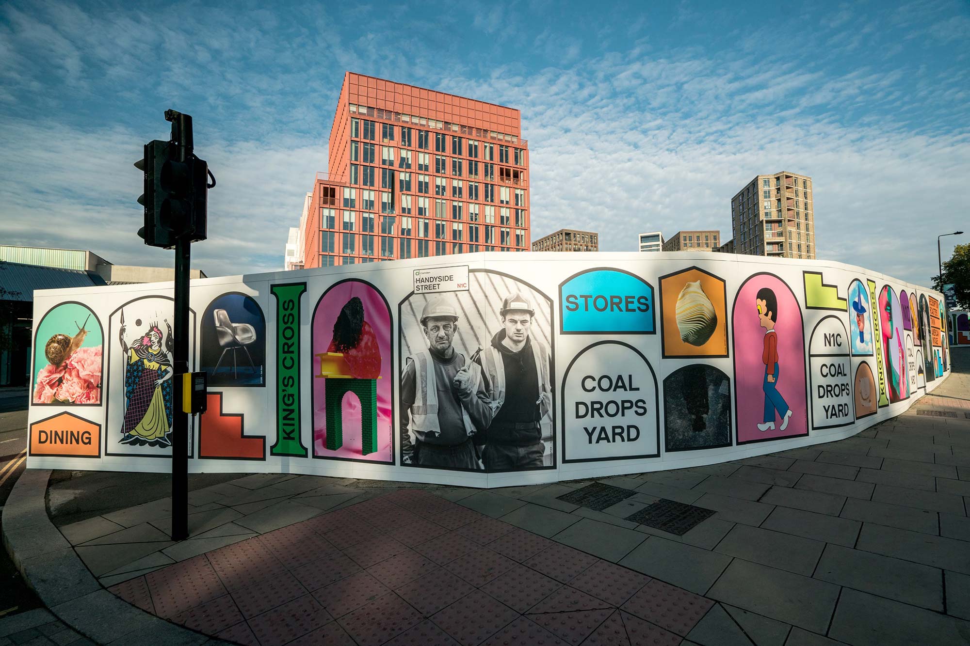
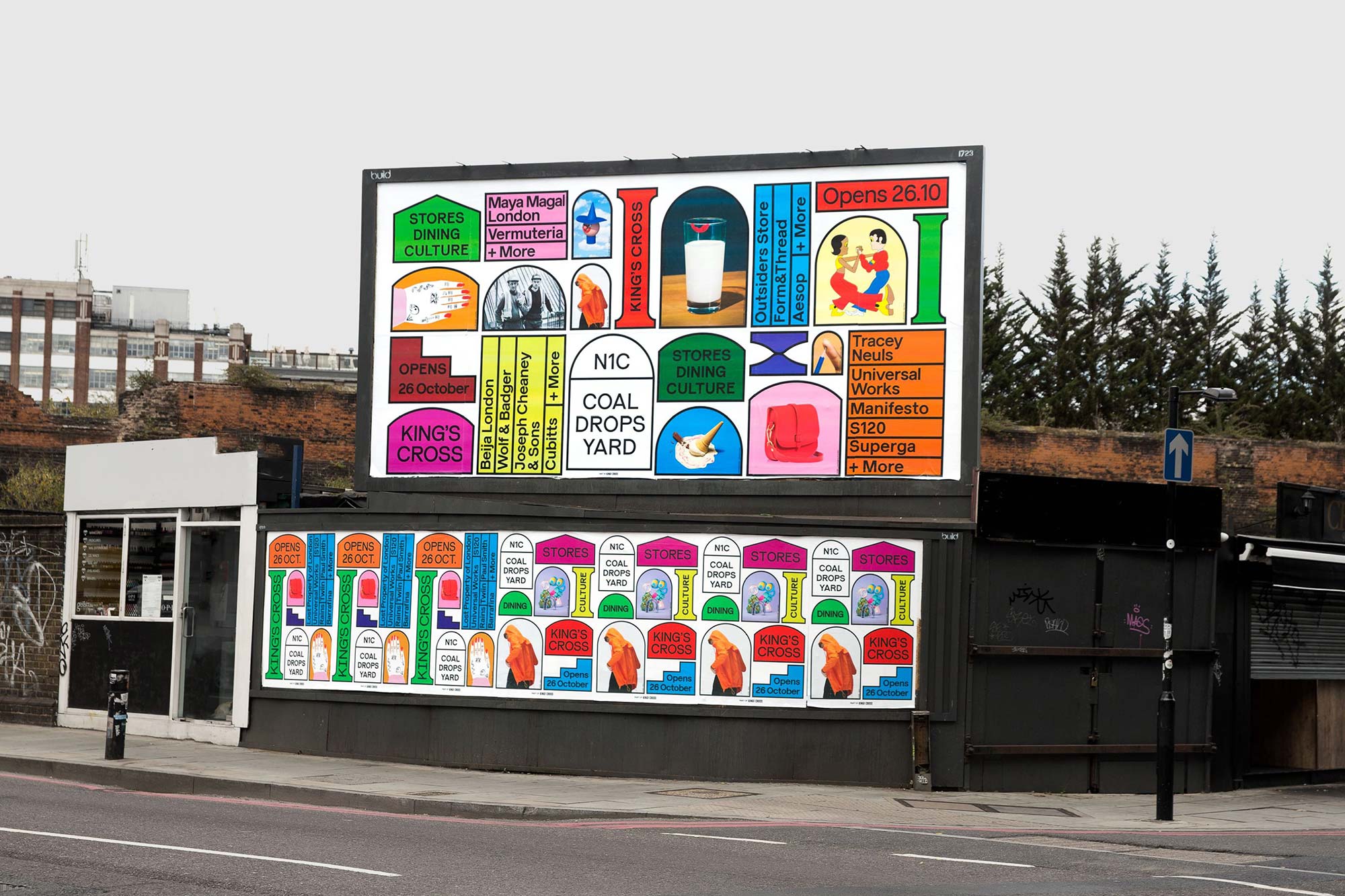
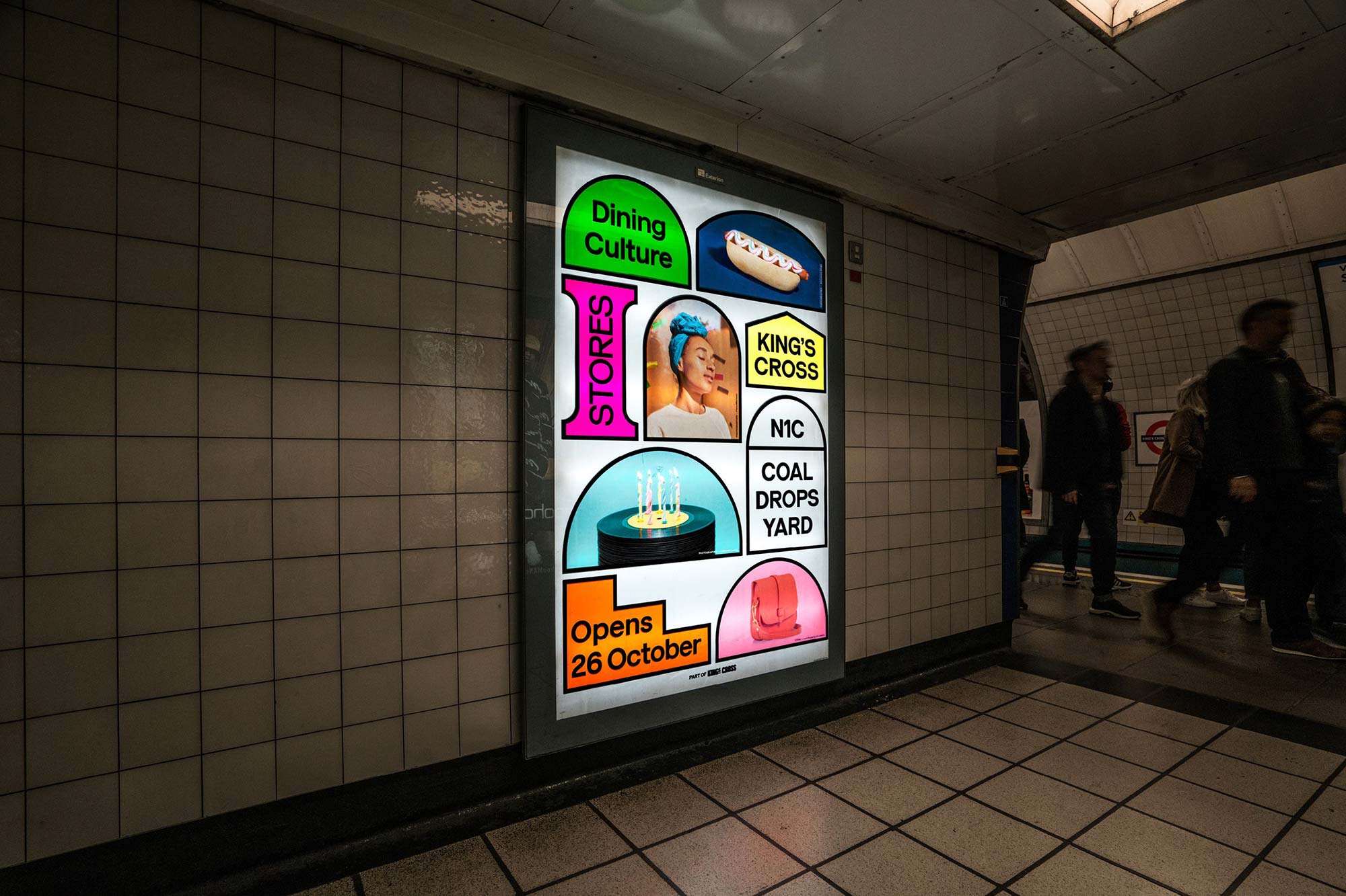
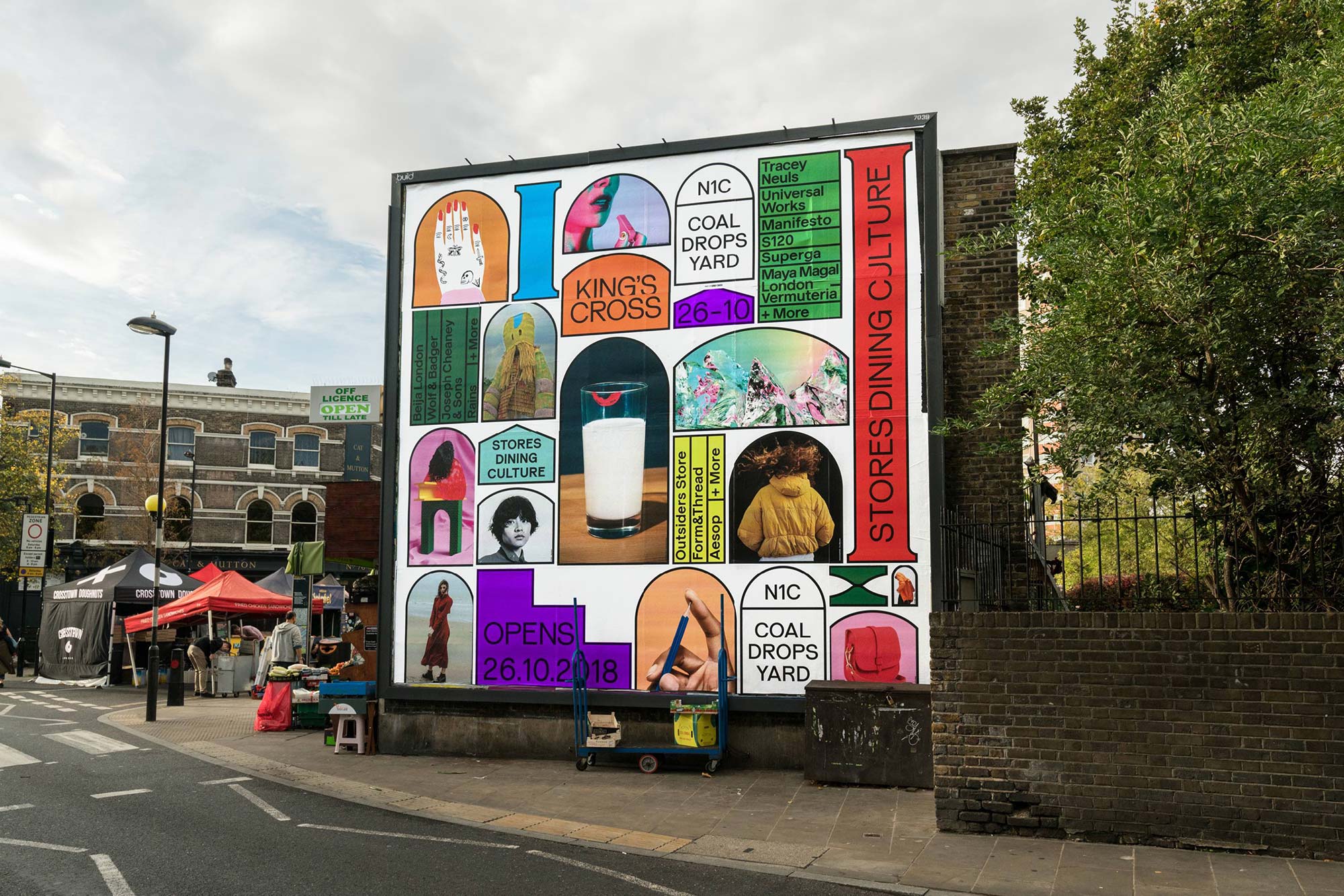
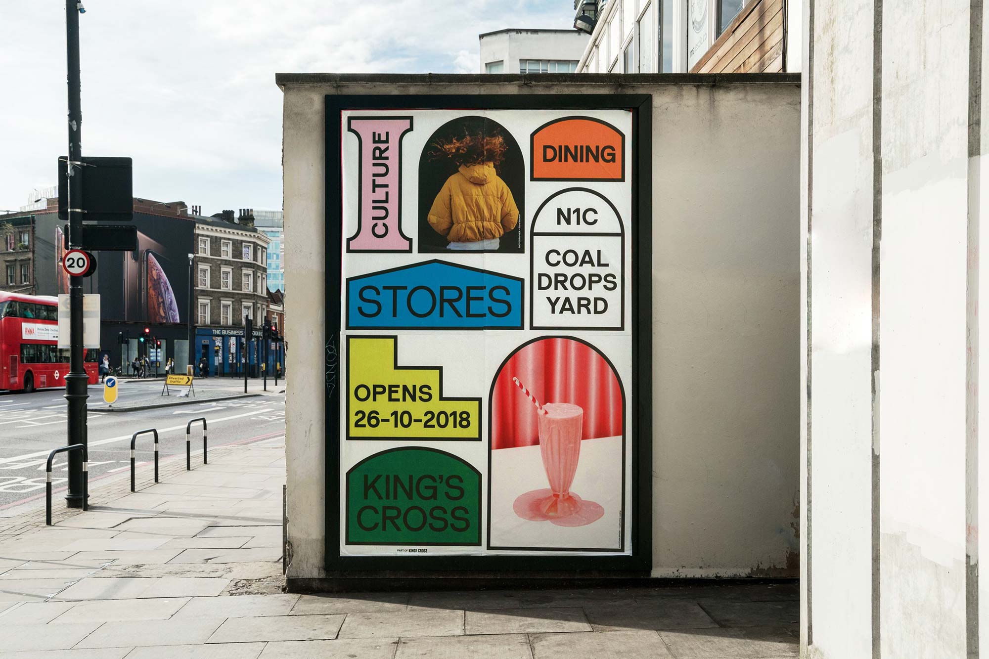
A cousin to our work on the King’s Cross project, we worked closely with Droga5 London to develop a heavily modified variant of our typeface Reader, to apply to the branding of Coal Drops Yard — a new renovated, high-end 9,290 sq metre, shopping complex and privately owned public space.
- Typeface
- CDY Reader
- Comissioner
- Droga5, London
- Year
- 2018
- Styles
- 3 Styles: Regular, Medium, Bold
- Coverage
- Latin-2 Encoded
- Classification
- Sans Serif Contemporary Sans
- URL
- coaldropsyard.com
- droga5.co.uk
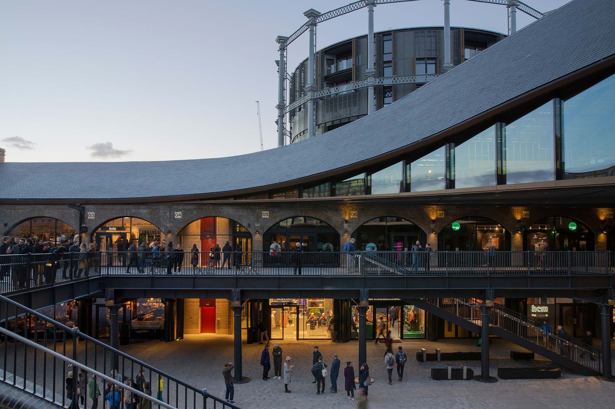


Located in the King’s Cross area of North London, Coal Drops Yard has existed since 1851 (notably with the two buildings being built at different times) to receive 8 million tonnes of coal per year. The two Victorian coal drops sheds received coal from South Yorkshire for the Great Western Railway and trans-ship it to narrowboats on the Regents Canal. As the gradual decline in coal demand began, part of the complex was converted to storing bottle and glass for merchant Bagley’s around 1880. By the early 1990s it was converted to a less-than-polished nightclub, and through its decline until 2007 saw a variety of drug-fuelled raves.
In 2008 it was derelict, but the close vicinity to the area to King’s Cross, St. Pancras and Euston stations meant it was only a matter of time until it was pulled back into the present day.
As part of the overall renovation of the area by Argent LLP, different parts of the site have been refurbished to house a variety of uses. Establishments such as Central St. Martins Art School at Granary Square, a supermarket and various restaurants have secured other parts of the site
Designed by Thomas Heatherwick, CDY is envisaged as an open-air shopping-centre hosting an unusual mixture of emerging brands to household names. The original specifics to Heatherwick briefed to connect the two buildings in some form. His solution was to rise-up both roofs, converging them together, into a singular moment.
The central focus of the renovation becomes the two kissing roofs, re-made in the original Welsh slate. This enables open-air performances, but also references past provincial market buildings, which were sometimes raised upon stilts, which allowed for weather protection and also a focus point to the market area.
)
)
Briefed by Droga5 to utilise and modify our Reader typeface, to both pull it aesthetically inline with the proposed CDY branding, and create an ownable asset, we began to research and started referencing the architecture of the site.

)
)
)
)
Our typeface Reader was the perfect starting point for the project, the neo-grotesque genre enabled it to be an open canvas on which to adapt and modify sufficiently, whilst still retaining readability and ownership for CDY.


)
)
)
)
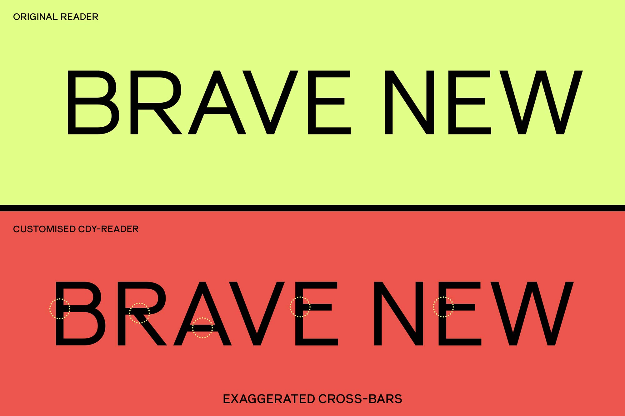
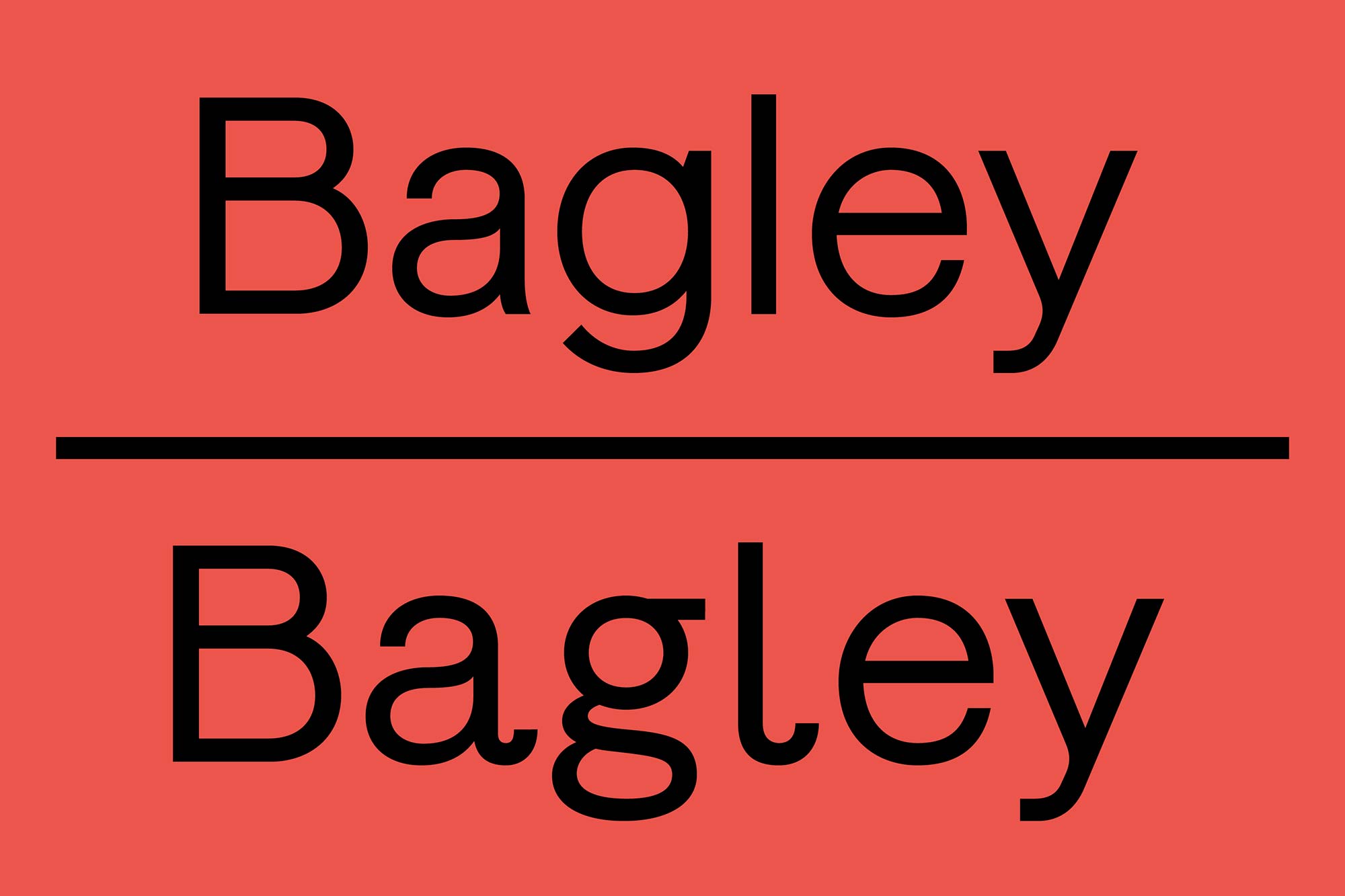
Taking notes from both the sympathetic renovation but also the juxtaposing contemporary application of the identity, the raised arches of Coal Drops Yard translated into tighter letterform curve tensions, which in turn raised crossbars and pushed terminal endings to become perpendicular.
These changes to the three weights of Reader in Regular, Medium and Bold, were genre-defining and moved Reader from a neo-grotesque into a more contemporary trajectory, and something moulded to fit seamlessly into the surrounding identity work.
As well key letterforms within Reader changing their curve tension, structure and overall form, we also offered individual ornamental glyphs as well as a series of alternate glyphs to further expand the identity toolkit of Coals Drops Yard for type-users and designers alike.
The identity encapsulated commissioning and the application of a plethora of image-making mediums, styles and artists with various forms becoming both frames and containers in a single instance, echoing Coal Drops Yard.
Between two projects for the King’s Cross area (CDY & King’s Cross) we have found a deeper connection with the area, and understanding of the sensitive and positive renovation work that has been undertaken in this area over the last number of years.
