Compass
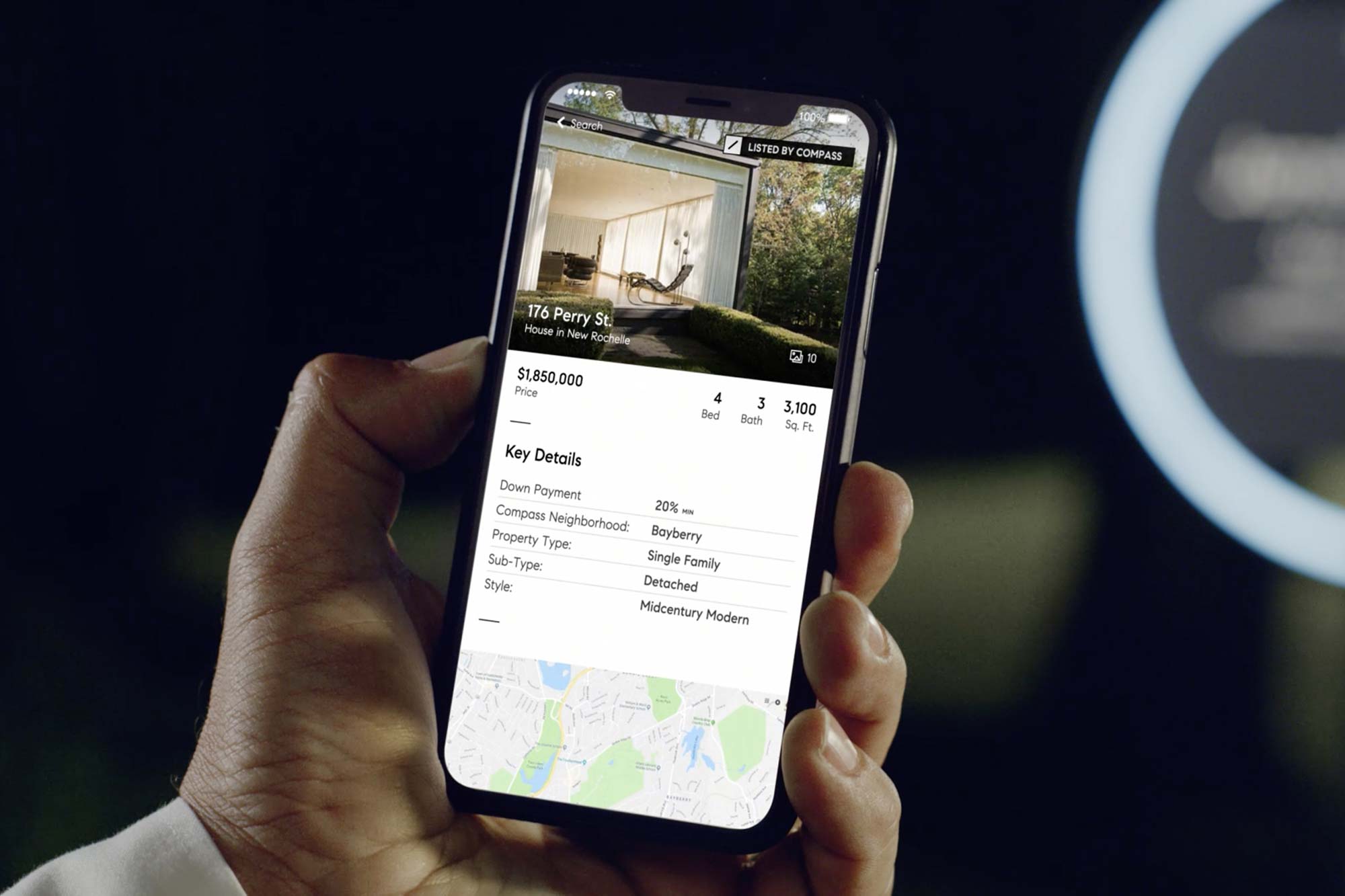
The vast and occasionally confounding world of US residential and commercial real estate is often marked by tradition for tradition’s sake: idiosyncratic practices with no clear provenance, and historic sales conventions that Brokers themselves often can’t unpack. Refreshing, then — both for customers and practitioners — to have an entity like Compass enter this occasionally-bewildering marketplace: since 2012, the technology-led company has helped agents and clients alike transparently navigate an otherwise semi-opaque industry.
- Typeface
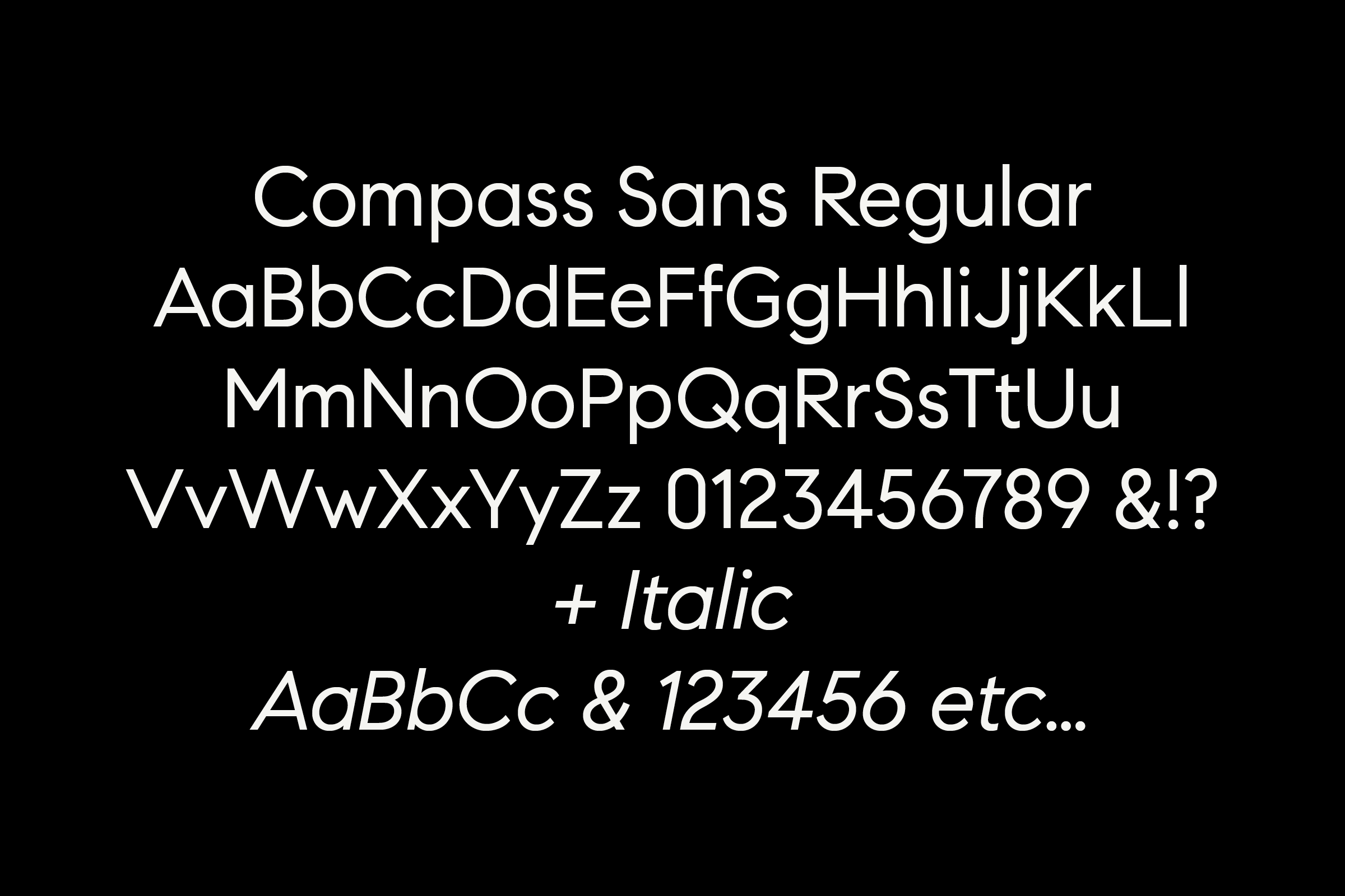
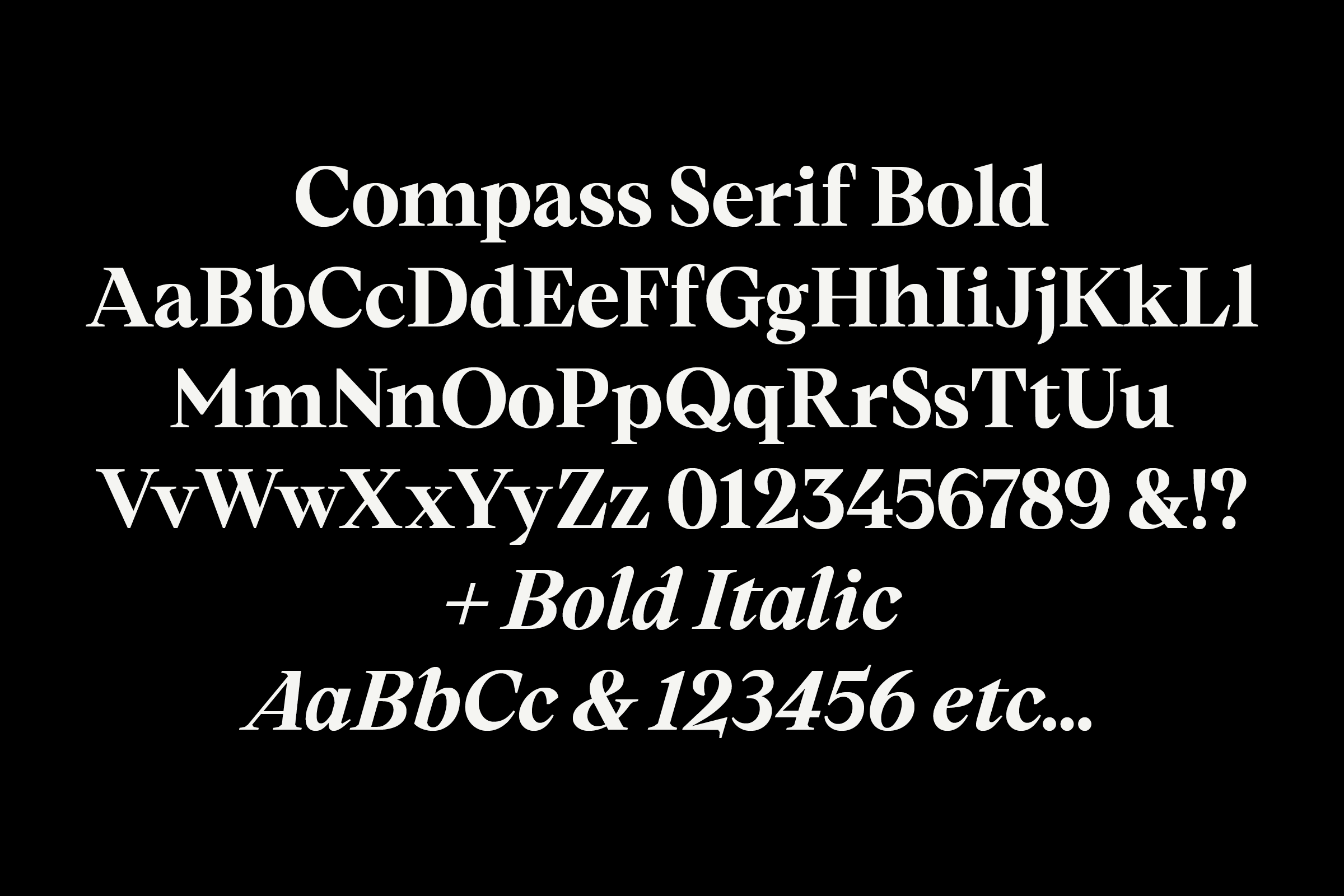
- Compass Sans Compass Serif Compass Text
- Comissioner
- Compass Inc., NYC, USA
- Year
- 2017–18
- Styles
- Compass Sans (3 Weights) Compass Serif (3 Weights) Compass Text (2 Weights) with corresponding italics
- Coverage
- Adobe Latin-2 Encoded
- Classification
- Geometric Sans Serif
- URL
- compass.com
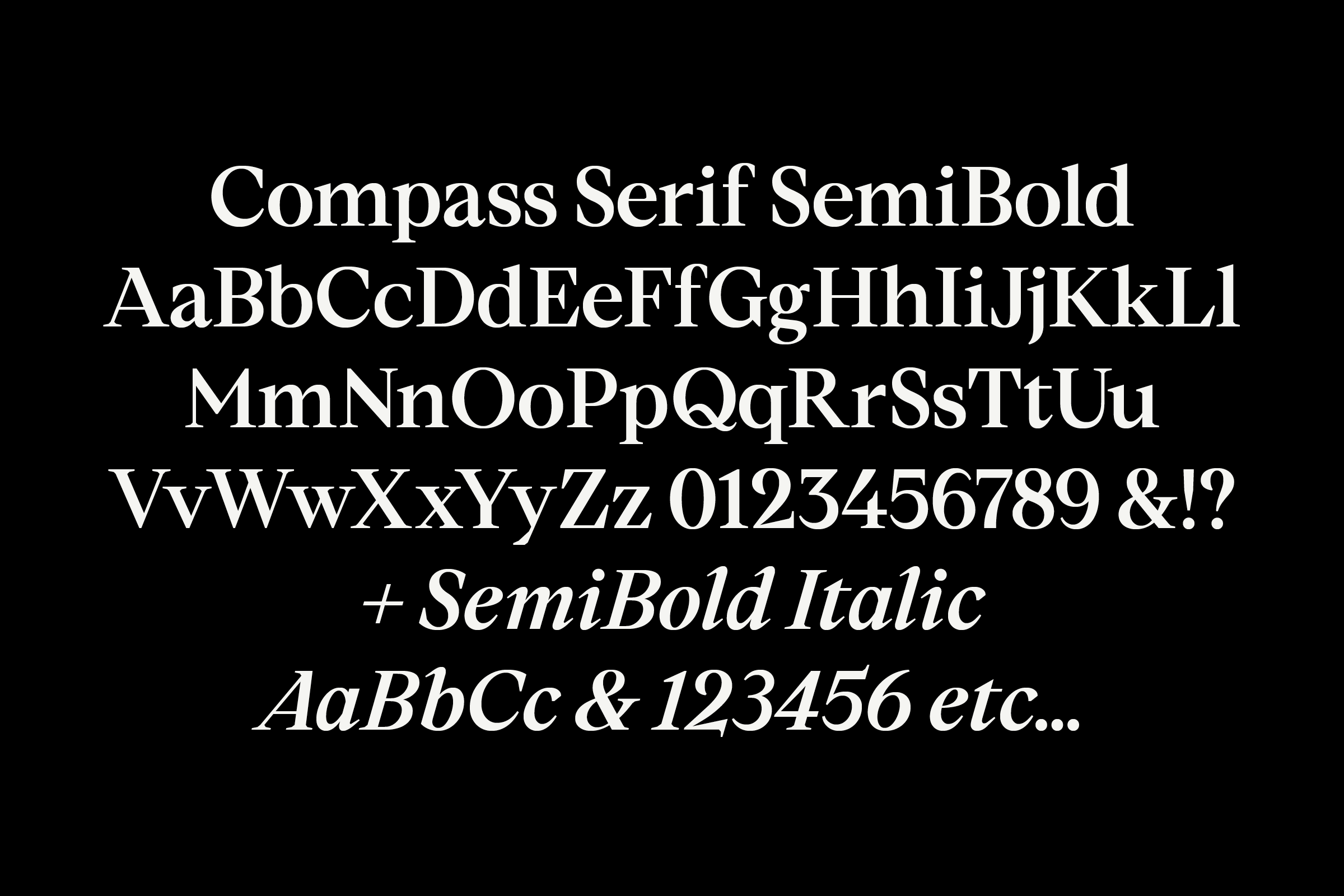
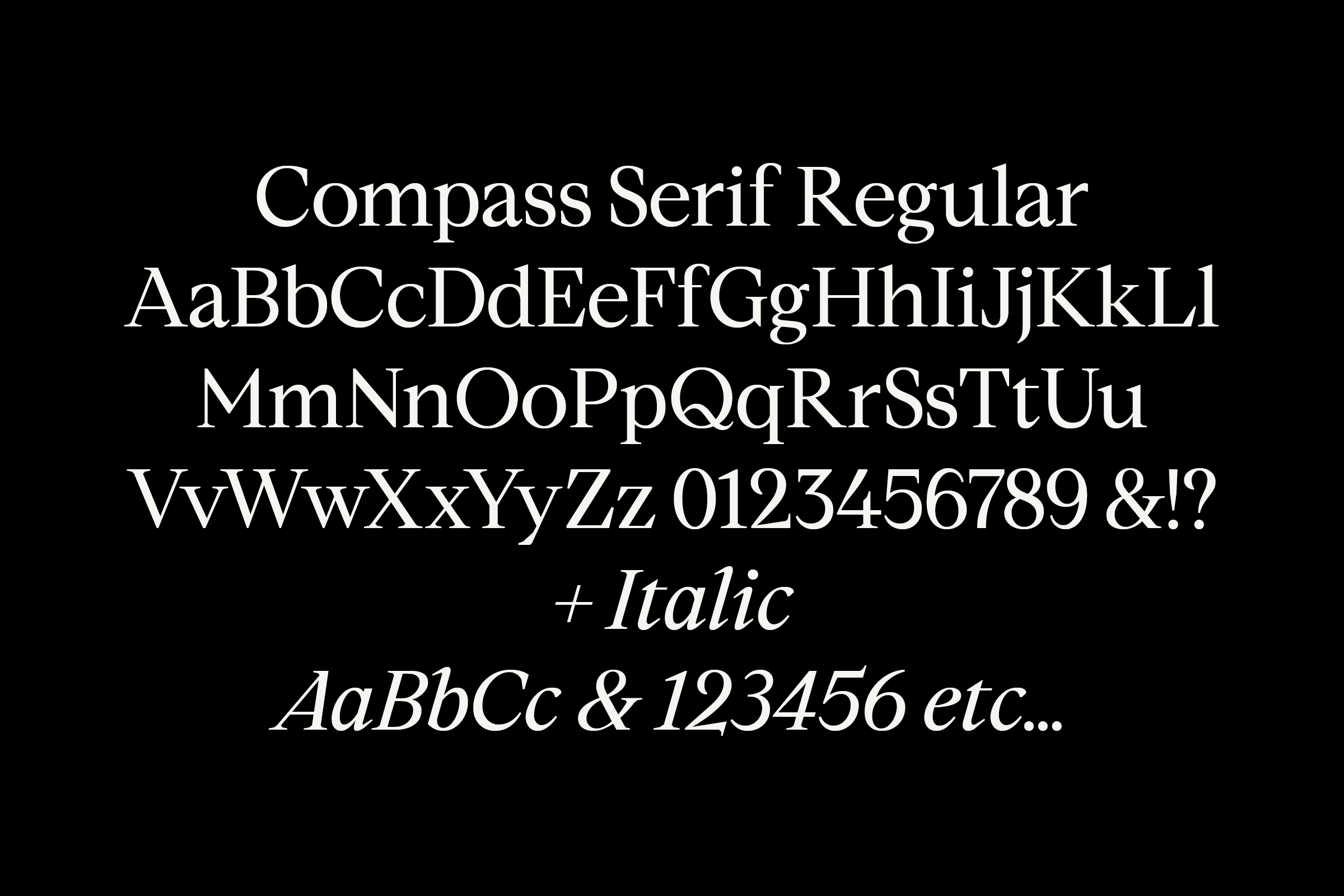
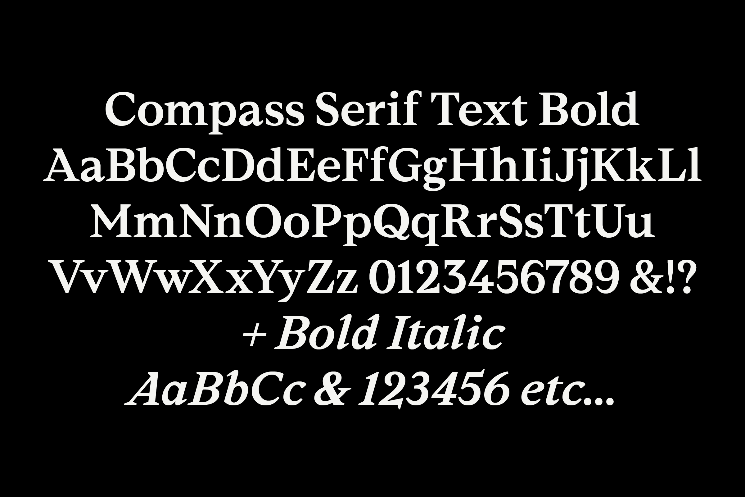
After a Series D financing round in 2016, the in-house creative team at Compass began looking to match their innovative approach to the real estate industry with a similarly original approach to the company’s graphic identity. Ultimately plotting out a comprehensive rebranding complete with a series of custom typefaces, Compass solicited Colophon Foundry to create a set of three versatile type families that would gradually replace a well-worn suite of off-the-shelf fonts.
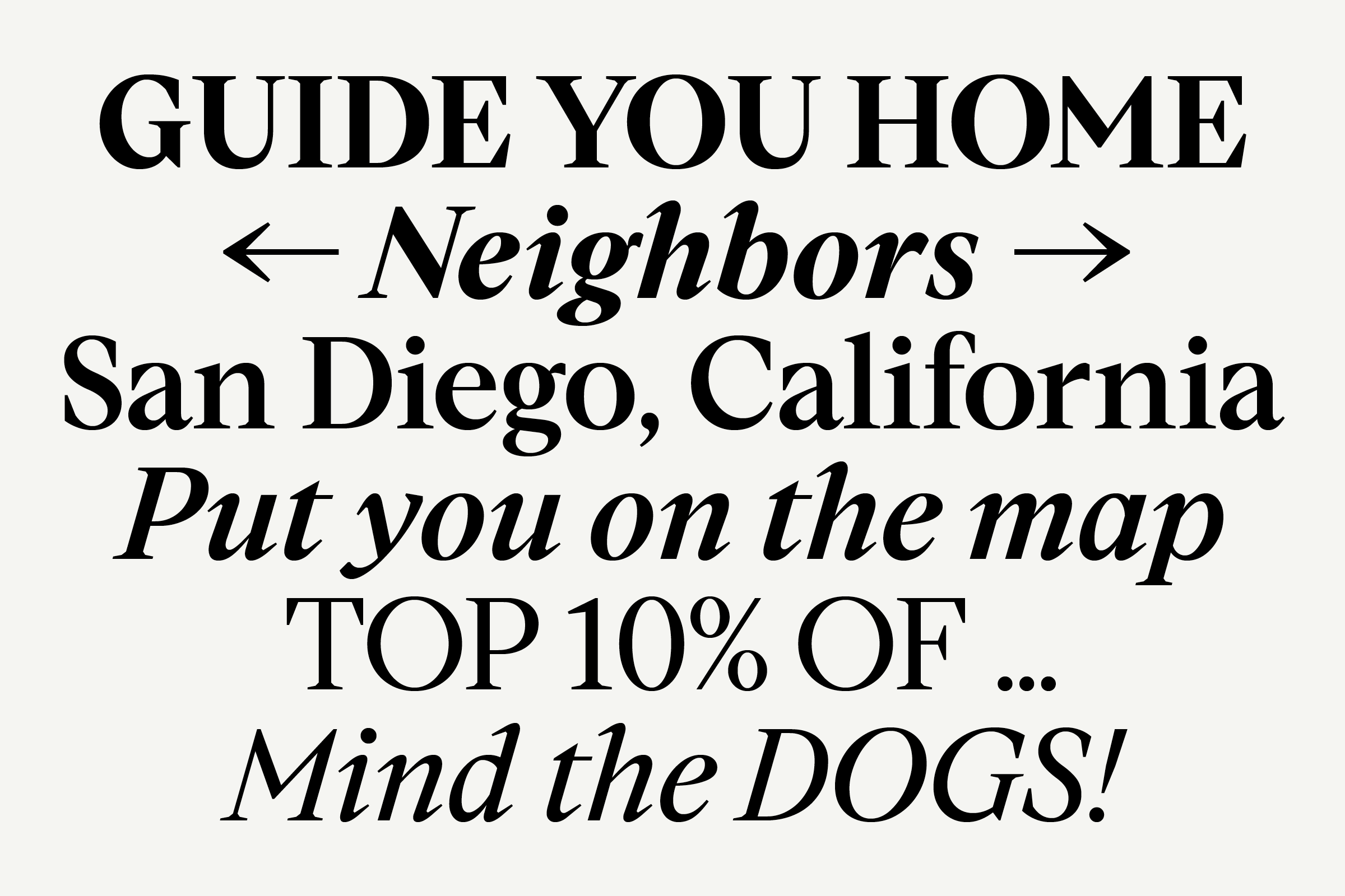
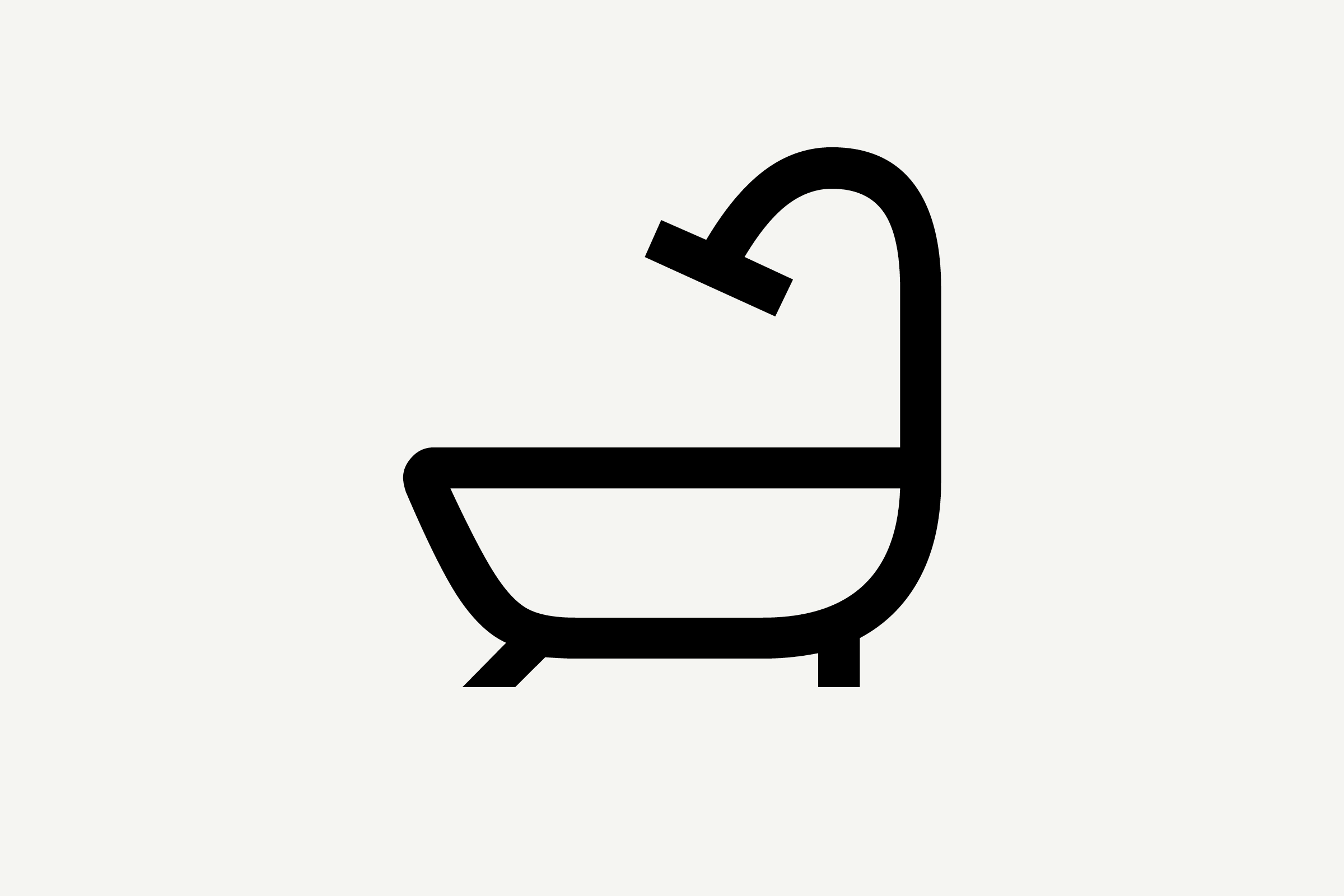
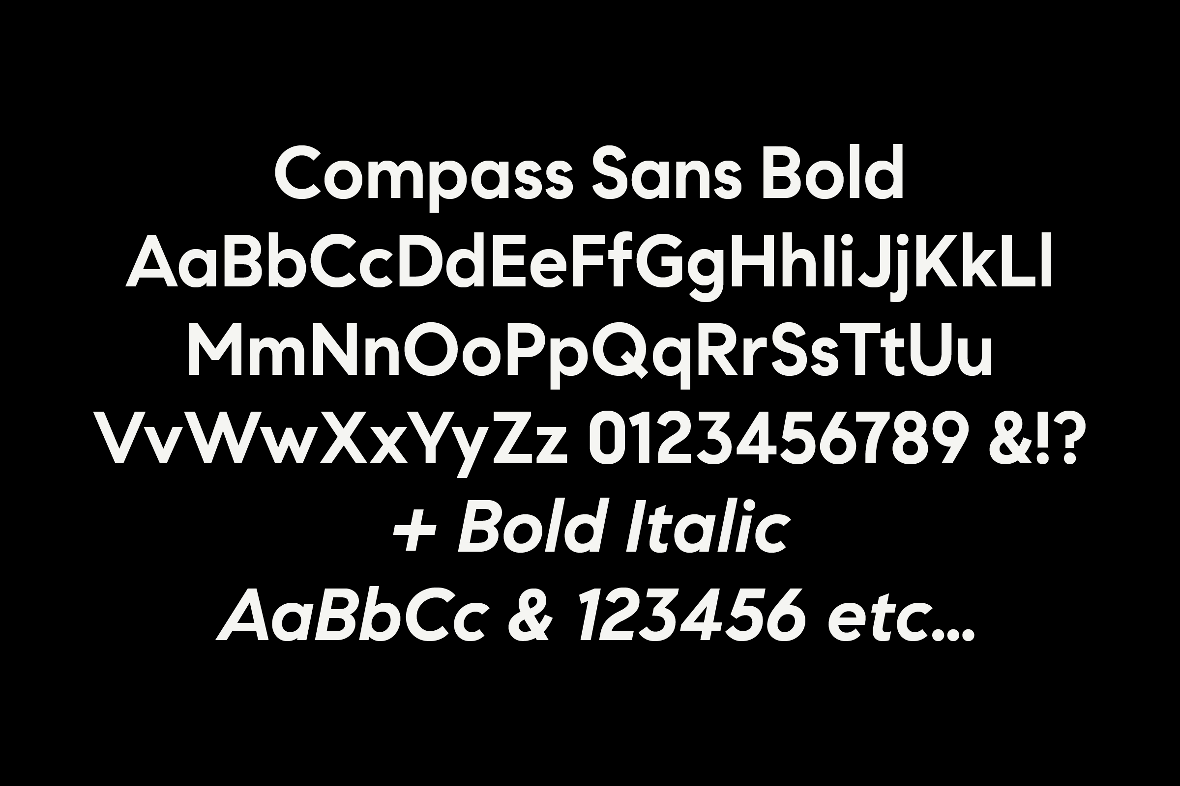
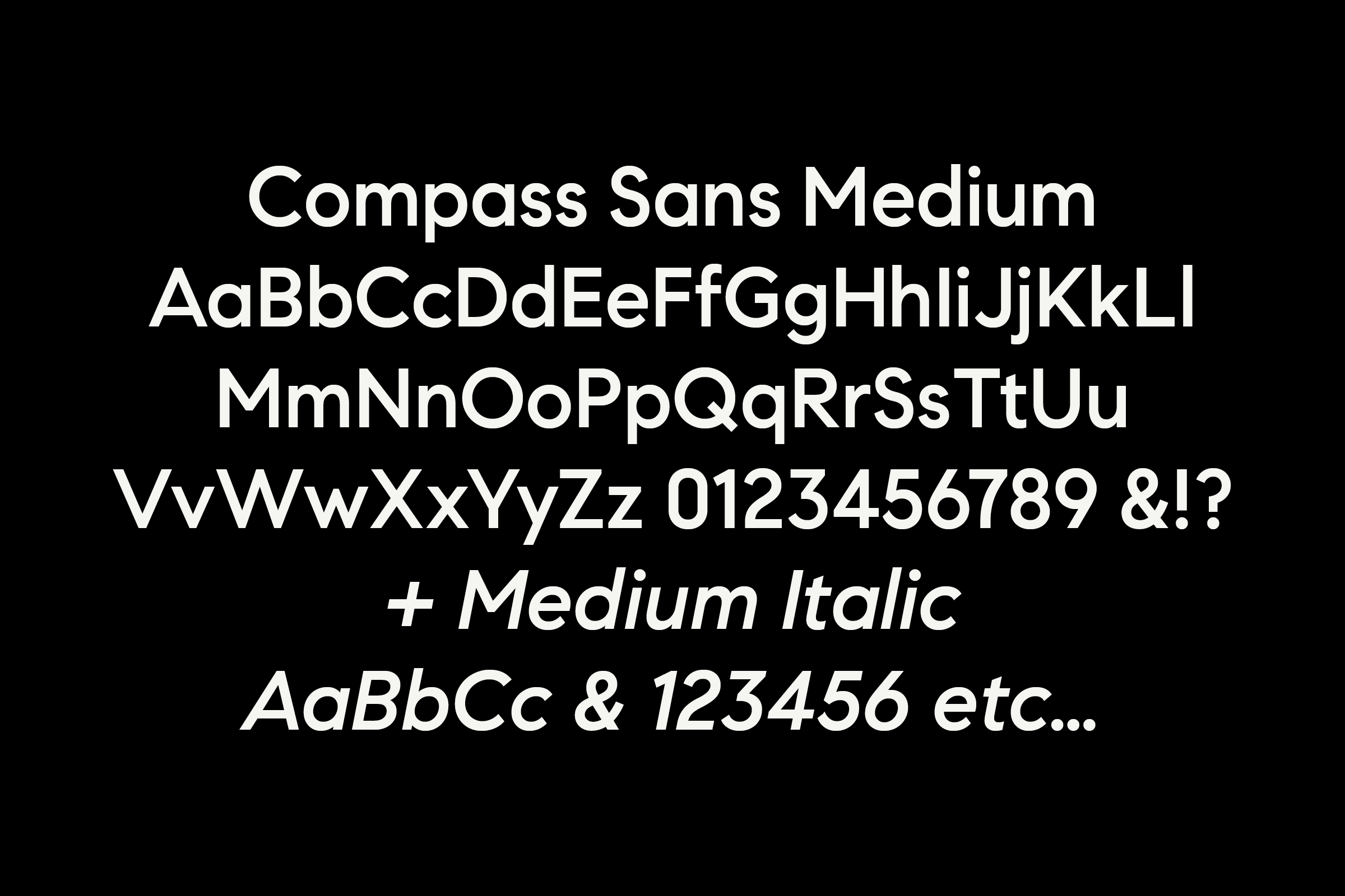
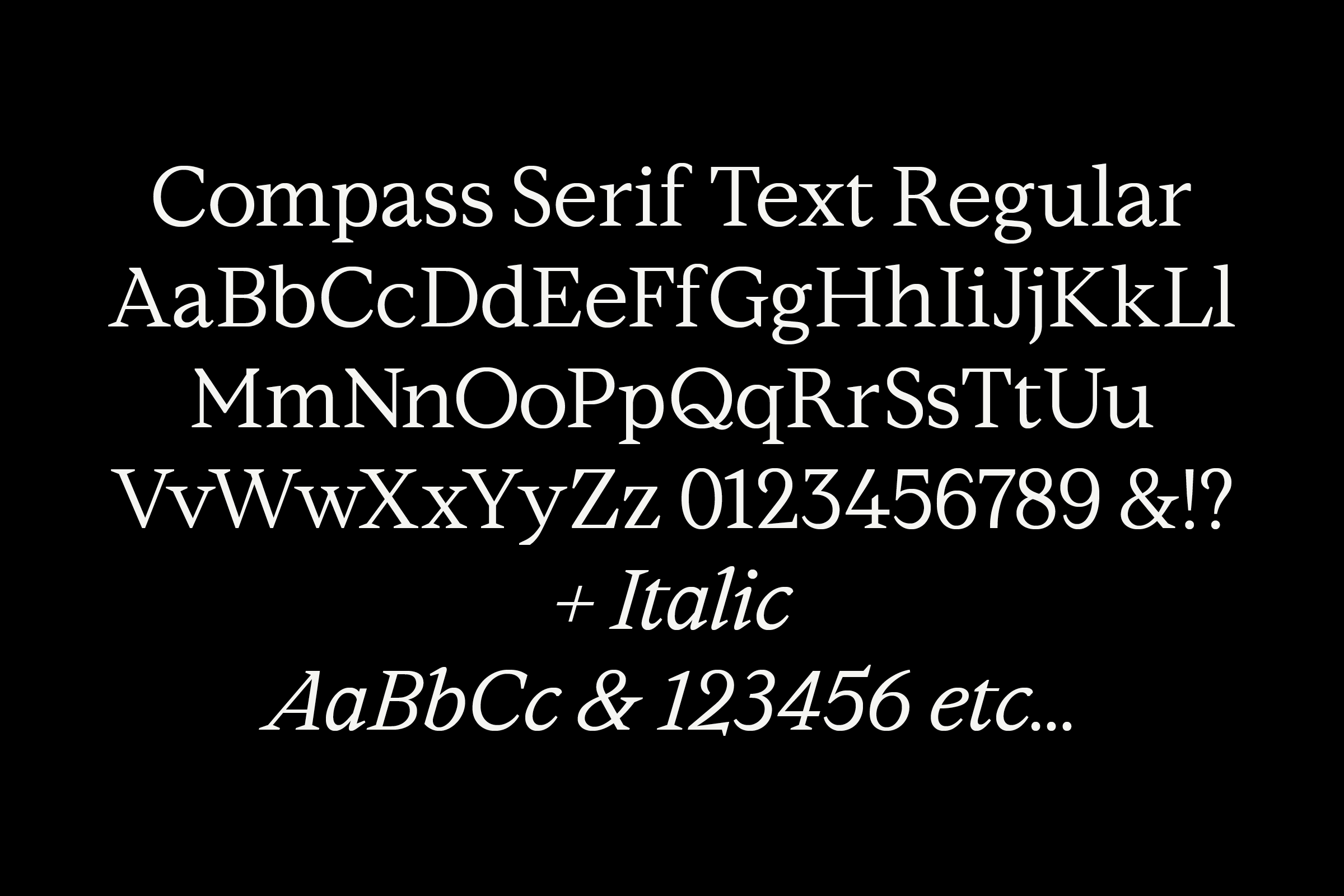
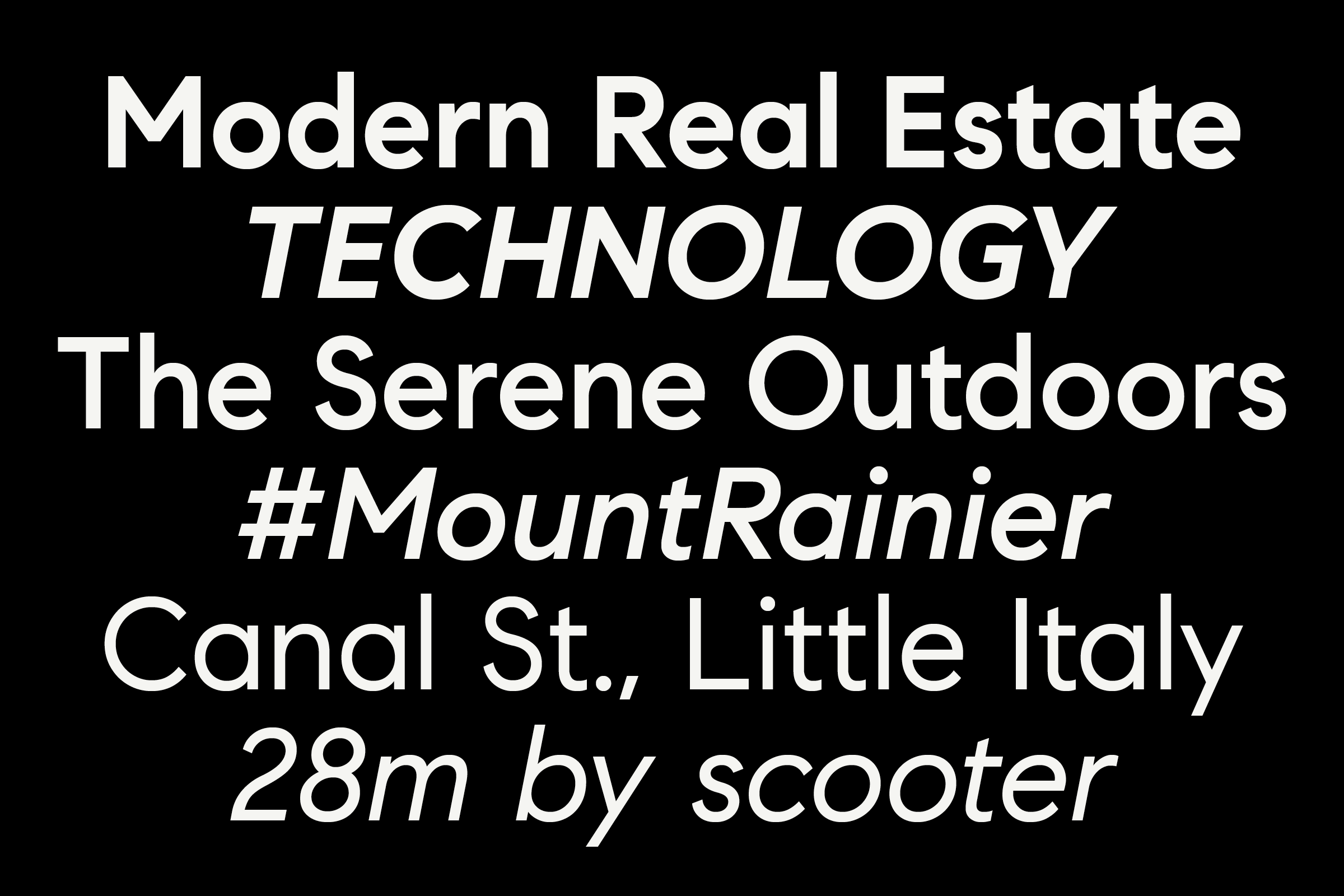
Eventually comprising Sans (Regular, Medium, Bold + Obliques), Serif (Regular, Semibold, Bold + Italics), and Text (Regular, Bold + Italics) weights across 16 total styles, our collaborative process began with the creation of a workhorse sans-serif that would come to contain a series of graphic devices, rating marks, and listing-related icons. Special attention was paid to the maths and metrics of the fonts’ construction: the transition from old typeface to new needed to be seamless and only barely stylistically-perceptible to users of the company’s digital platforms.


Borrowing in part from the construction of Compass’ unchanging wordmark and its typographic behavior, we first set out to create a geometric sans-serif typeface suited to everyday use: one that would harmonize with the company’s existing branding, play well with any lingering retail typefaces, and later pair effortlessly with the nascent (but at that time undesigned) Compass Serif and Compass Text.
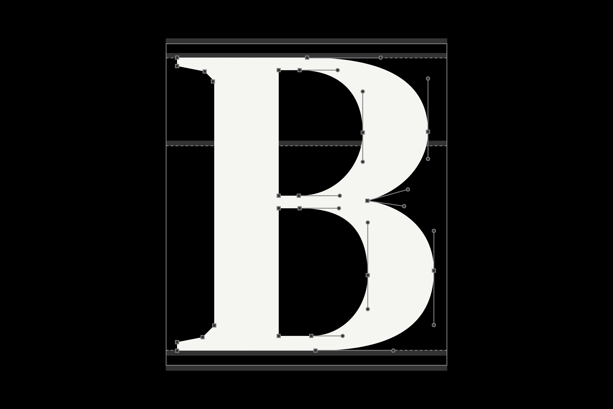
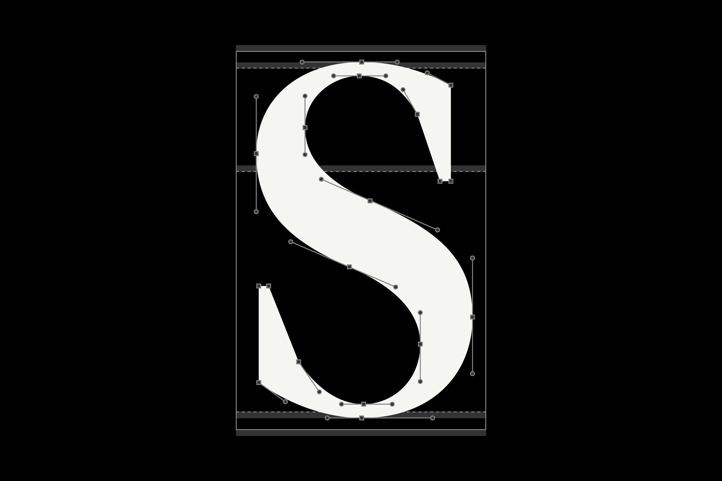
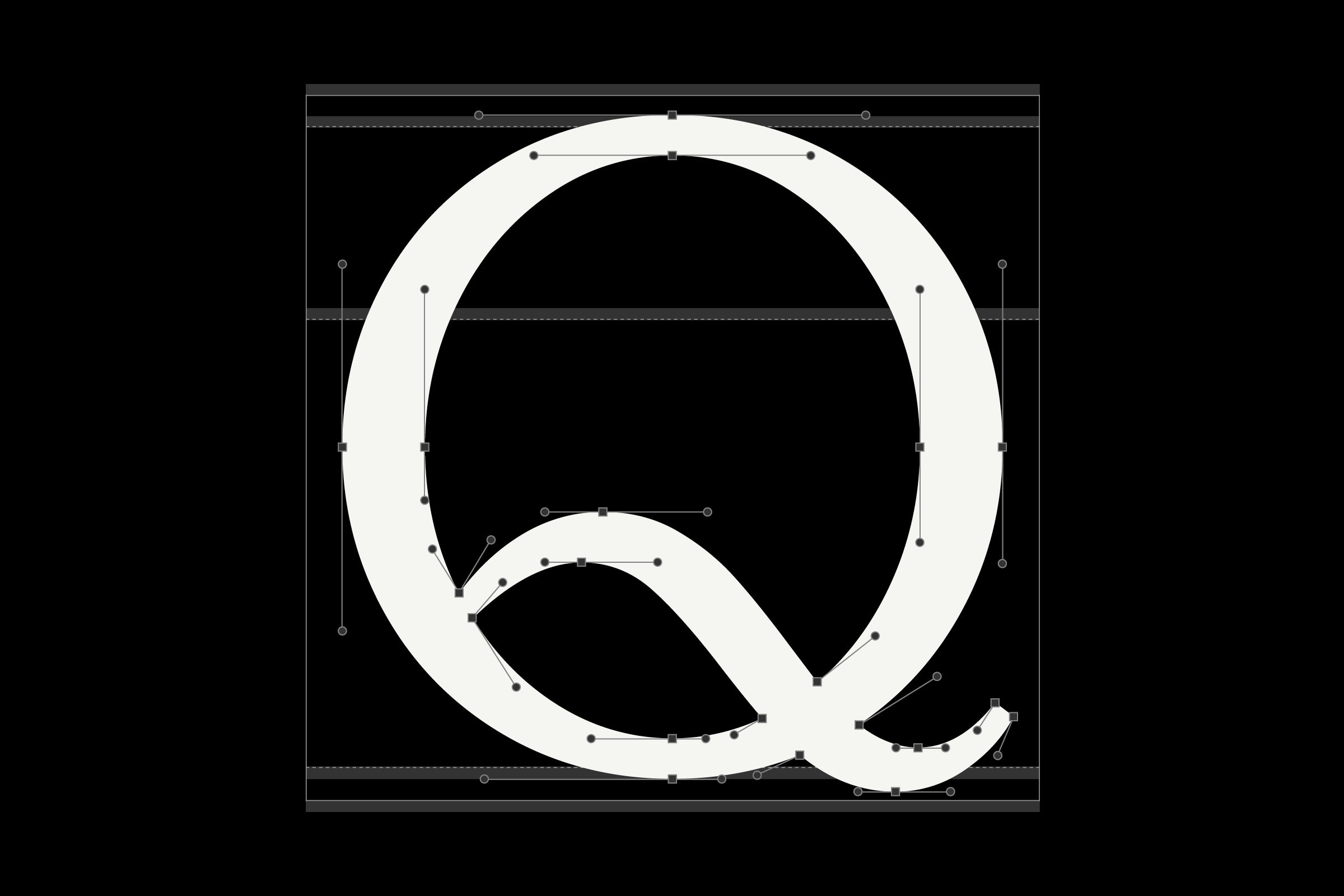
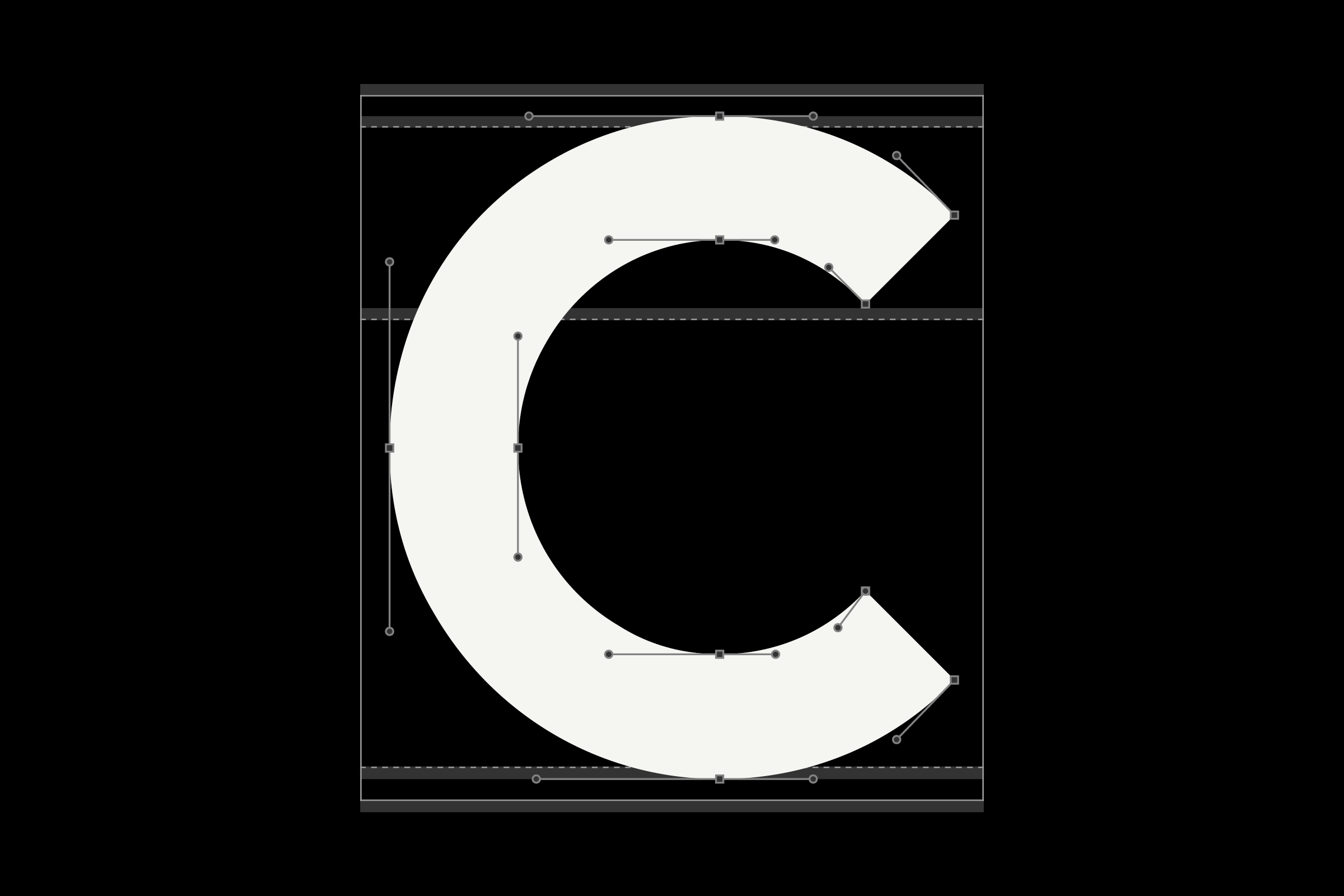
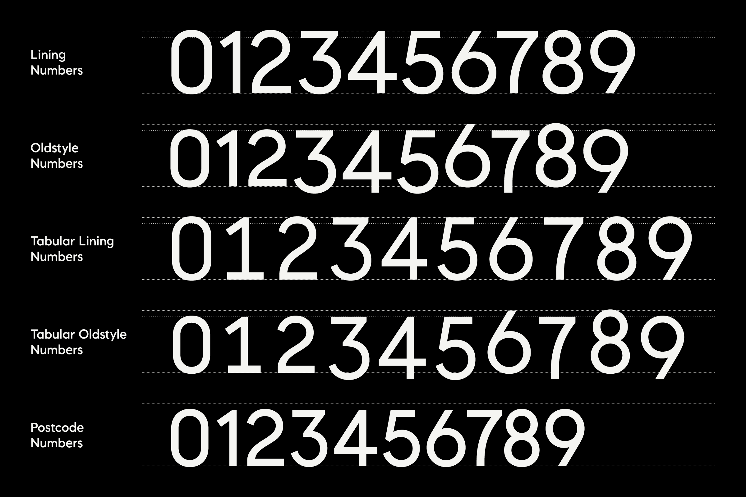
Typified by near-perfect circles — distilled directly from the ellipse in the brand’s ‘Ø’ compass — rigorous geometry was used to craft the curvature in characters like b, Cc, d, Gg, Oo, p, Qq, and numerals 3, 5, 6, 8, 9. Number sets were cut in capital height, 7/8 height (for postal codes), and traditional old-style formats, each in proportional and tabular variations. Angles borrowed from the Compass wordmark established 45º kicks to characters like the K and R, as well as 45º terminals on letterforms like Cc, e, G, Ss; slighter angles were set at exactly half that measure (22.5º) to establish a sense of rhythm and pattern.
)
)
)
)
As completion of the initial Sans Serif grew closer, the foundry’s process again gravitated toward hard numbers in order to establish several rules moving forward with Serif and Text styles: angles within the curves-and-straights construction adhered to 45º / 22.5º / 12.25º increments, creating a subtly chamferred aesthetic.
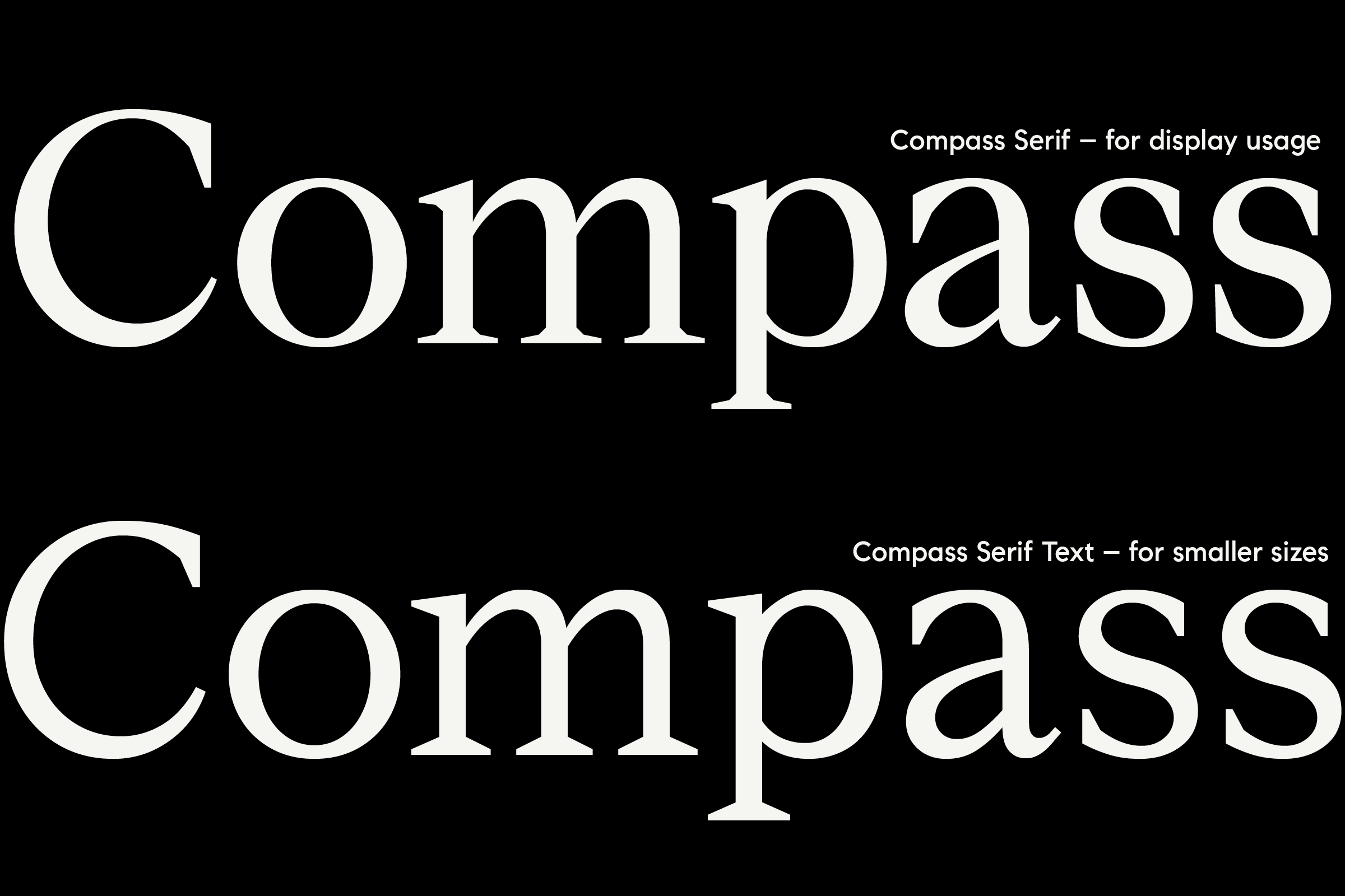
The optically sharp terminals in the display weights give way to reduced contrast, open apertures, and dulled terminals in the Text weights, enabling legible use at sizes down to 6pt. Corresponding italics are ‘true’ in their composition, adding texture and movement to titles, quotations, and emphases.
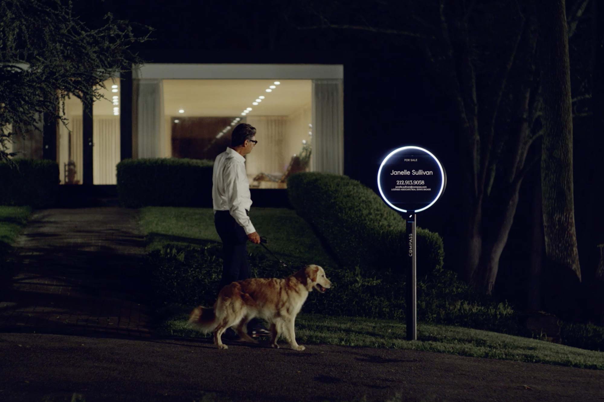


As each project phase came to a close, final font files were manually delta-hinted and engineered specifically for Compass’ product transition from Old to New. Of their collaboration with the foundry, Compass writes: ‘Working with the Colophon team was a dream. Even from across the Atlantic, the process was seamless and every round came in above our expectations. We now have a typeface even the harshest internal critics are proud of.’
