
Eir
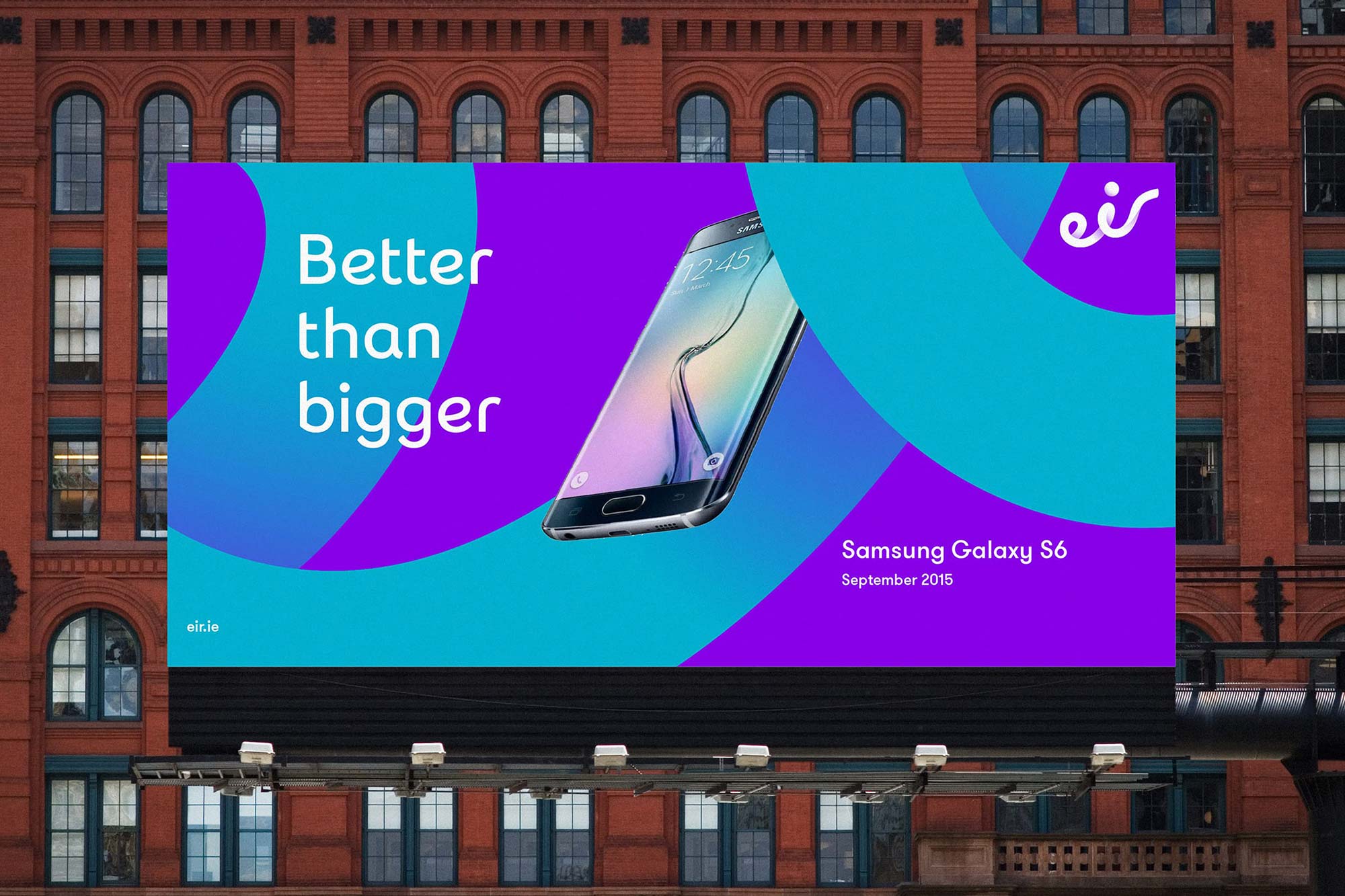
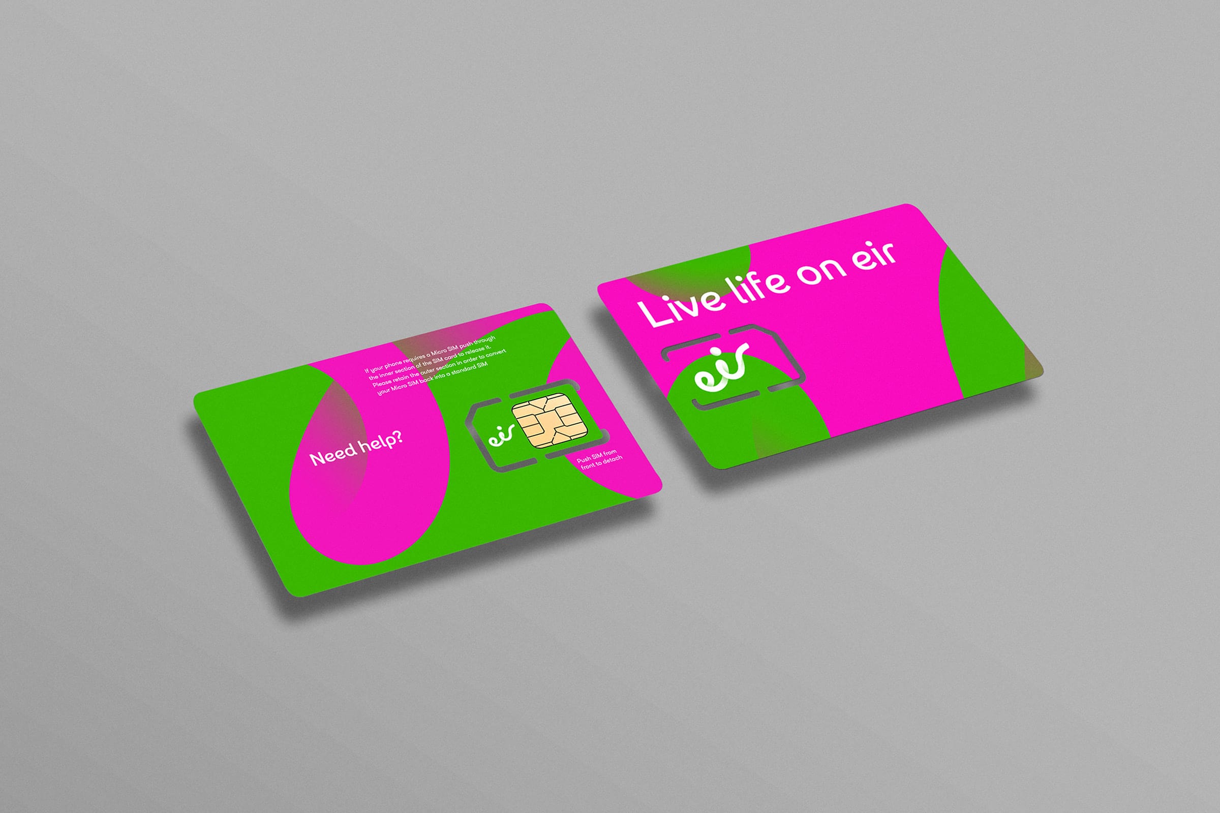
A comprehensive re-naming and re-branding, courtesy of London-based Moving Brands, provoked a thorough typographic reexamination for eir (previously Eircom), Ireland’s largest telecommunications business.
- Typeface
- eir
- Comissioner
- Moving Brands, London / eir, Dublin
- Year
- 2015
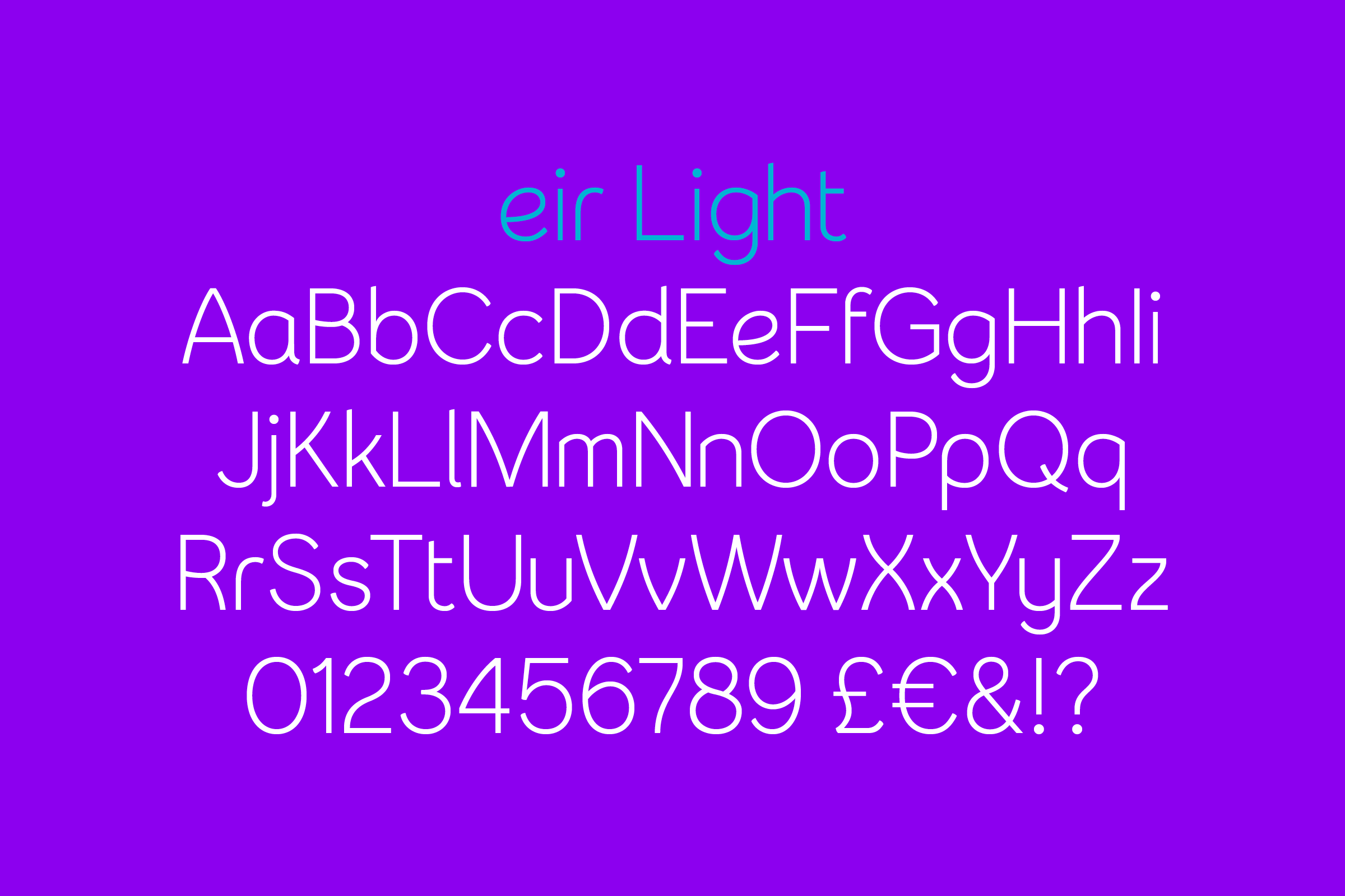
- Styles
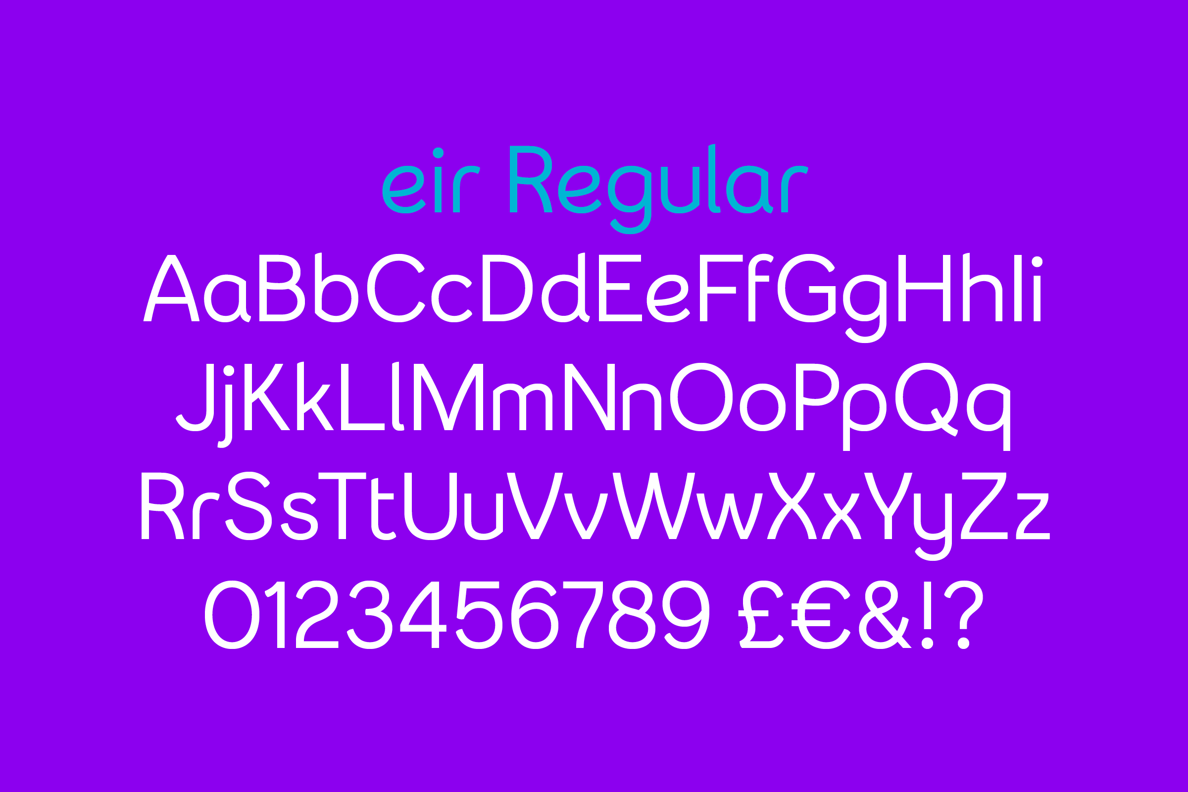
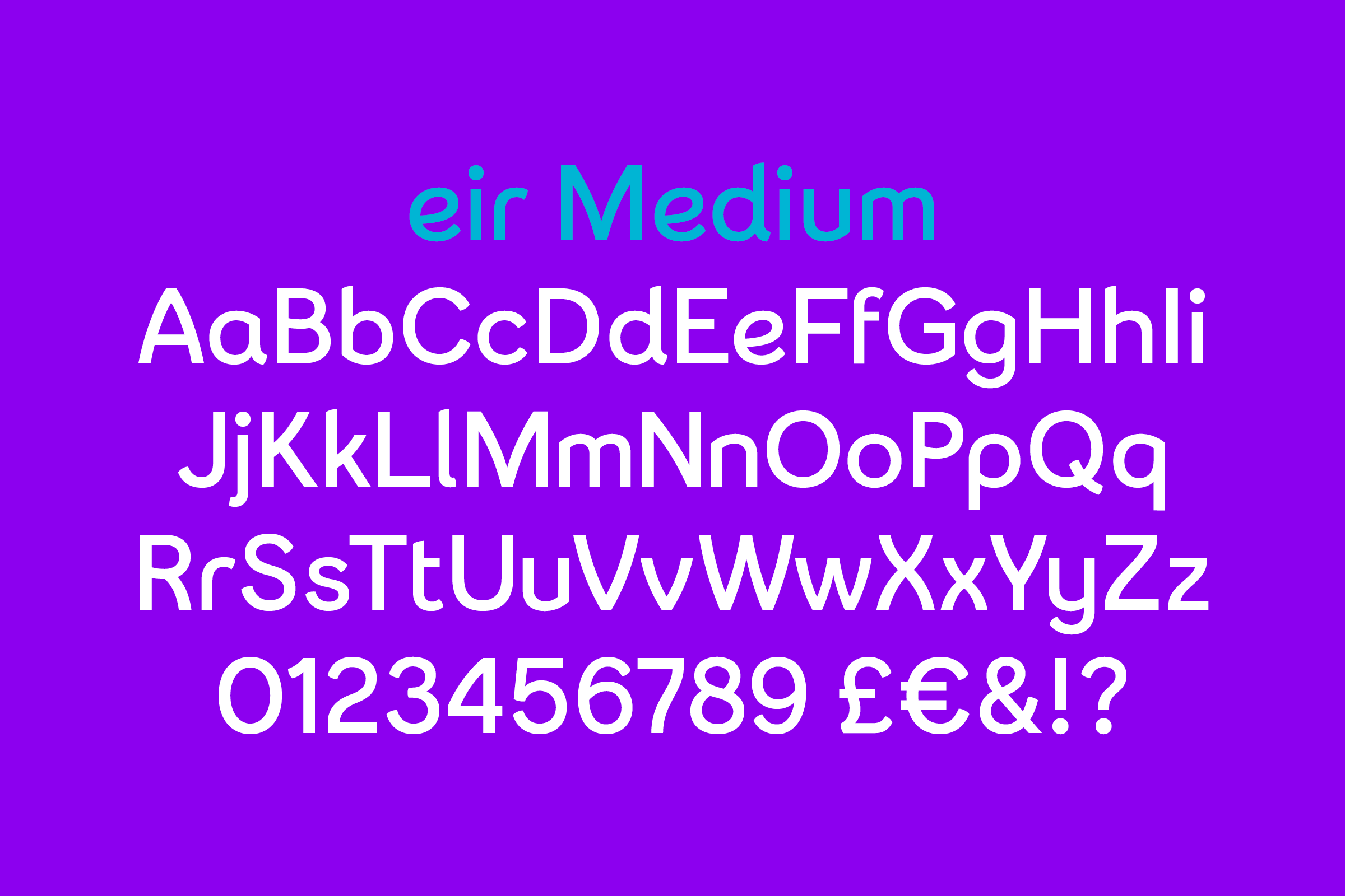
- 4 Styles, Light, Regular, Medium, Bold
- Coverage
- Latin-A Extended
- Classification
- Sans Serif Neo-Humanist Display
- URL
- eir.ie
- movingbrands.com
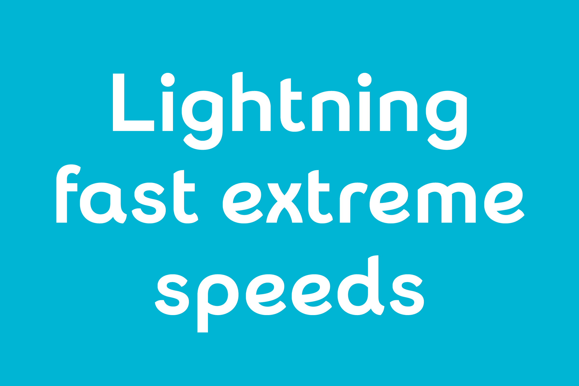
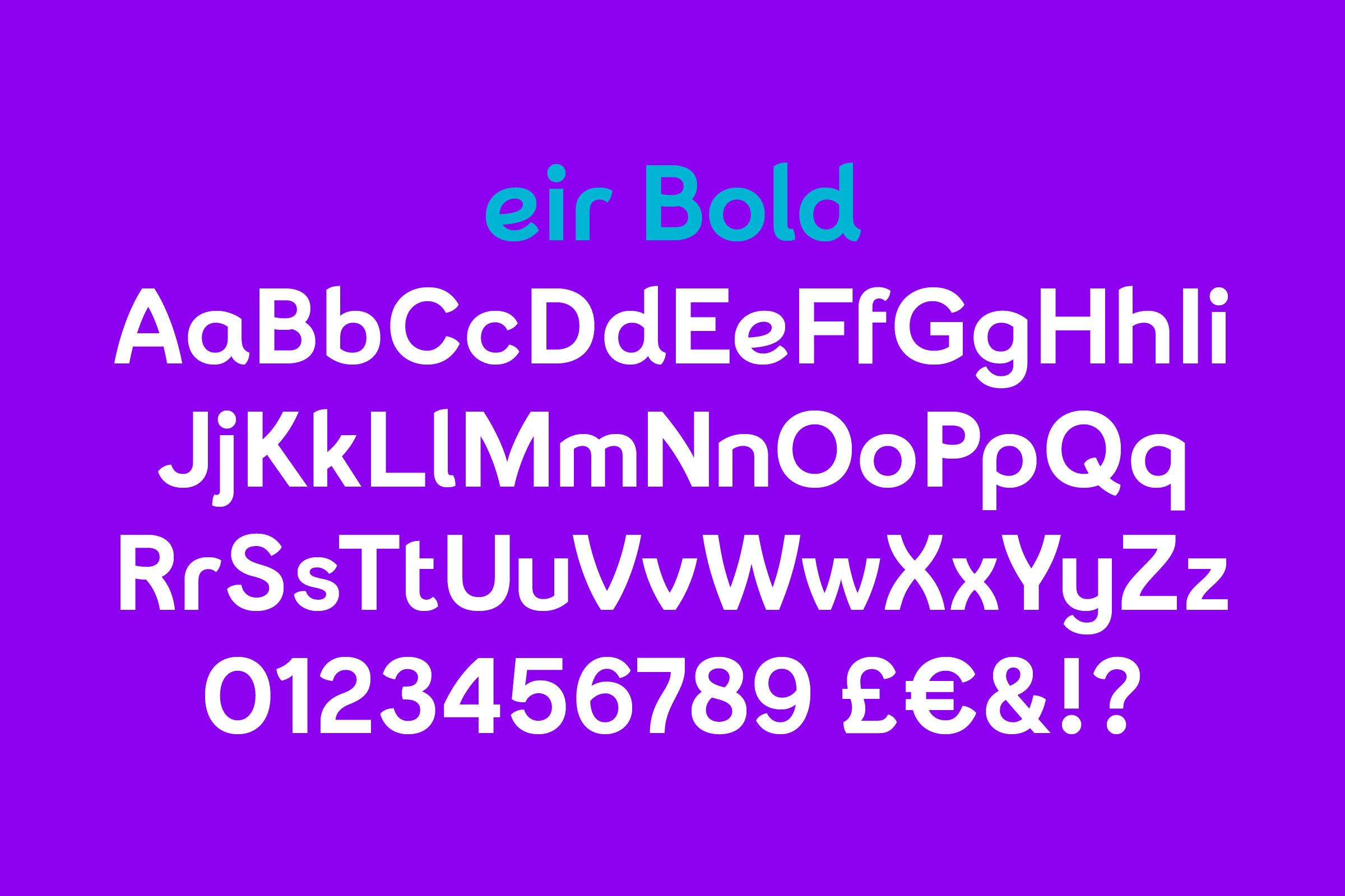
Prompted by the sinuous forms within the newly-established eir logotype, Colophon proposed the creation of a headline typeface that would split the difference — both formally and functionally — between the wordmark and accompanying geometric body copy, ultimately creating a versatile, four-weight sans serif in the spirit of eir and its Irish lineage.
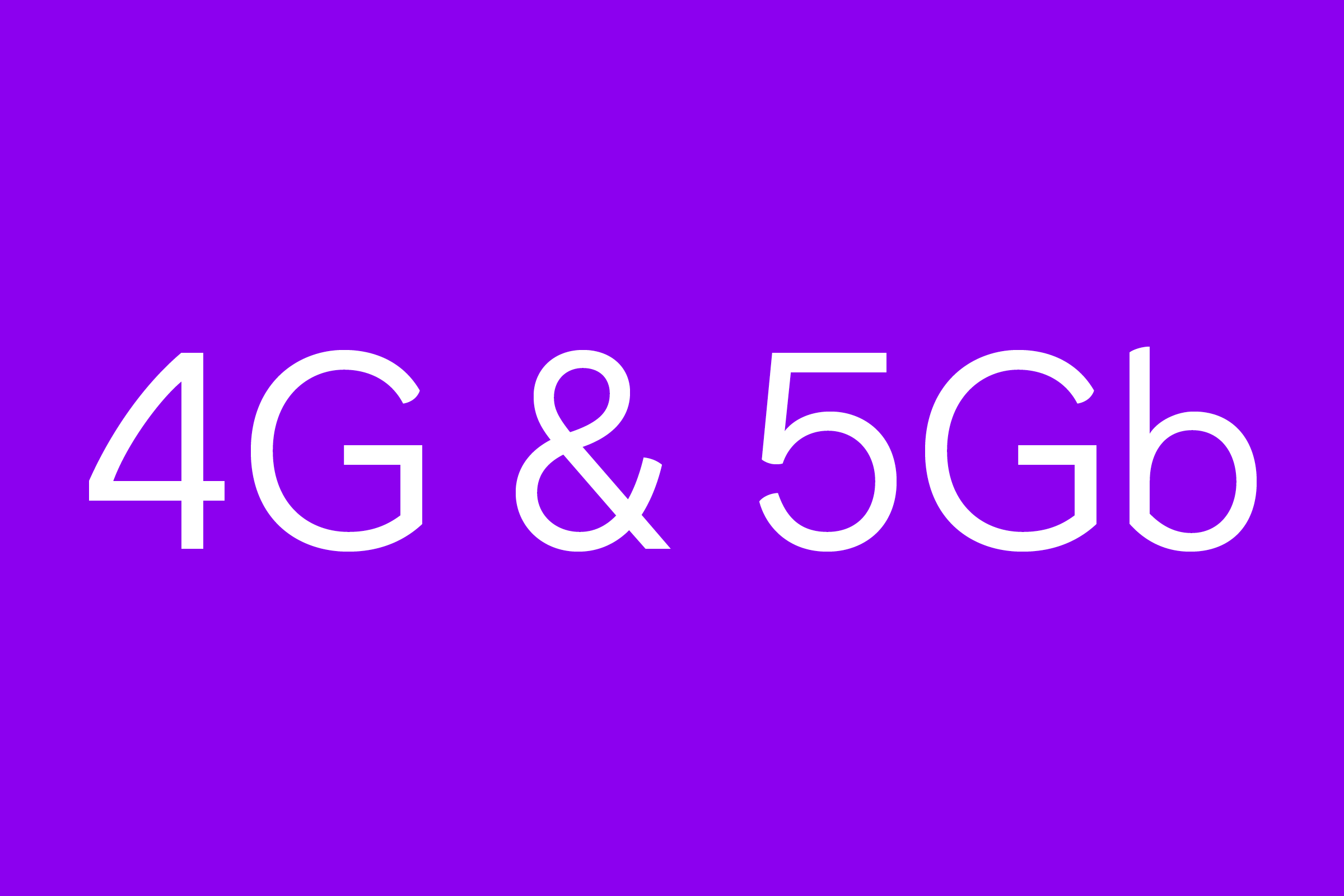
Owing to the organic, single-line construction of the eir logotype — itself a subtle send-up of Celtic linework and Gaelic letterforms — we experimented with economising the construction of certain characters, reducing the number of strokes wherever possible while maintaining legibility.

The e, in this instance, becomes a single line that doubles back on itself; the r sheds the superfluous portion of its stem in favor of restraint. Emulating a simple, gestural script, we imagined a pen or pencil constructing the letterforms in as few (and as fluid) movements as possible.
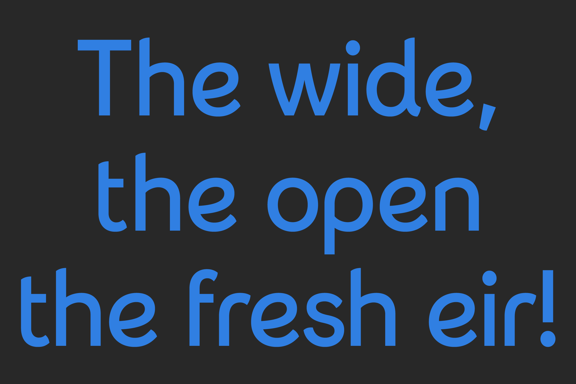
The resulting type family is one that dynamically flits back and forth between formal and casual, precise and loose, technical and organic, historical and contemporary, containing the necessary subtleties of both an expressive display face and workhorse body type.
Recent Custom Projects
View all

