
Fanta
Working closely with international creative teams at The Coca-Cola Company, London-based Studio Koto was asked to reimagine Fanta’s worldwide brand identity, and turned to Colophon Foundry to assist in crafting a trio of types that would convey the historic soft drink’s evolving identity—from humble wartime creation (1940) to re-engineered classic (1955) to the globally-recognised beverage it is today, with 90+ flavours distributed across more than 60 countries over six continents.
- Typefaces
- Fanta
- Comissioner
- Studio Koto, London
- Year
- 2017
- Styles
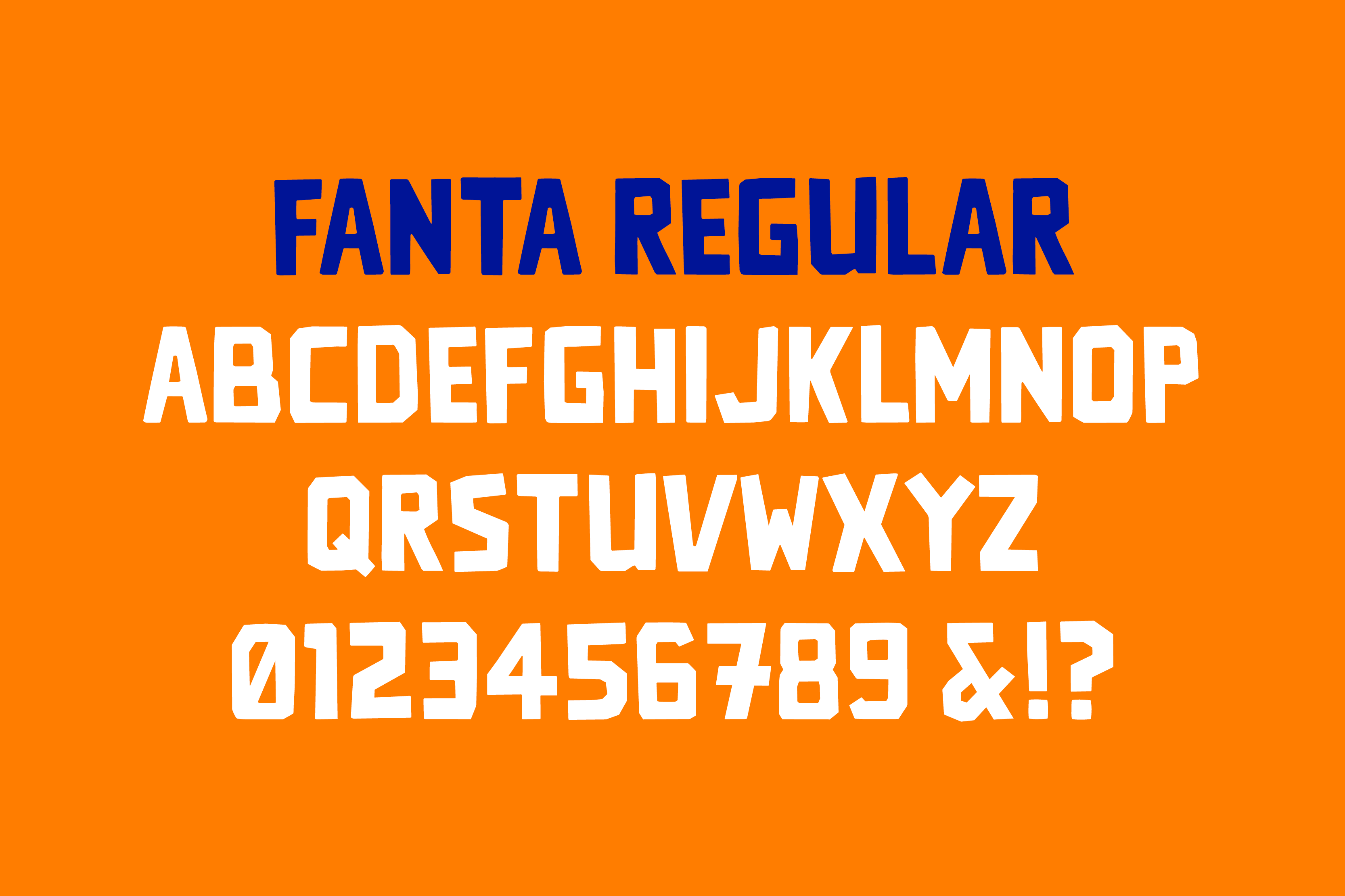
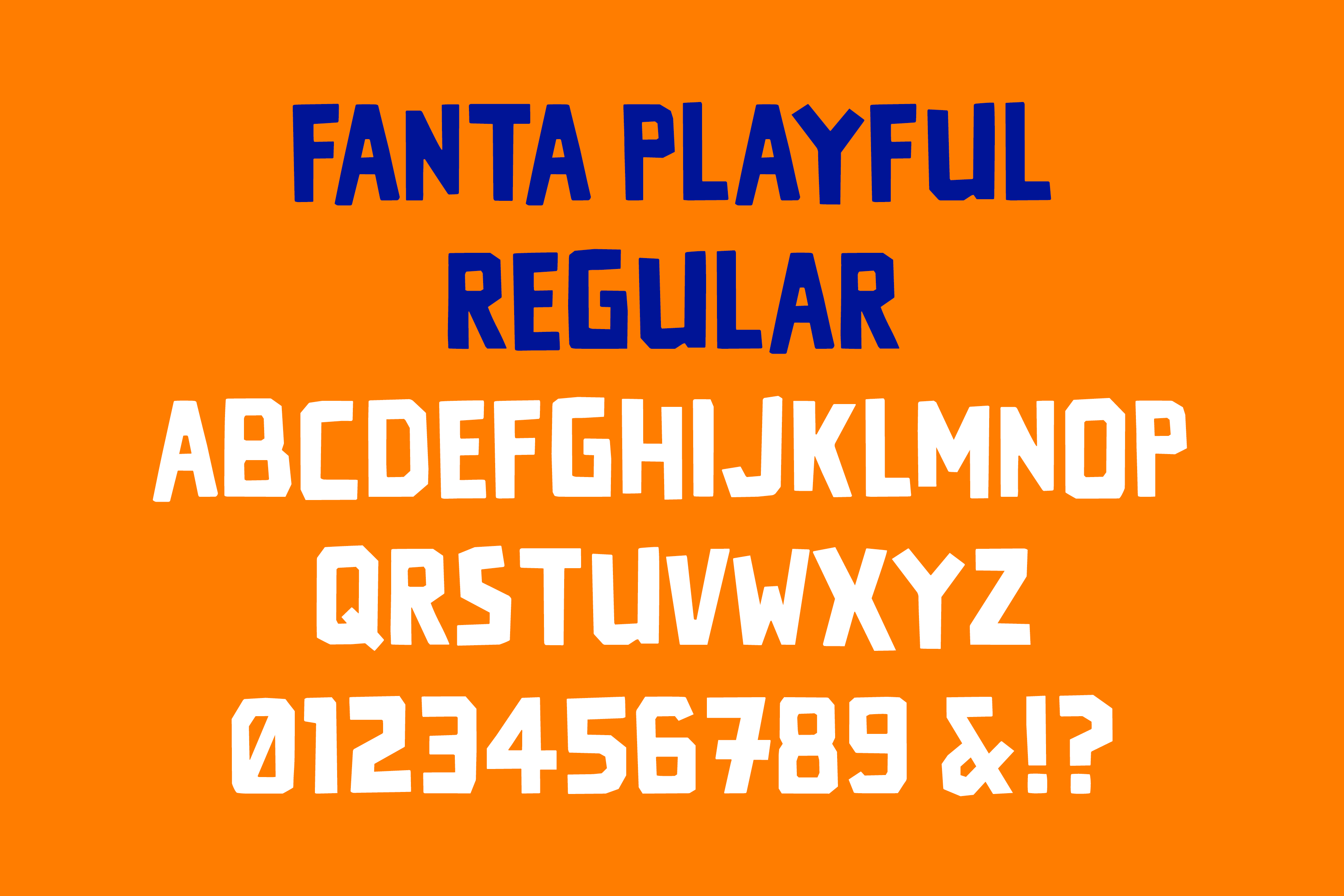
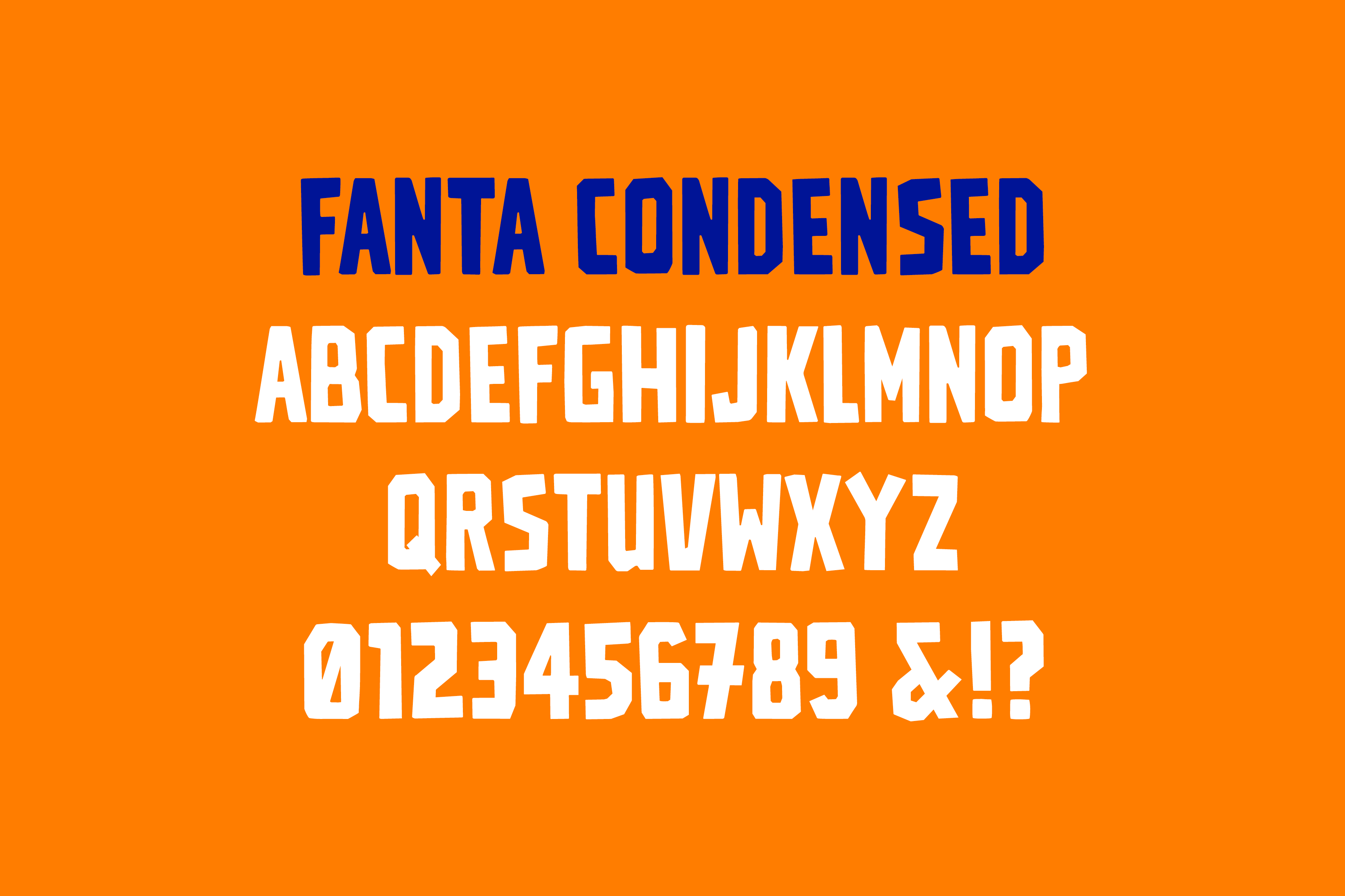
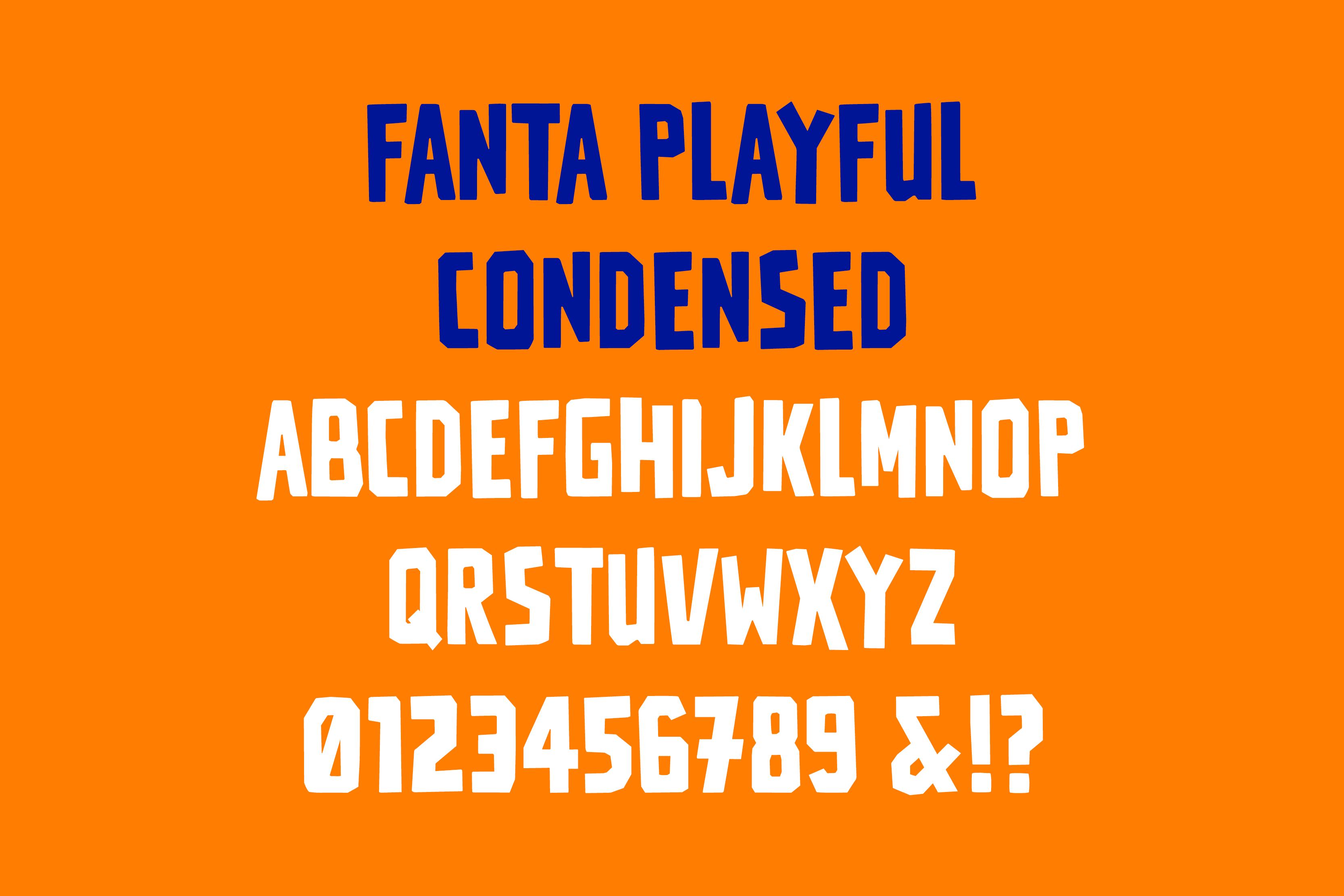
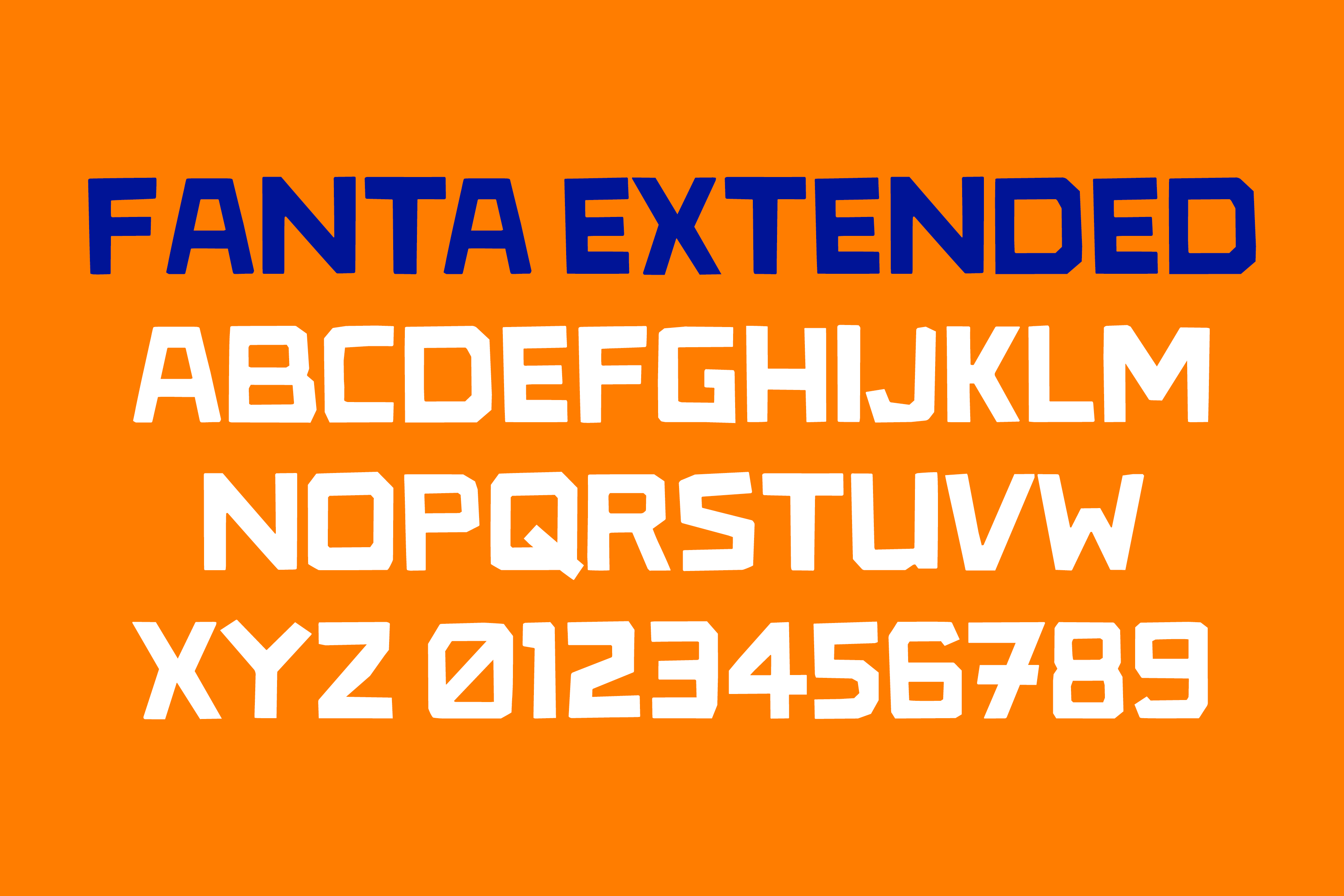
- 3 Styles: Condensed, Regular, Expanded
- Coverage
- Latin-A
- Classification
- Display Papercut
- URL
- koto.studio
- coca-cola.co.uk/brands/fanta

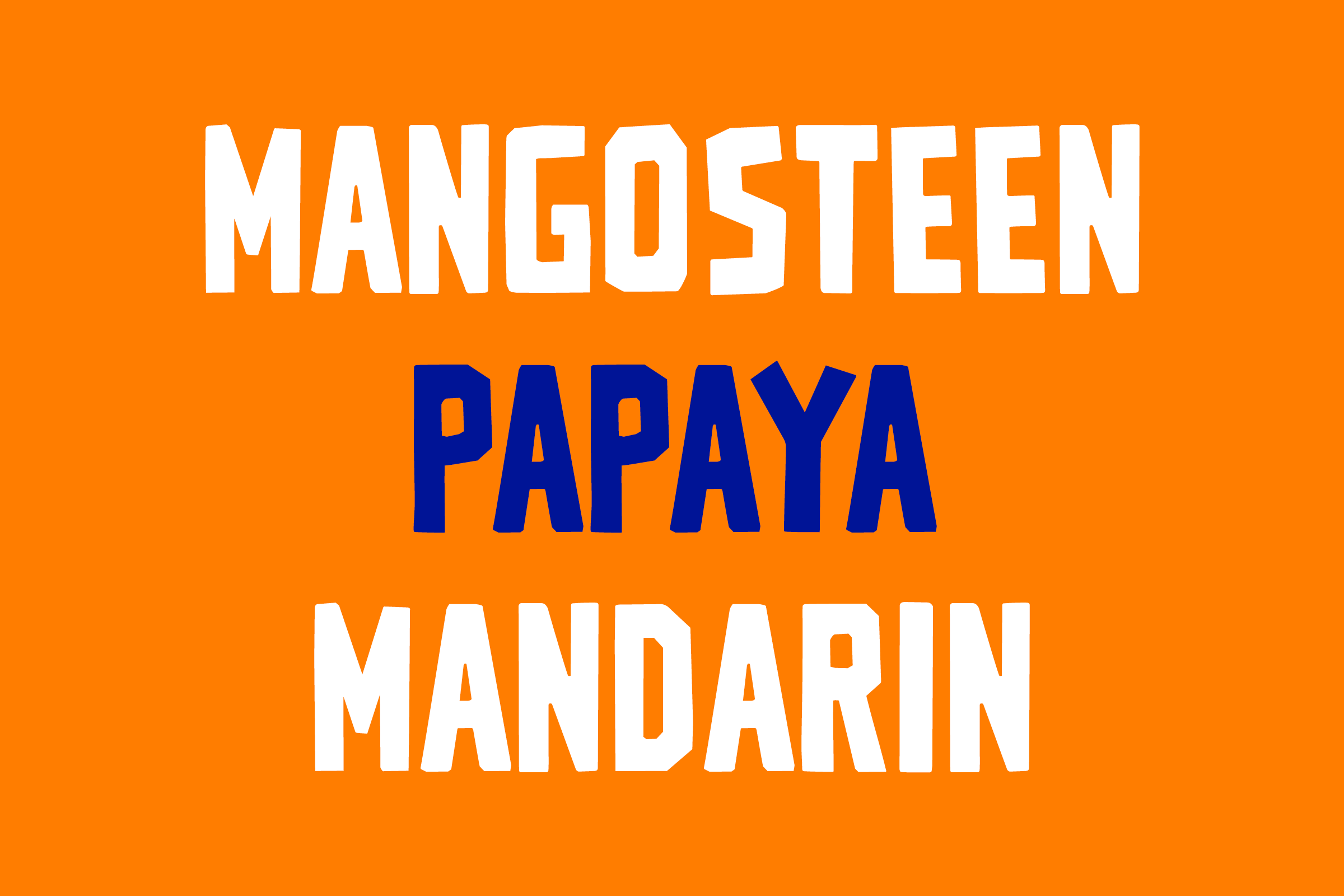
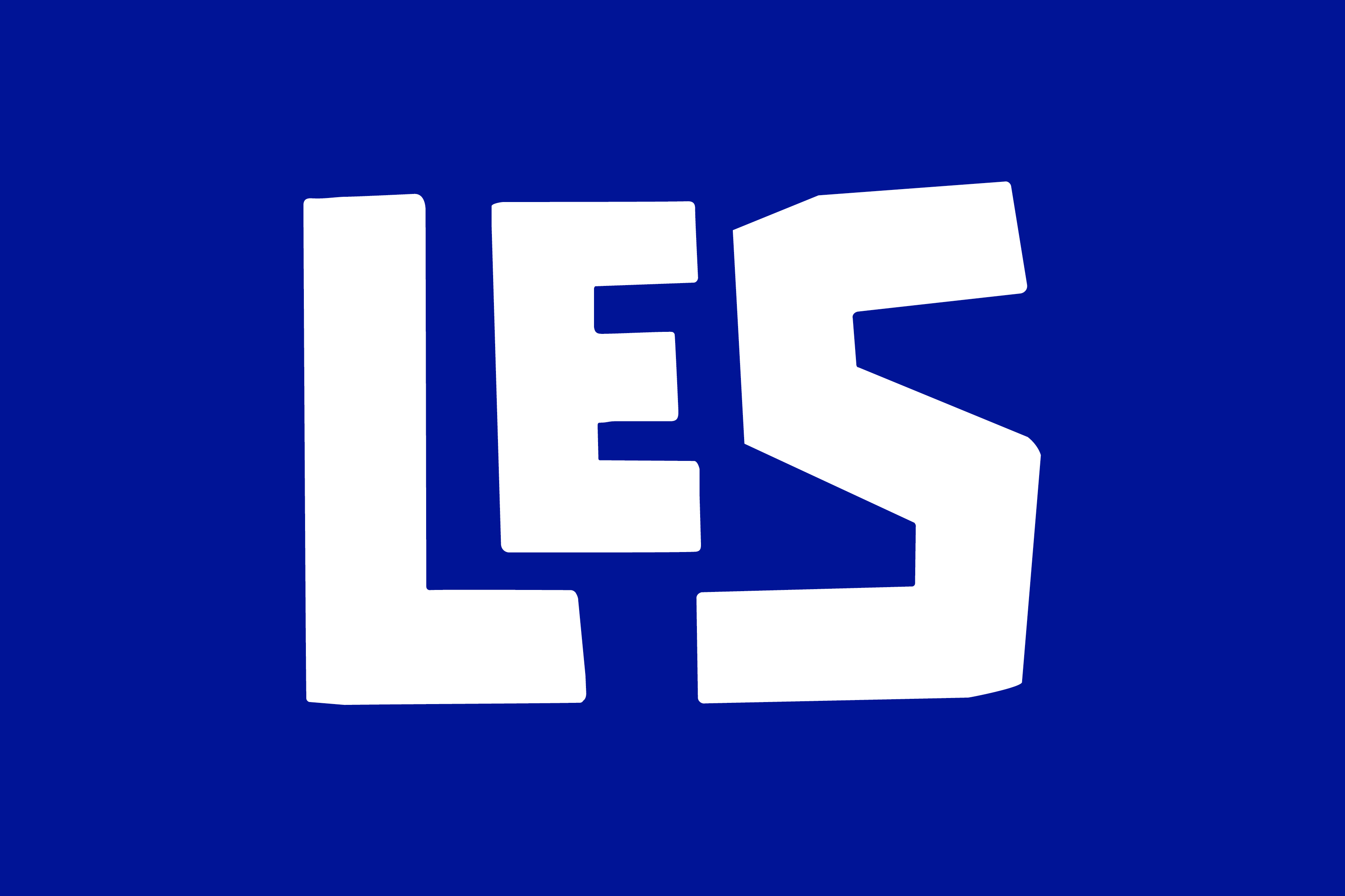
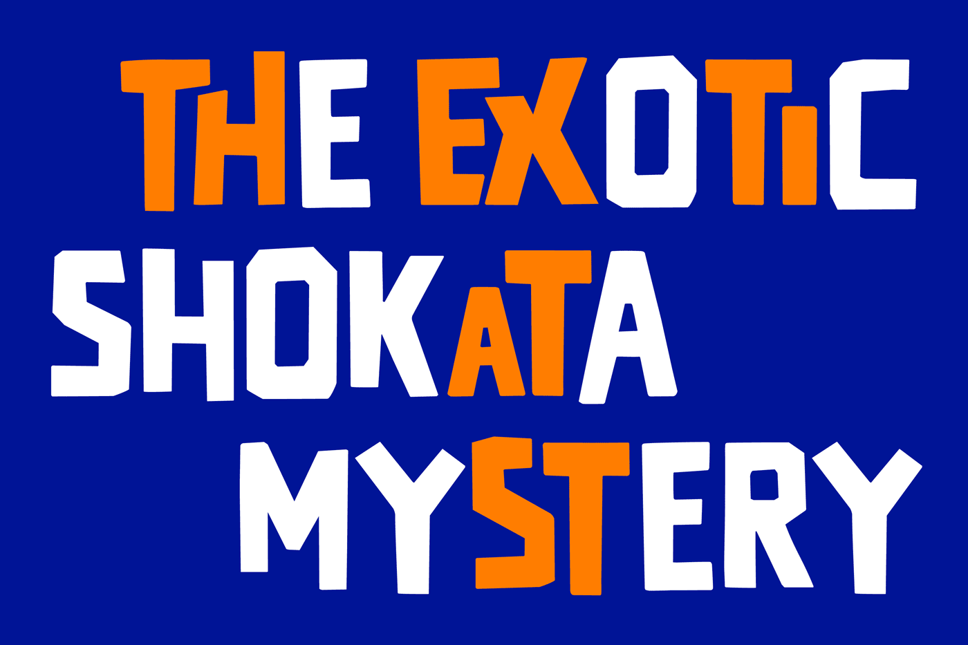
The brand refresh demanded a bold, youthful, vibrant typographic identity that spoke to notions of Craft (the hand-made) while avoiding the identifiable marks of any region-specific writing tool (pen, marker, paintbrush, etc.). To this end, a semi-literal three-‘cut’ typeface was created with collage in mind, resulting in Condensed, Regular, and Expanded sets of letterforms that subtly appear rendered from cut paper.
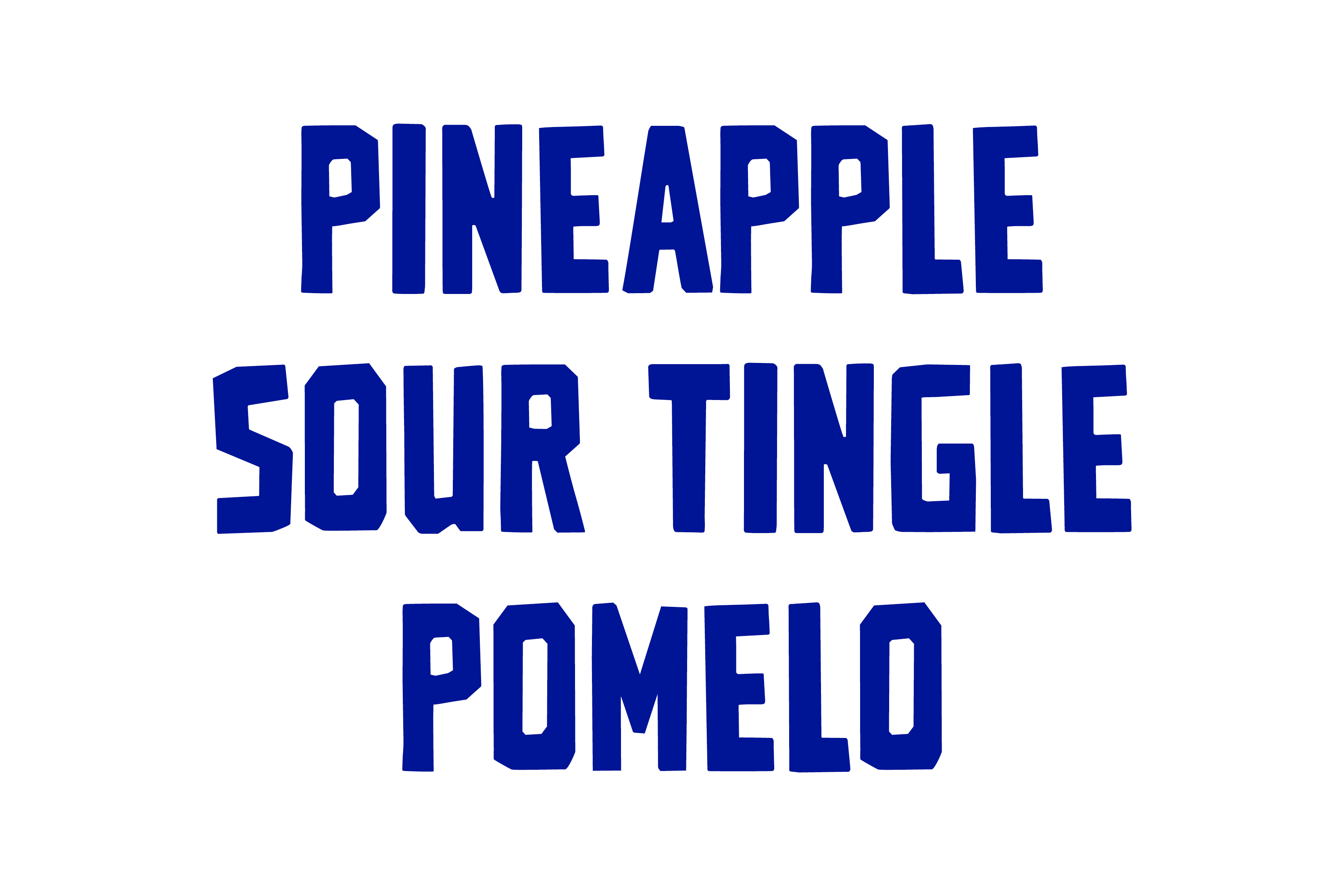

Additional features abound across these three styles, making the already-playful type into a dynamic, frequently-changing device that conjures the appearance of being trimmed and set by hand.
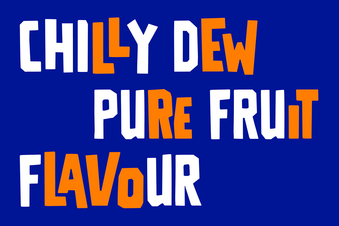
Contextual ‘ligatures’ throughout create lively moments of nesting and interlocking letter pairs; meanwhile automated stylistic alternates ensure that repeating adjecent letterforms will never appear the same way twice.
Fanta Condensed presents a lean, vertical construction perfect for smaller horizontal allotments and assertive headlines; Fanta Regular hews closest in proportion to a Roman type while still preserving a slightly compressed stature that proves perfect for everyday display usage; and Fanta Extended is the somewhat unruly, outsize sibling to its Condensed and Regular family members. Each of these ‘cuts’ can be used independently or mixed-and-matched for further rhythmic theme and variation.


When Fanta creator Max Keith initially pitched the carbonated libation to parent company Coca-Cola in 1940, he is quoted as having proudly stated that the drink’s ingredients were ‘the leftovers of the leftovers’. Indeed, this from-the-[paper] scraps mentality suited the commission perfectly, resulting in a light-hearted yet sturdy set of typographic tools that prize an expressive approach to brand refreshment.
Recent Custom Projects
View all

