)
Mandai
The Mandai Wildlife Group is a wildlife and conservation organization that manages the majority of zoos in Singapore including the Singapore Zoo, the Night Safari, the Jurong Bird Park and the (recently renamed) River Wonders. Long renowned for its serenity, beauty and dedication to protecting animals and the natural environment, The Mandai Wildlife Group required a refreshed identity that united the groups various locations and outputs, reflected Singapore’s wildlife heritage, and cemented their position as a global champion for biodiversity.
- Typefaces
- Mandai Value Serif
- Comissioner
- Anak, Mandai
- Year
- 2020
- Styles
- 2 Styles: Regular, Bold
- Coverage
- Colophon-STD
- Classification
- Serif
- URL
- mandai.com
- withanak.com
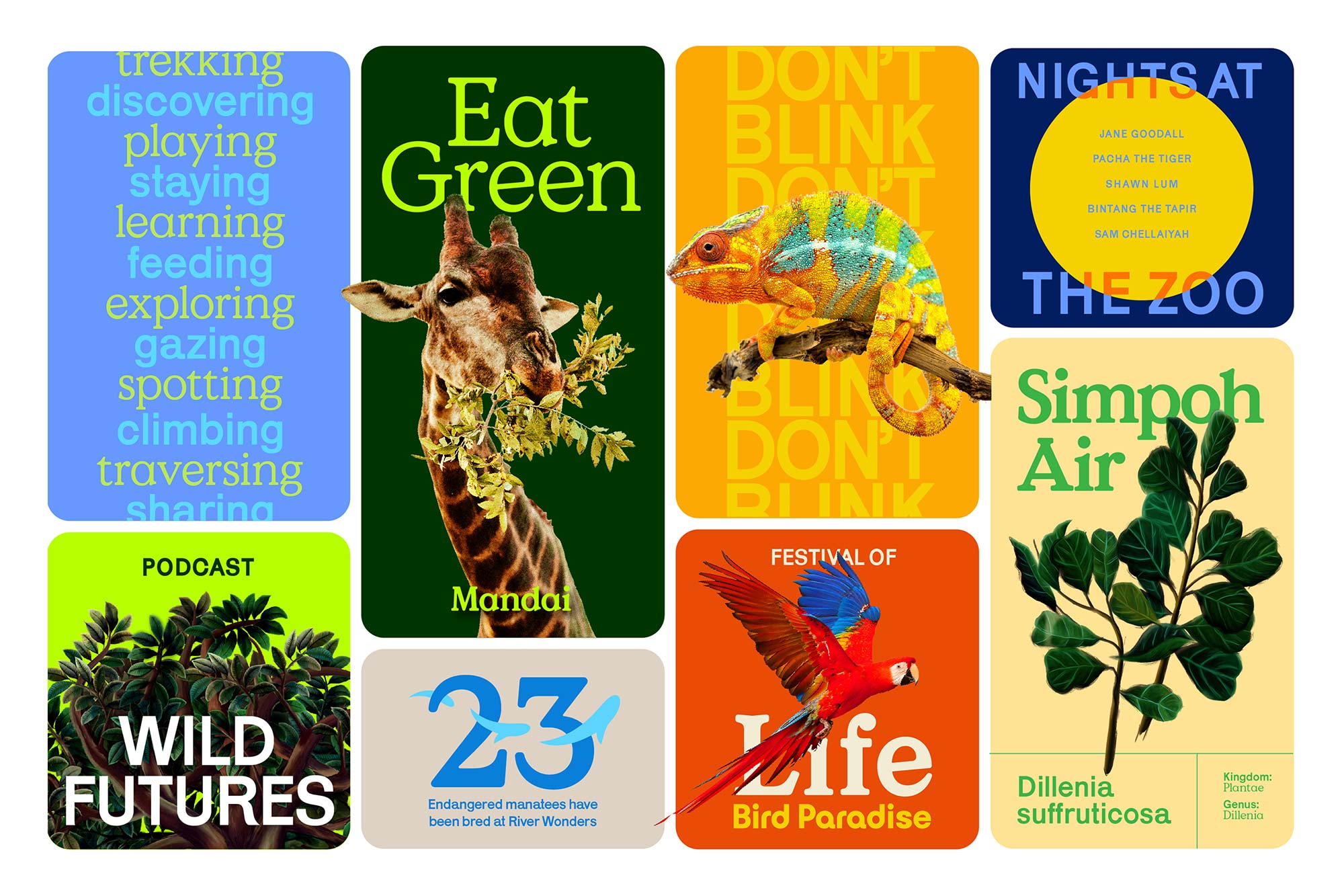
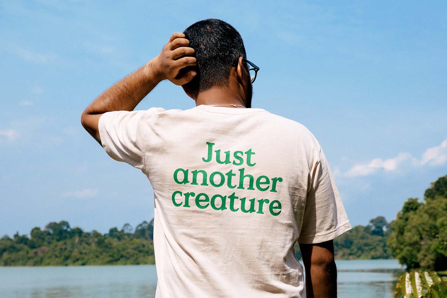
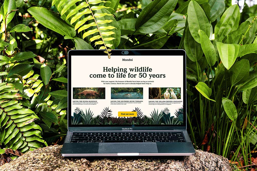
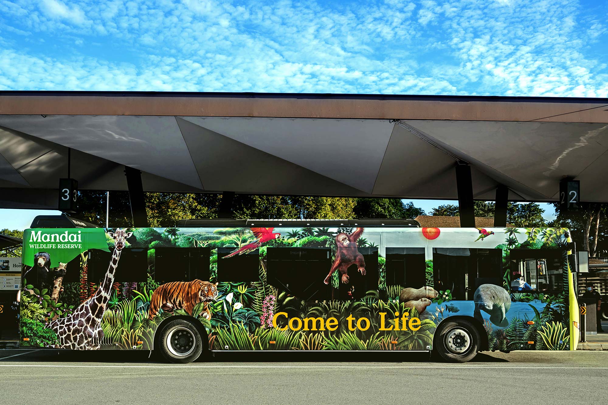
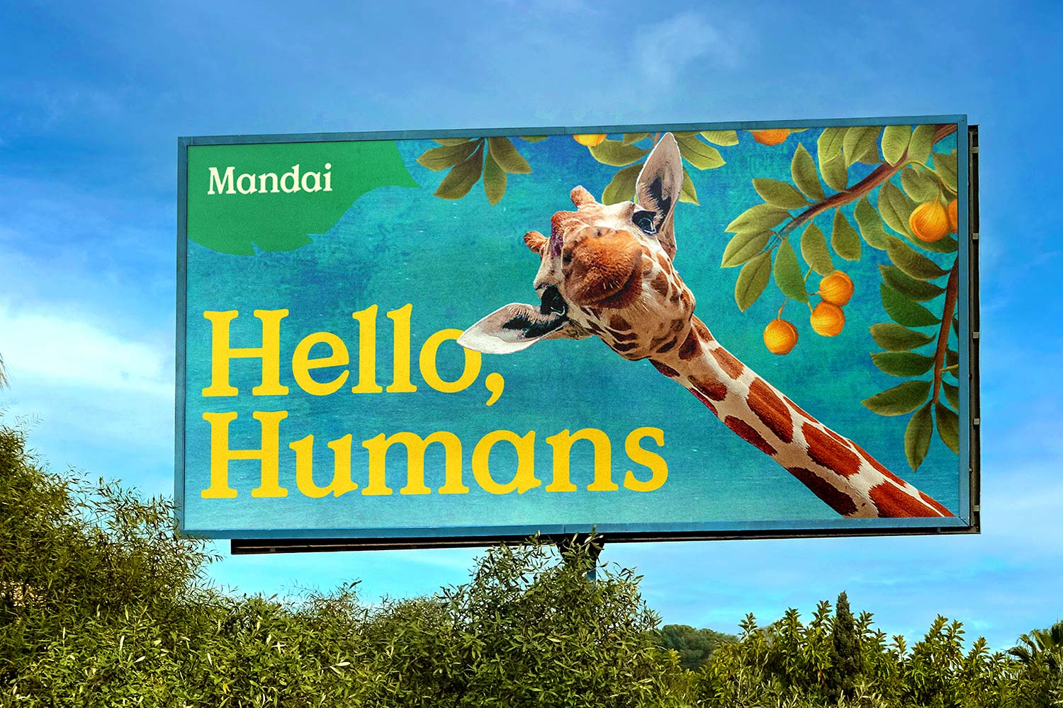
Working with Anak, the guiding principle of the brand refresh was the equality of wildlife, humans and nature. Capitalizing on Mandai’s pioneering role in the cageless Zoo concept, this core ethos is articulated through an updated brand imagery that plays with perspective: viewers are encouraged to enter into the visual landscape through foliage, or distracted by the image of a bird flying across the screen while the text “Life” sits in the background.
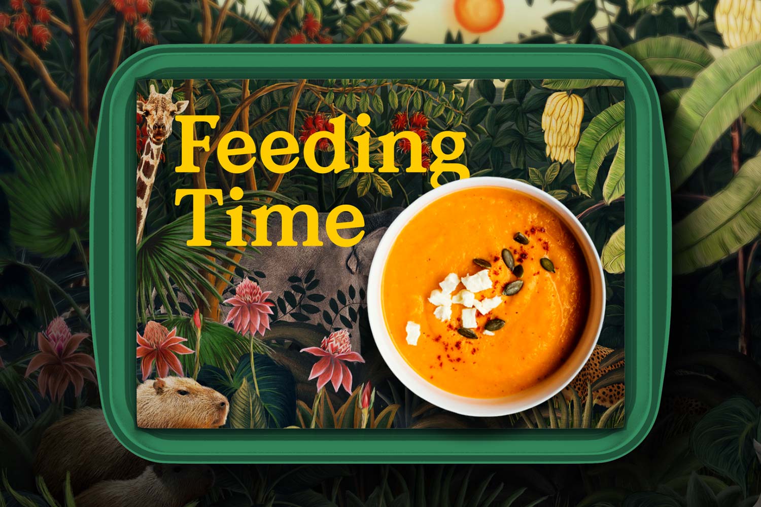
Supported by an all-encompassing tagline — “come to life” — the identity is defined by a sense of joyfulness and accessibility. Colophon worked closely with Anak to develop a modified variant of the library typeface Value Serif for Mandai. Using Value Serif as a base, Colophon was able to create a timeless and uplifting style with a focus on warmth and openness. Reducing the contrast and increasing the weight of the base typeface created a softer variant that speaks to the natural imagery used throughout Anak’s branding.


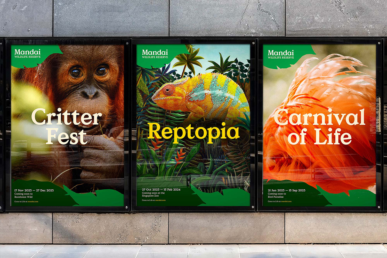
Mandai Value Serif has a dual role of providing clear messaging across a variety of platforms as well as articulating a natural warmth. Mandai opted for a serif design not only for the increased legibility but also for the pertinent visual idea of rootedness. Following this logic, typically straight serifs are updated with soft kinks to bring additional character and dynamism.
Roll-out for the rebrand began in October 2021 and was fully completed by the end of 2022.
Recent Custom Projects
View all

