
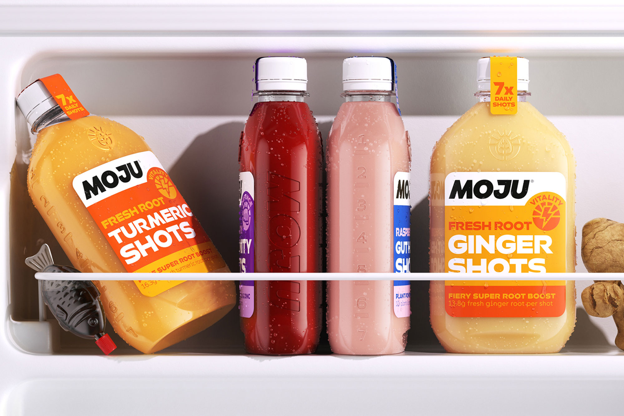
MOJU
Working with Earthling Studio, Colophon designed a custom typeface for the UK’s leading functional shot brand, MOJU. Inspired by the new Earthling-designed MOJU logo, a leading Bold and complementary Medium and Light weights create a type system that packs a punch.
- Typeface
- MOJU
- Comissioner
- Earthling Studio
- Year
- 2023
- Styles
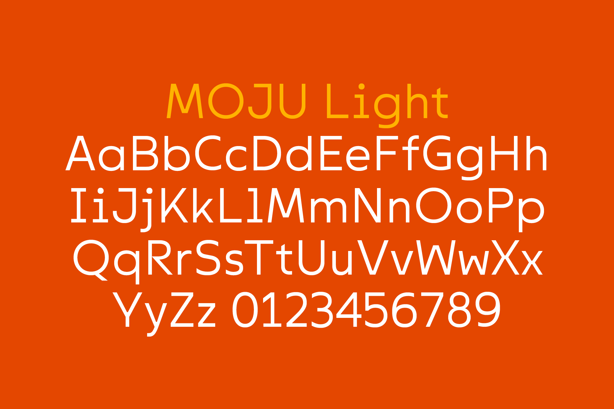
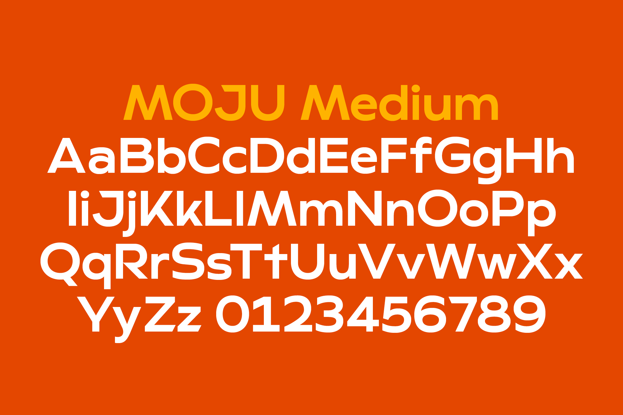
- 3 Weights — Light, Medium, Bold
- Coverage
- Adobe Latin 2
- Classification
- Sans Serif Display
- URL
- mojudrinks.com
- studioearthling.com
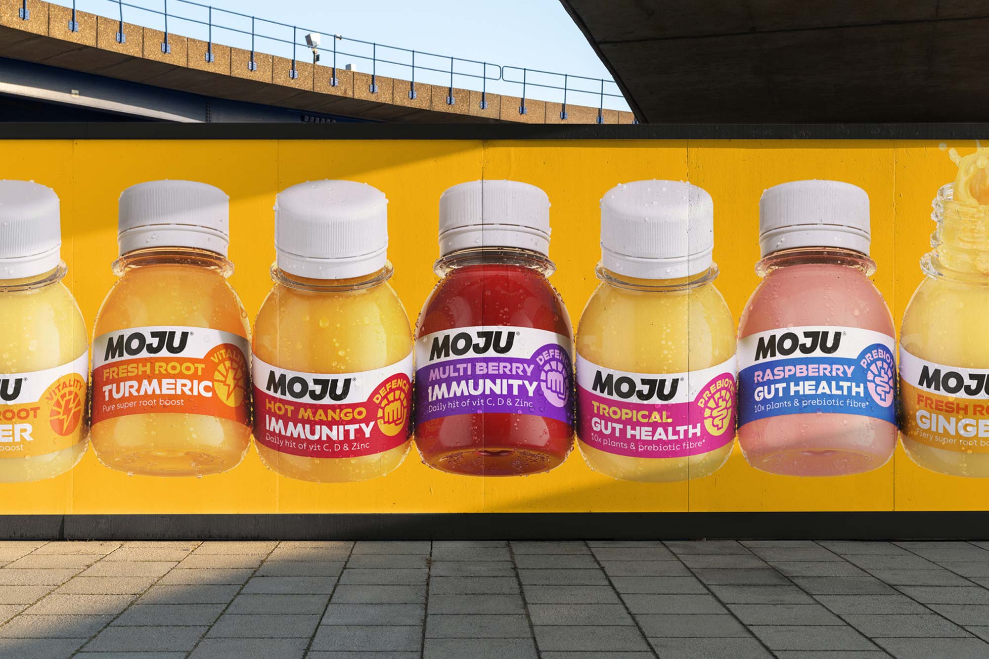
Building on MOJU's high-energy brand ethos, the overall design concept is to evoke the vitality of MOJU's product range through typography. The top stroke of the “J” in the MOJU logomark was the starting point for the Bold weight, with similar angled cuts featuring throughout the typeface in forms such as the “Q” “t” and “Z”.


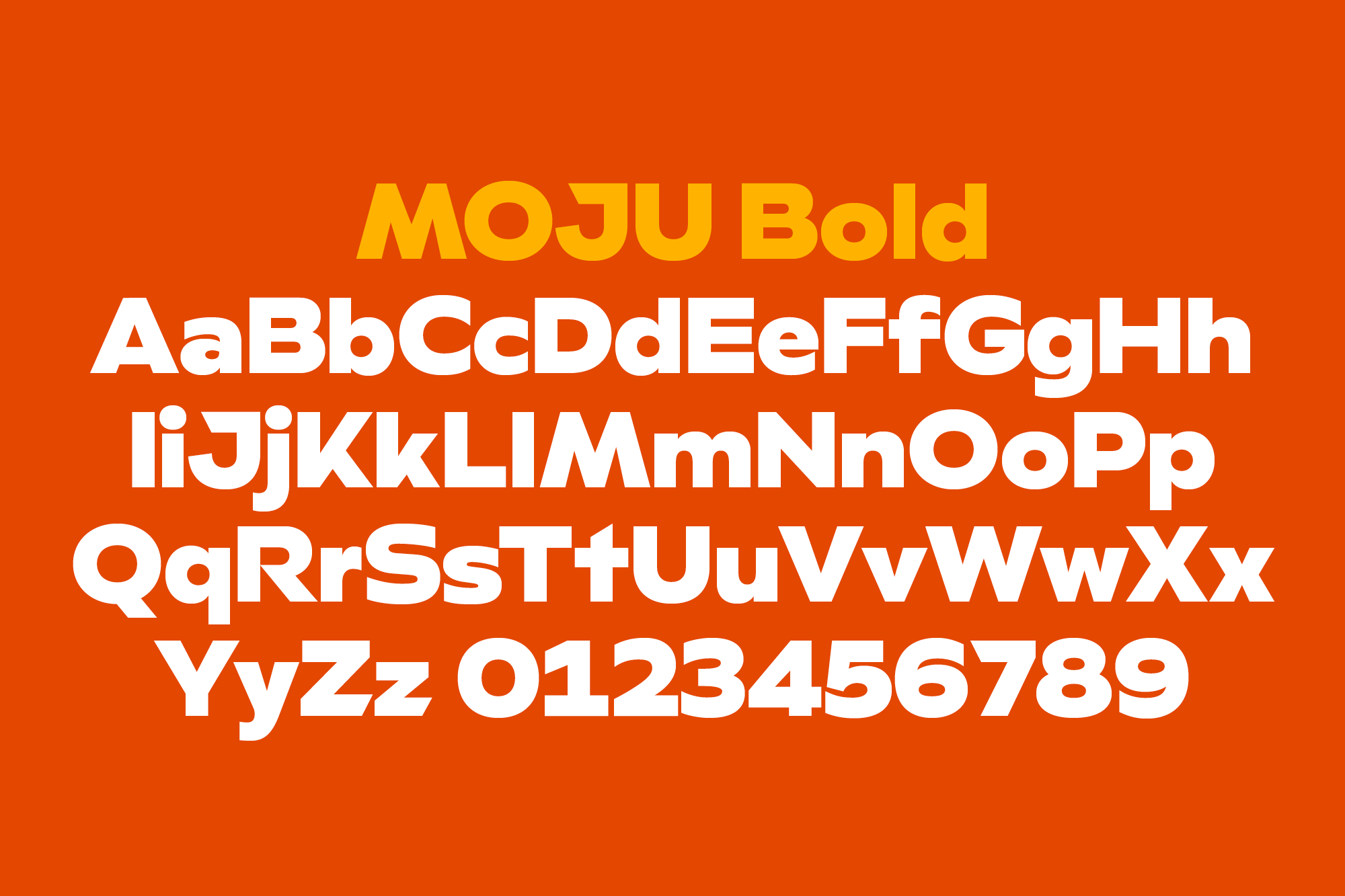
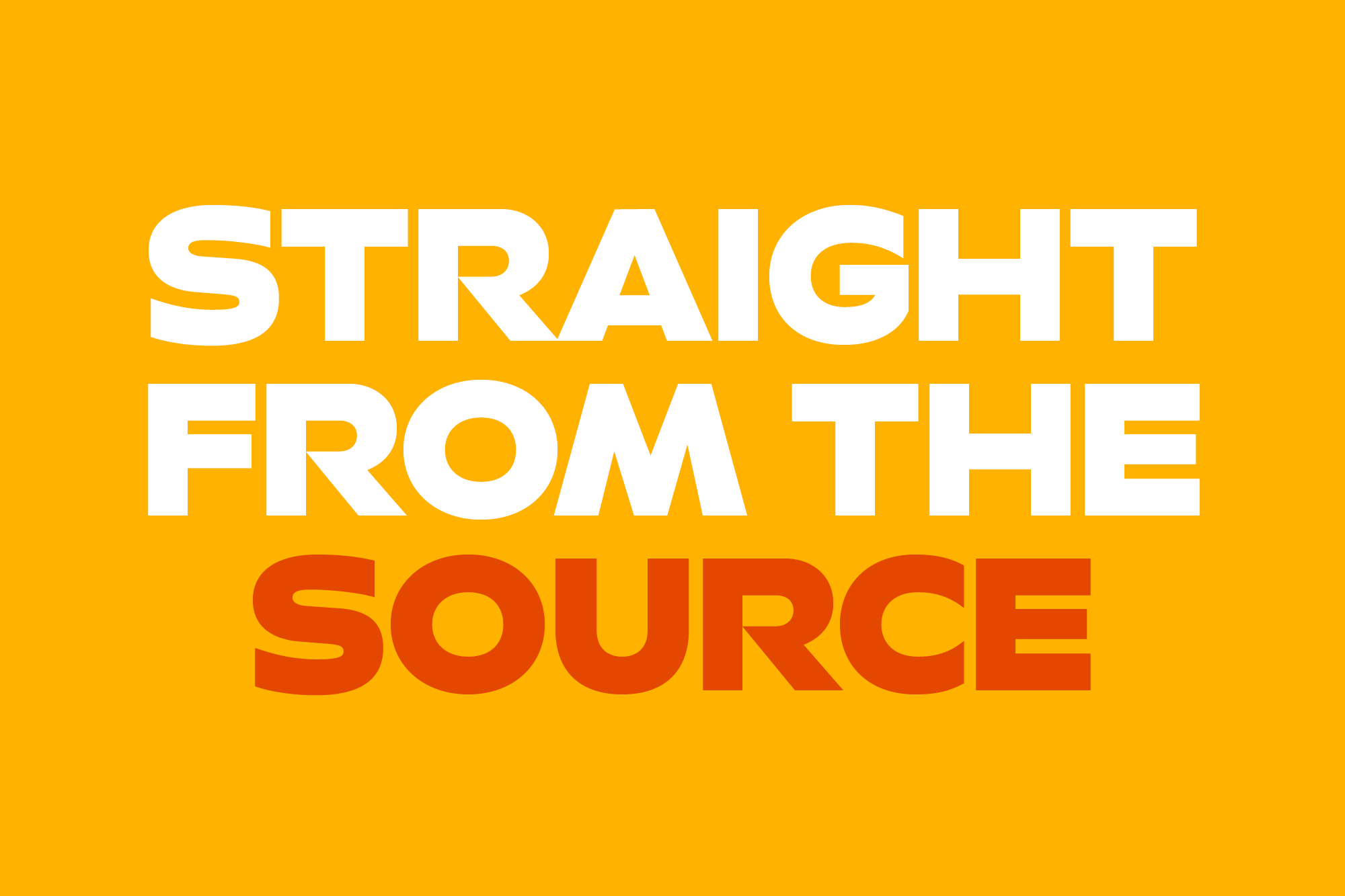
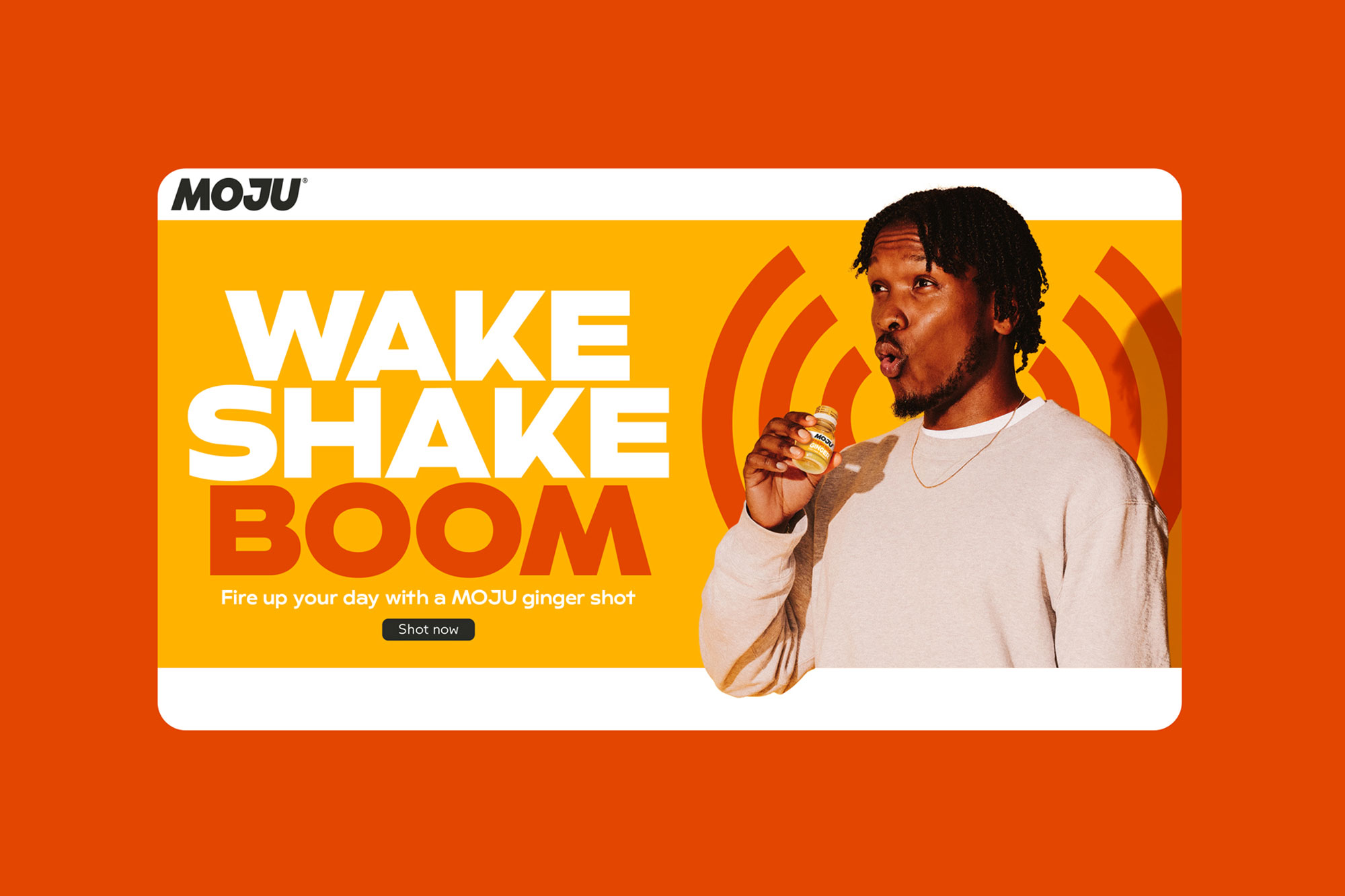
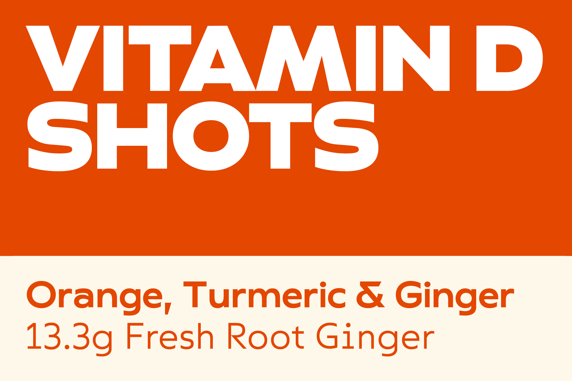
The Bold’s extended width adds an extra level of impact to already rousing headlines (MOJU's first out of home campaign featured the tagline “Wake. Shake. Boom”). Despite this, the nature of their most popular product range — vitality shots measuring only a few centimetres in size — meant the type had to be legible and carry the same impact at below 16 point size as on billboards. As such, the vertical terminals carry the dual purpose of producing impactful headlines while also allowing for more compact type setting in these smaller point sizes.
A complementary Medium style follows the same design principles as the bold for use in subheadings. The Light weight follows a similar system, with additional inspiration from prescription bottle labels leading to a monospaced feeling that articulates the medicinal properties of the brand offering.
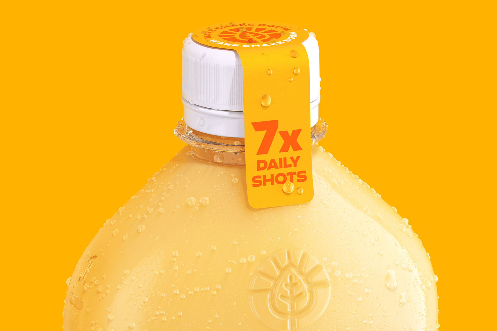
The refresh was rolled out in May 2023, accompanied by a new product range, the MOJU dosing bottles, and a newly distilled product messaging that centres around three brand pillars: Vitality, Immunity and Gut Health.
With thanks to Earthling Studio for the images.
Recent Custom Projects
View all

