
New England Revolution
Founded in 1996 as one of Major League Soccer’s original clubs, the Greater Boston team New England Revolution worked with creative agency JKR New York on a rebrand that would draw heavily on the club’s heritage and revolutionary roots.
- Typeface
- Revolution
- Comissioner
- JKR, New York
- Year
- 2021
- Styles
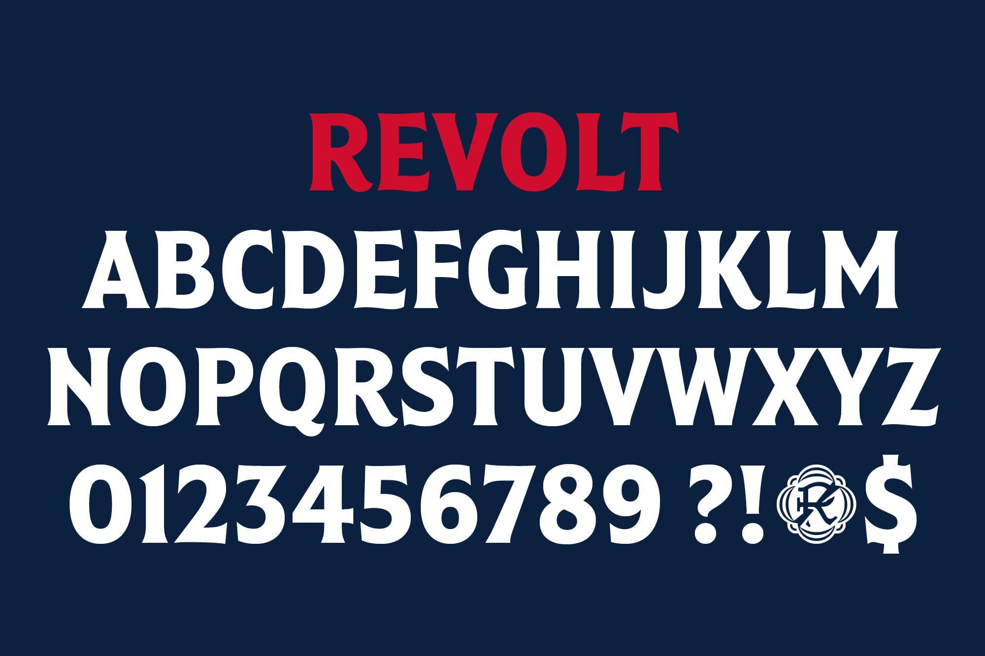
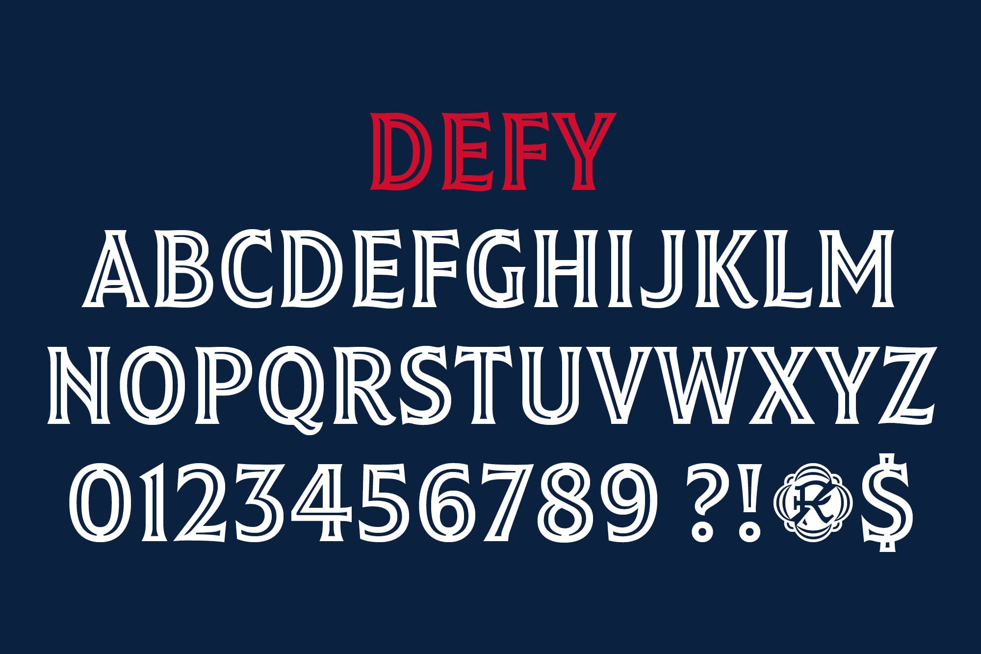
- 2 Styles — Revolt, Defy
- Coverage
- Adobe Latin-A Extended
- Classification
- Display
- URL
- jkrglobal.com
- revolutionsoccer.net

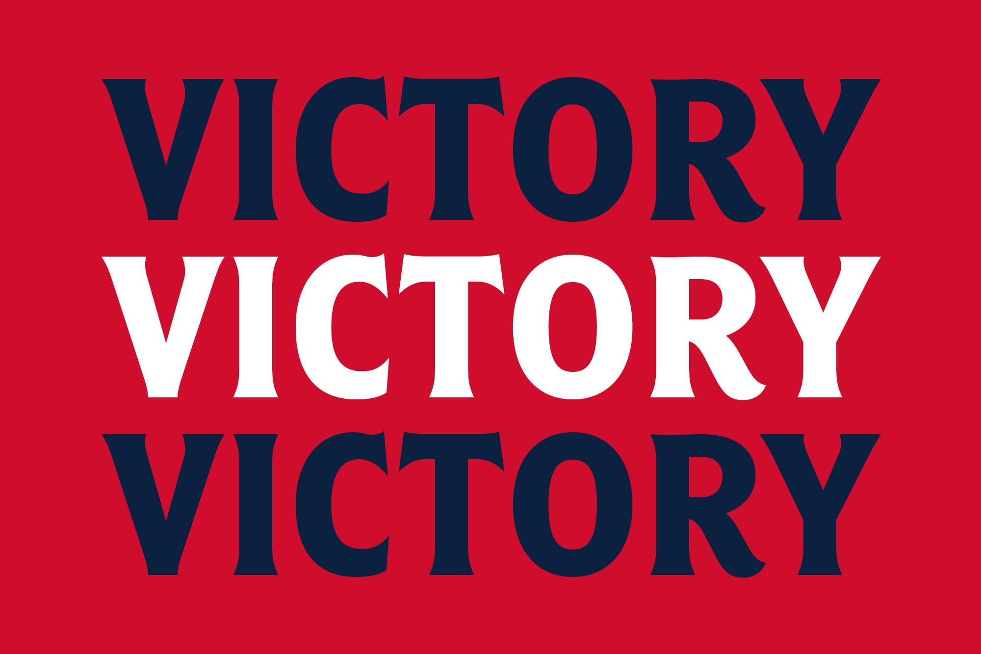
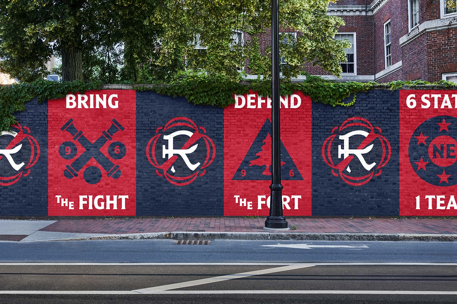
Working with JKR, Colophon developed a two-type system of display styles for New England Revolution — a solid type, “Revolut”, and an inline type, “Defy”. Both styles are based on heritage designs, featuring flared serifs, low contrast and calligraphic influences amplified by incised movements in the bottom left corners of forms. The styles are designed to work together to create a diverse visual system that can be overlaid, interchanged, interconnected and used in combination to create multi-coloured designs.
With a new rally cry of “Bring the Fight” launched as part of the rebrand, the graphic identity drew heavily on the area's link to the American Revolution. Fluidity within character forms is reminiscent of the wave of the revolutionary flag, bringing a natural rhythm into forms such as the “B” and the “D”. This feature occurs not only in more expected characters like the “R” but also in uncommon forms such as a fluid curve in the “H” that introduces a sense of movement.
The inline form, “Defy”, references both classical inline shapes and stencil forms, with the notched interiors breaking at their meeting points. For example, inline shapes in the “O” break at the centre line that would traditionally be a high contract point, adding detail and precision to an otherwise simple form.

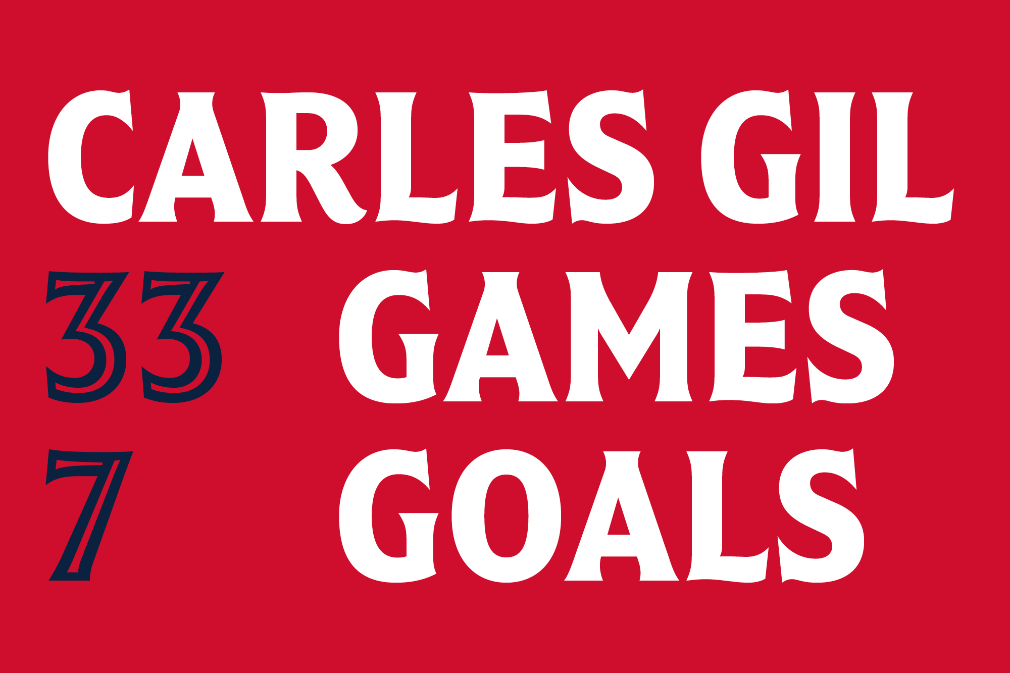
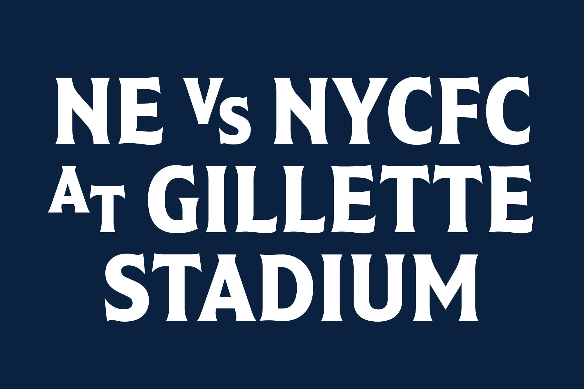
Designed for headline use with a redacted character set, a series of lock ups were created for specific use cases; “THE”, “VS”, “[1]ST” and “[3]RD” etc.

The rebrand offered a unique opportunity to modernise New England Revolution while also honouring the area and club’s rich history. “We are excited to officially share our new identity with the world. We made sure to engage our fans in this process, and what was abundantly clear was that they wanted a more progressive identity and expression, while still keeping the name Revolution and everything that goes along with that conceptually,” said Cathal Conlon, Vice President of Marketing & Community Engagement at New England Revolution. “The name of the club is central to the spirit of the region, fans, and players, and therefore it has inspired every step of the journey.”
With thanks to JKR for the images.
Recent Custom Projects
View all

