Pret
Titans of the workday lunch scene, Pret A Manger has grown exponentially since establishing its first location in London in 1983, with over 12,000 employees and 450 locations in the UK and internationally. Working with JKR London, a challenging two years of pandemic inspired a shift in the brand's focus. The 2022 rebrand coincided with an expansion into new markets and a new tagline, “Pret makes every day”, referencing both their freshly made ingredients and their loyal customer base.
- Typeface
- Star Serif
- Comissioner
- JKR, London
- Year
- 2022
- Styles
- 2 Styles — Headline, Subhead
- Coverage
- Adobe Latin-A Extended
- Classification
- Display Serif
- URL
- jkrglobal.com
- pret.co.uk

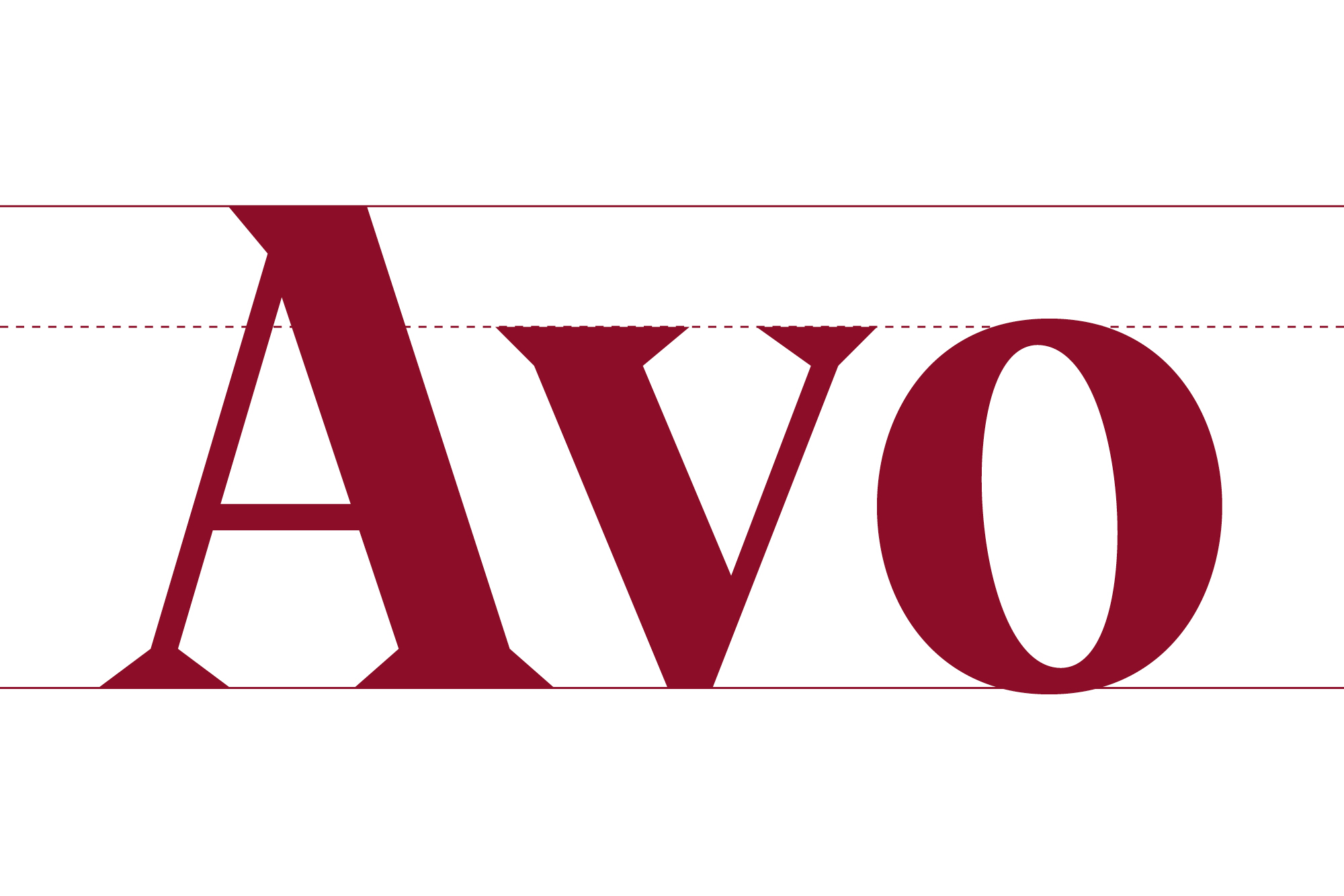
As the name suggests, Star Serif uses the design of the Pret Star as its guiding principle, with the star’s geometry running throughout the entire design. Aiming to articulate a more “accessible, uplifting and welcoming” branding through refresh, the tapered serifs and accent marks bring an open, friendly and confident aesthetic, with unique and dynamic forms building on Pret’s already recognisable brand equity.


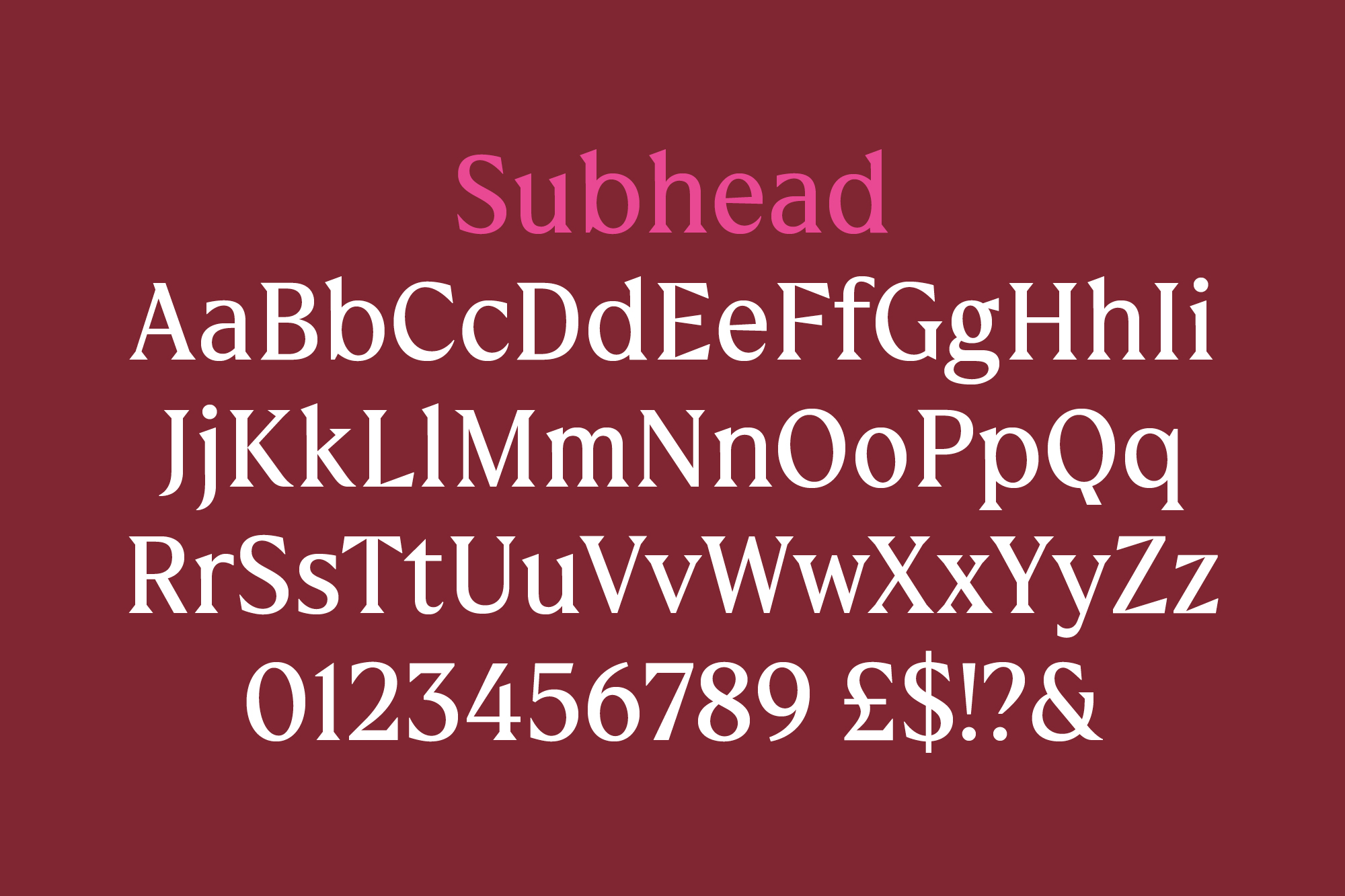
Star Serif was developed in two styles: Headline, for use at large sizes, and Subhead, for smaller use cases. The more distinct of the two, Star Serif Headline uses star-inspired forms in the crossbar of the “f” and “t” and contains additional stylistic sets with star-shaped tittles and punctuation to increase brand expression. The larger use cases allow for more subtle quirks, with a slight curvature in the serif forms bringing delicacy and detail into the Headline design.
The corresponding Subhead design uses the Headline as a base with more refined features to increase legibility. The lower contrast and overall less weighty design contains geometric, angular lines as opposed to the tapered curves of the Headline, increasing its performance at smaller point sizes. Individual letterforms, such as the characterful “t” and “f” of the Headline style, are equally muted for a focus on functionality over expression.



Jane Walker, Pret A Manger’s global brand and communications director, concluded: “Our new brand identity…is freshly-made for the digital age, while also being deeply rooted in Pret’s legacy…Our business has gone through huge changes over the past two years, and we recognised the need to bake our new identity into every asset, interaction and touchpoint.”
)
)


