)
TCHO
Established in 2007 by an eclectic mix of ex-NASA employees and WIRED Magazine founders along with chocolatiers Karl Bittong and Brad Kintzer (who still co-runs the company today), California-based and produced TCHO chocolate has a mission to “reimagine the word of chocolate from the ground up”.
- Typeface
- TCHO
- Comissioner
- TCHO, SuperOkay
- Year
- 2020
- Styles
- 2 Styles — Milk, Dark
- Coverage
- Colophon Redacted set
- Classification
- Display
- URL
- tcho.com
- superokay.co
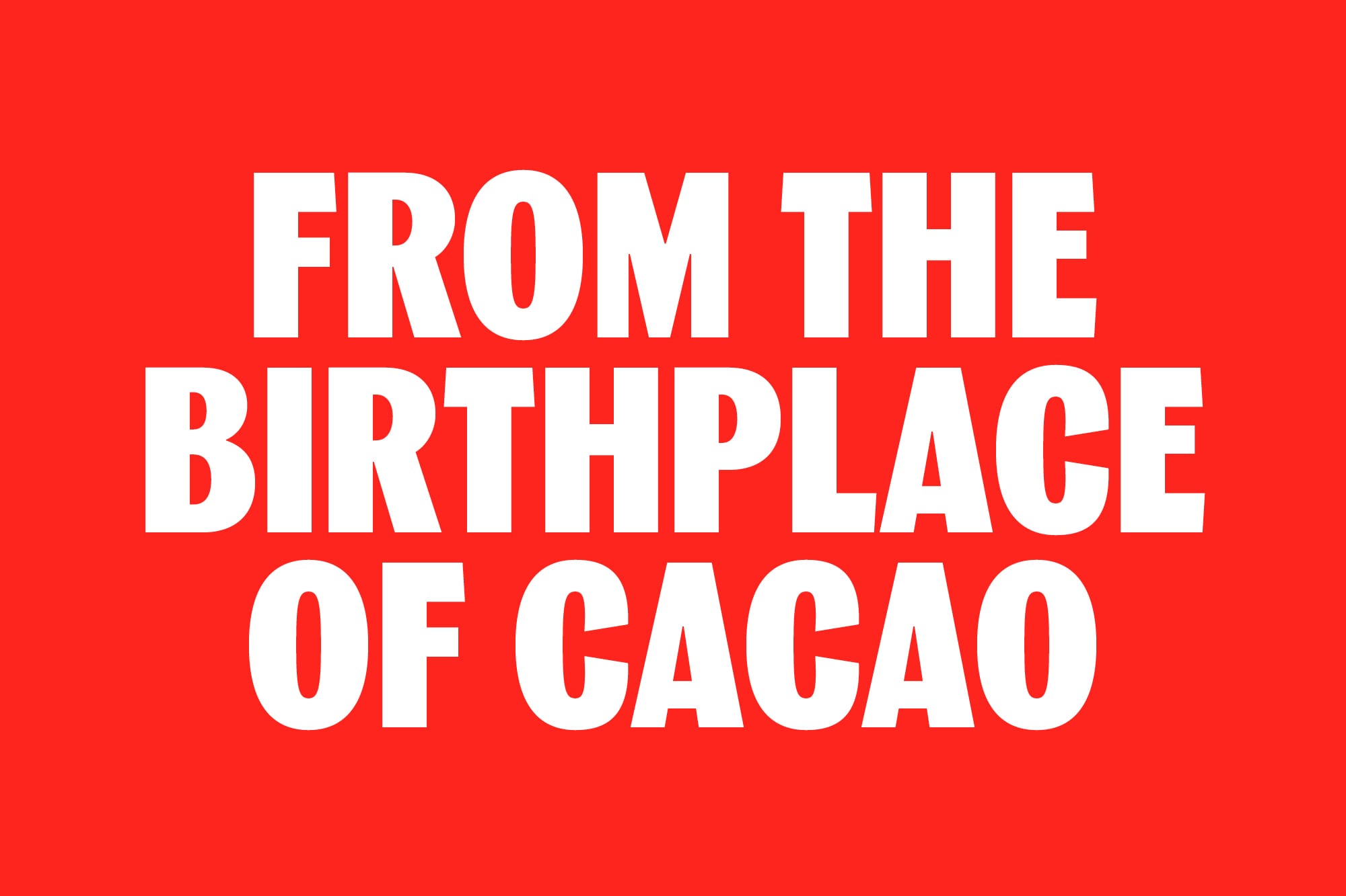
By bringing tools directly to farmers and enhancing flavour through new technologies, their programme TCHO Source partners with suppliers and research institutions to advance the chocolate making process through the dual paths of improving working conditions and developing infrastructure and research into the production of cacao.
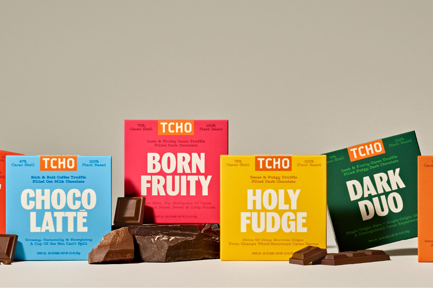
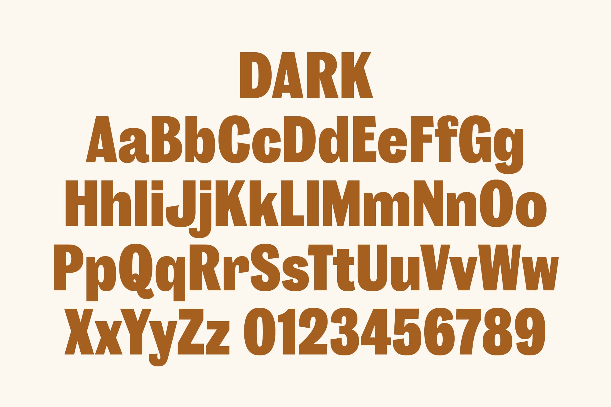
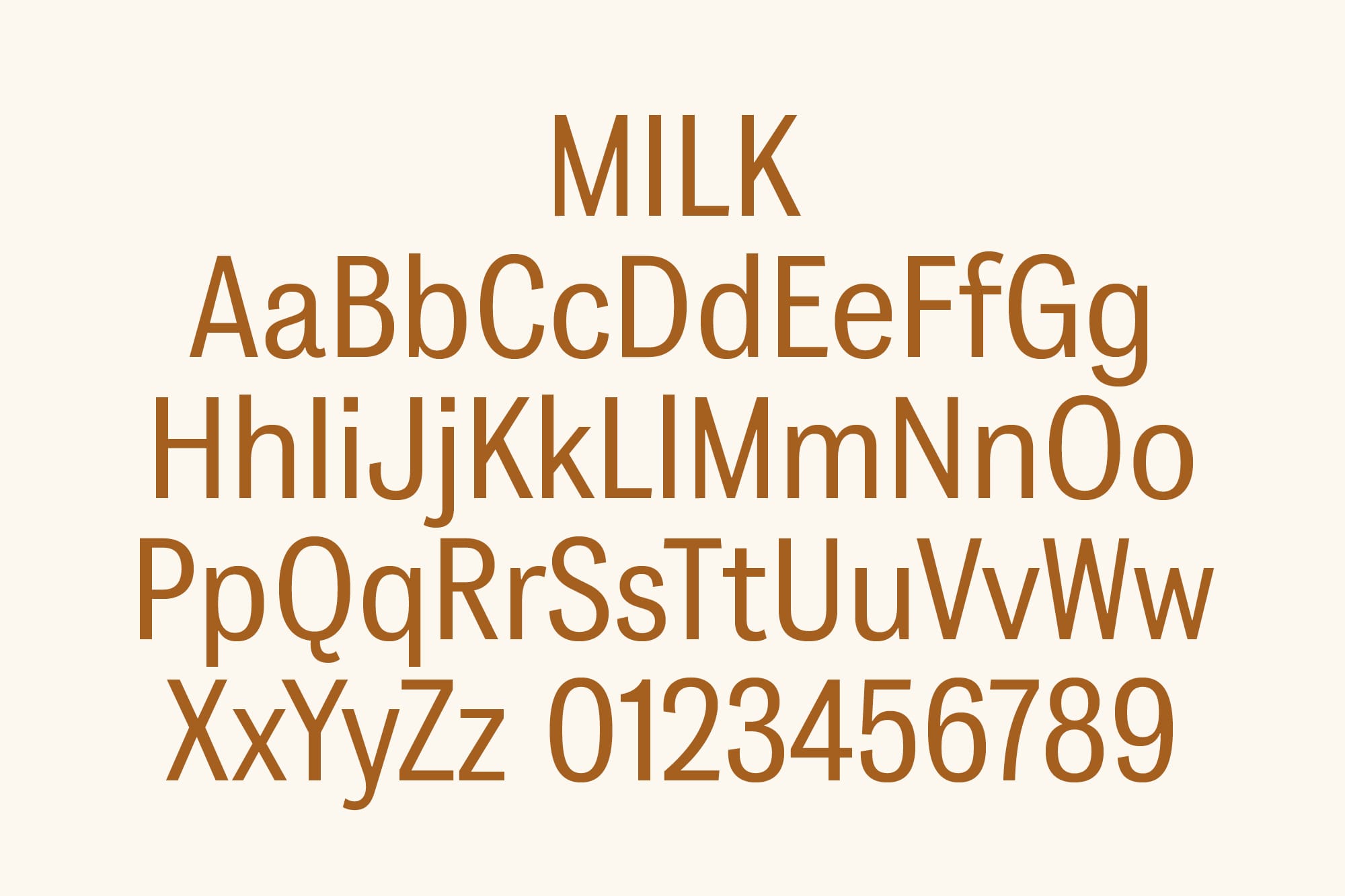
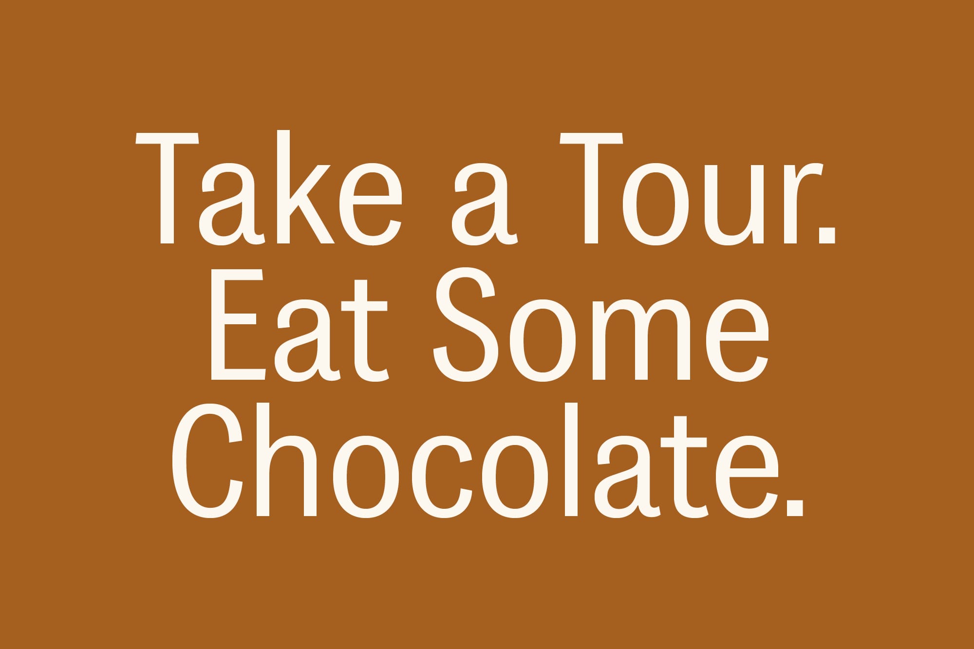
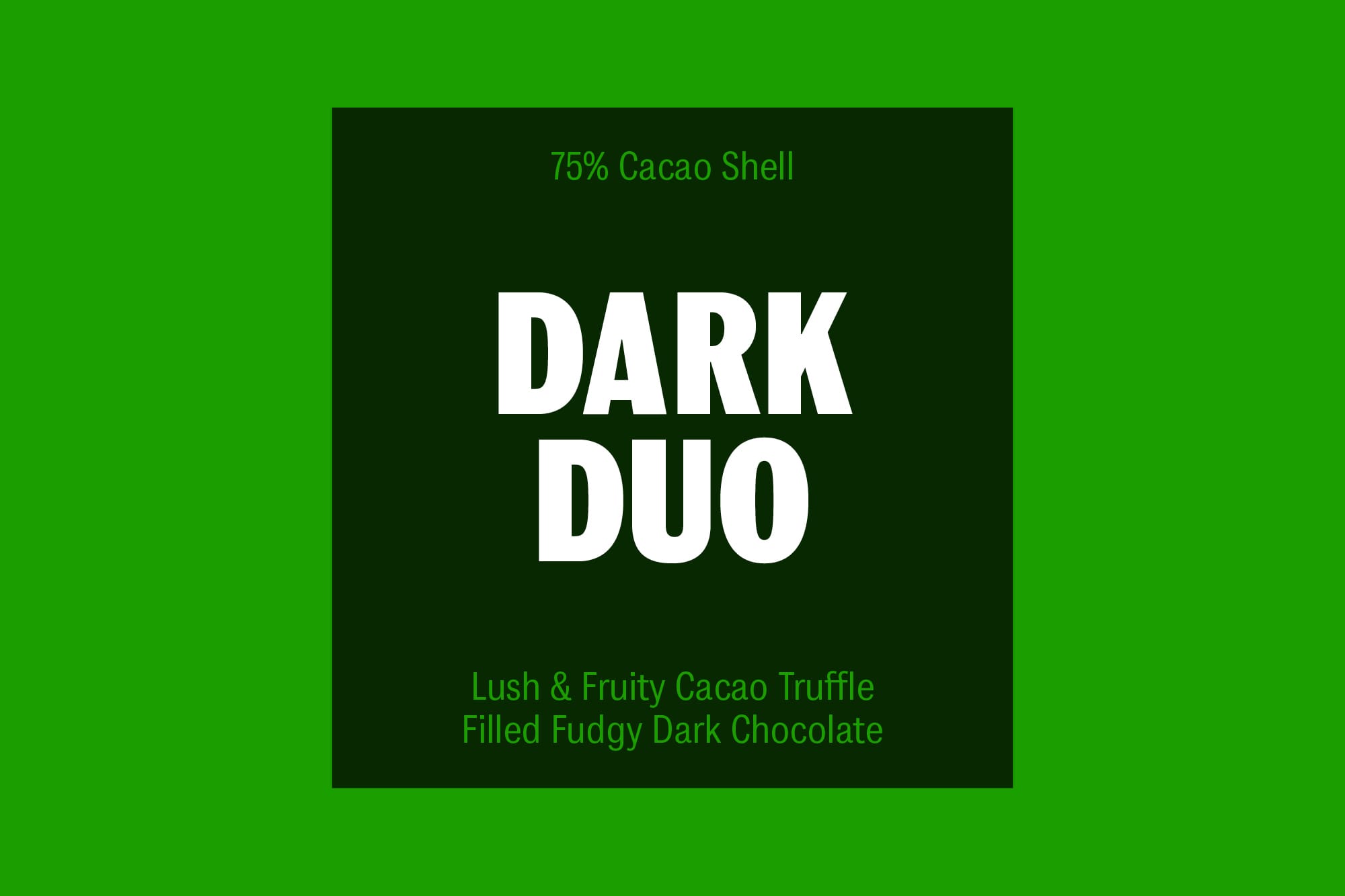
Colophon worked with Super Okay to create a two weight condensed design for TCHO chocolate: a headline typeface for use on pack, “Dark”, and complementary typeface, “Milk”. The type system was designed to sit alongside their existing logomark, designed by Erik Spiekermann, which reflects the shape of their chocolate blocks.
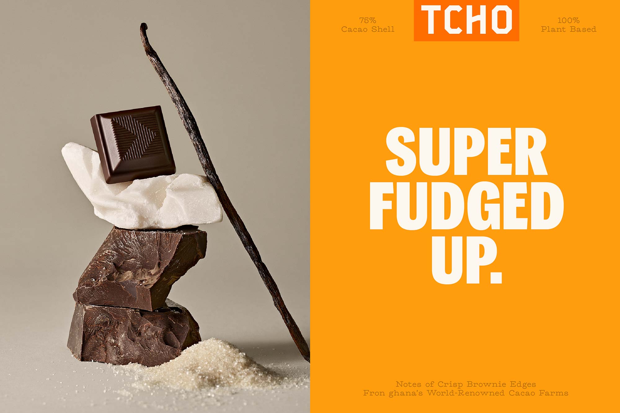
Drawing inspiration from Spiekermann’s logo design, the superbold “Dark” style uses the material properties of chocolate in its DNA, with angular forms reminiscent of a bar being broken. Curled endings in characters such as the “C” recall the larger brand story by bringing a sense of hand crafting through references to wood type. Accents are thin and slanted — inspired by splinterings of chocolate while simultaneously accommodating for the tight line spacing in the TCHO packaging design.
