)
Tesco
Fast approaching Tesco’s 2019 centenary, Wolff Olins approached Colophon on behalf of the historic grocer (founded 1919) with a series of typographic requests that would ultimately come to encapsulate the drawing of 34 styles of type across four families and 15 weights. A household name across the UK, Tesco operates 6,800 stores amongst 13 countries in Europe and Asia, and is supported by a staff of over 440,000 that serves upwards of 80 million customers each week.
- Typefaces
- Tesco Modern, Modern Condensed, Tesco Serif, Tesco Slab, Tesco Lotus
- Comissioner
- Wolff Olins, London
- Year
- 2015-16
- Styles
- 4 Families, 15 Weights, 34 Styles
- Coverage
- Adobe Latin-1
- Classification
- Sans Serif Serif Thai
- URL
- wolffolins.com
- tesco.com
Curves smoothed
Made symmetrical
Stroke width made consistent
Stroke width made consistent
Character width increased
Reduced overshoots
In order to be truly comprehensive about the task at hand, Colophon set about the process by collaborating with Wolff Olins on a reexamination of Tesco’s core wordmark, subtly refining the company’s 1996 logotype by balancing and stabilizing both centrifugal characters (S, O), and addressing several quiet weight inconsistencies so as to harmonize the all-capitals setting. In familiarizing ourselves with the brand’s visual history by way of this early exercise, a foundation was established that would carry the project through its disparate stages.
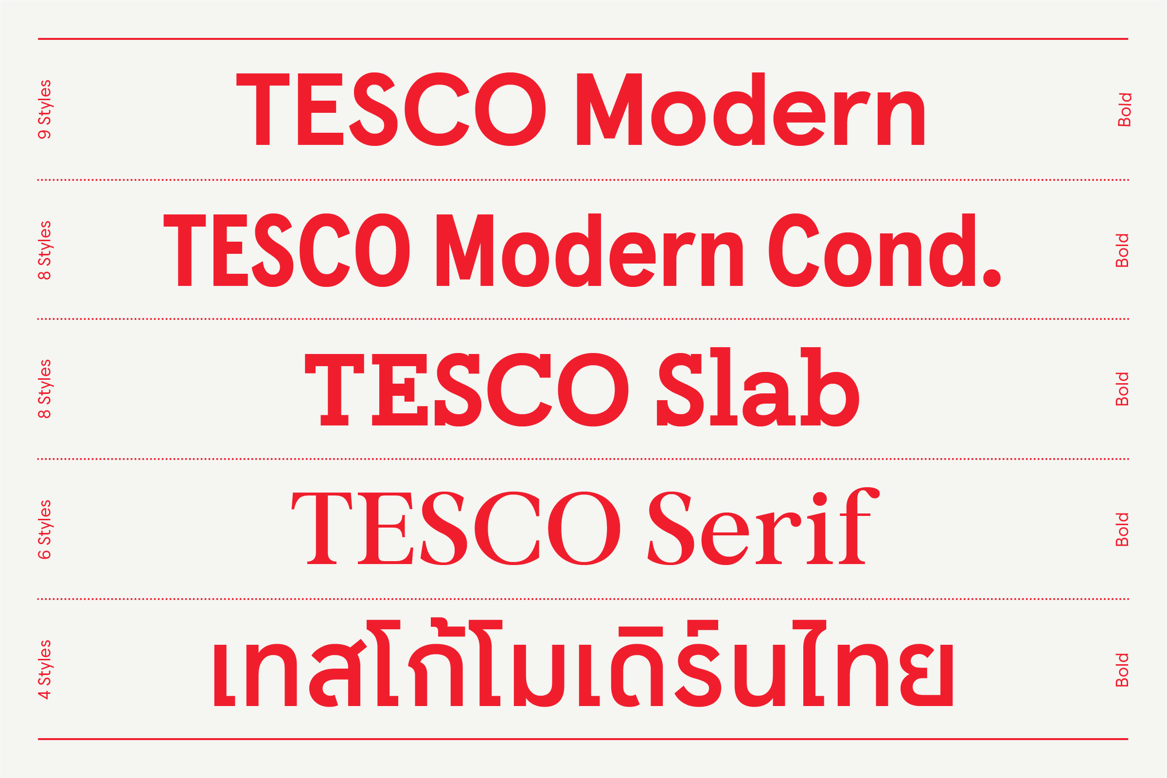
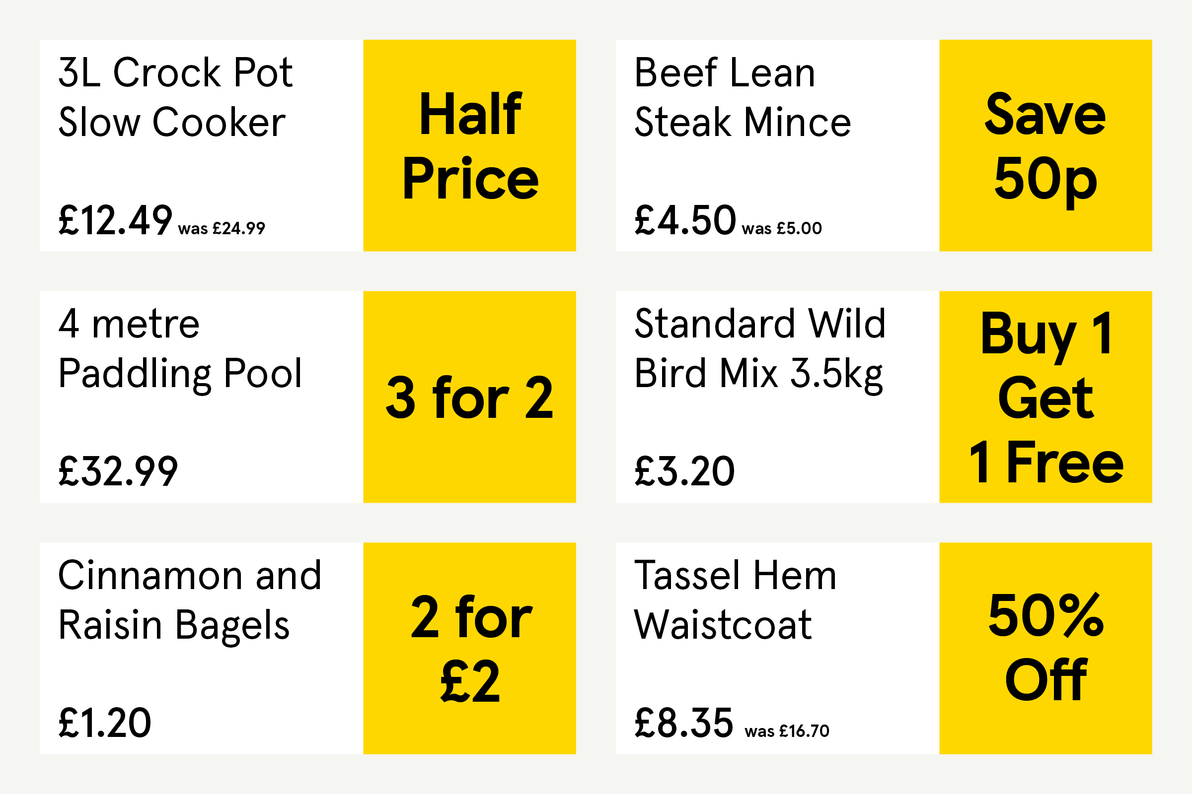


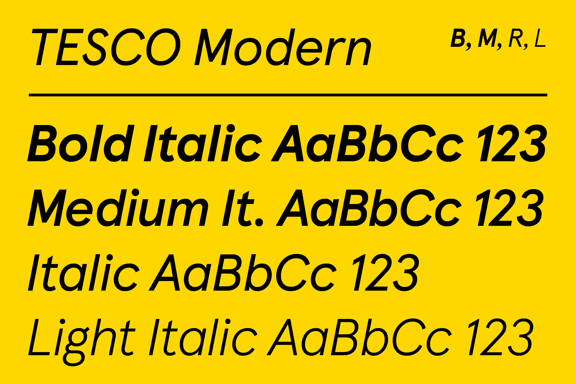
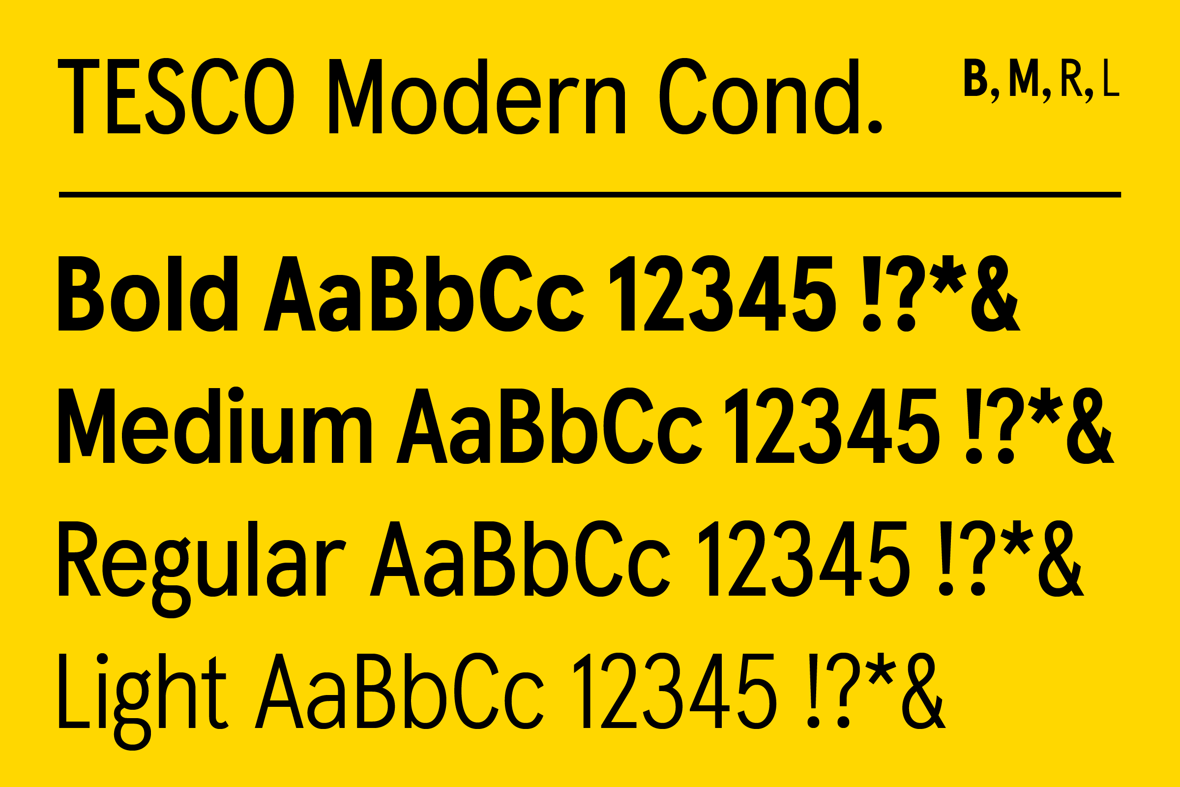
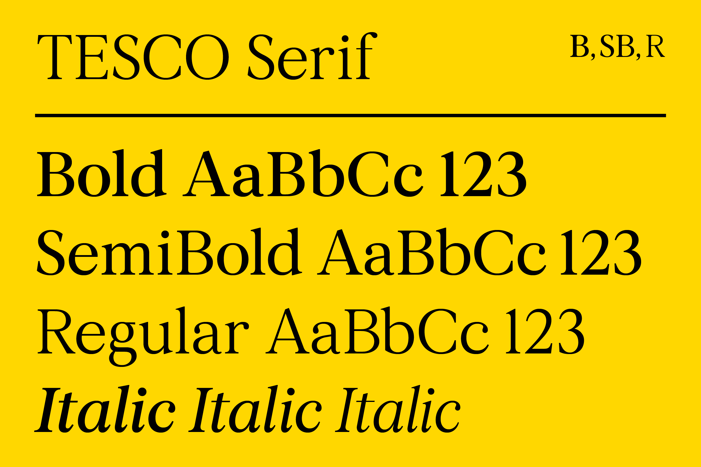
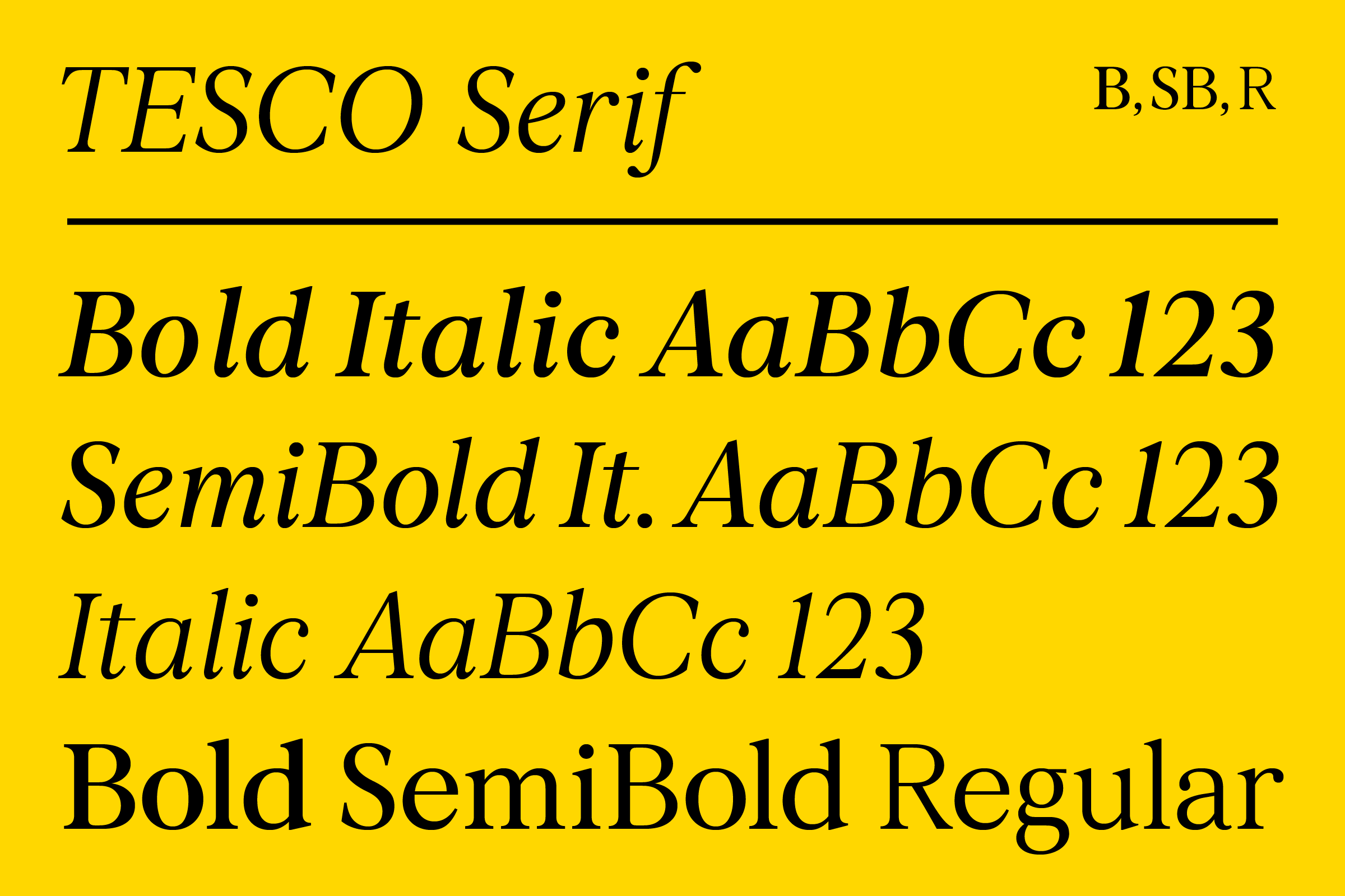
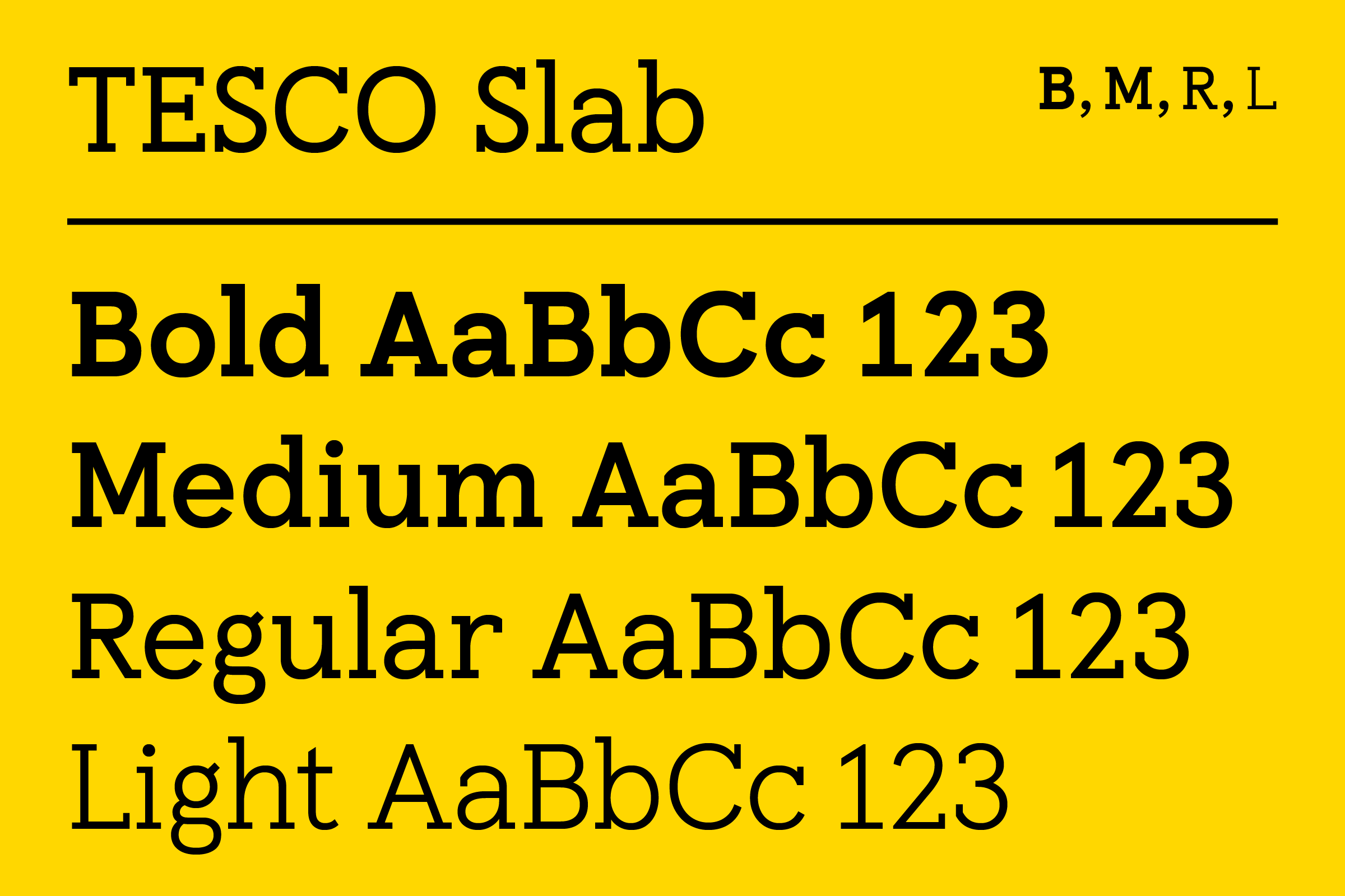
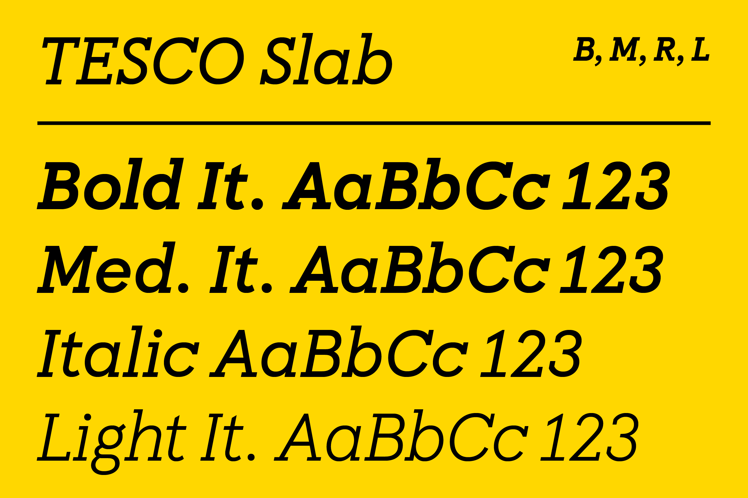
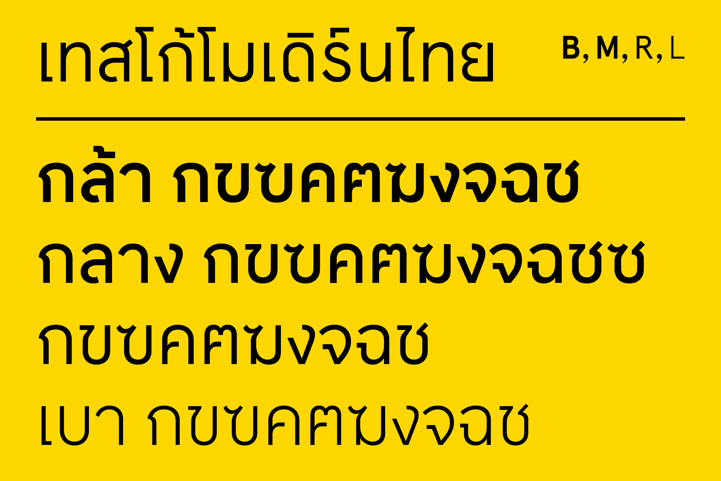
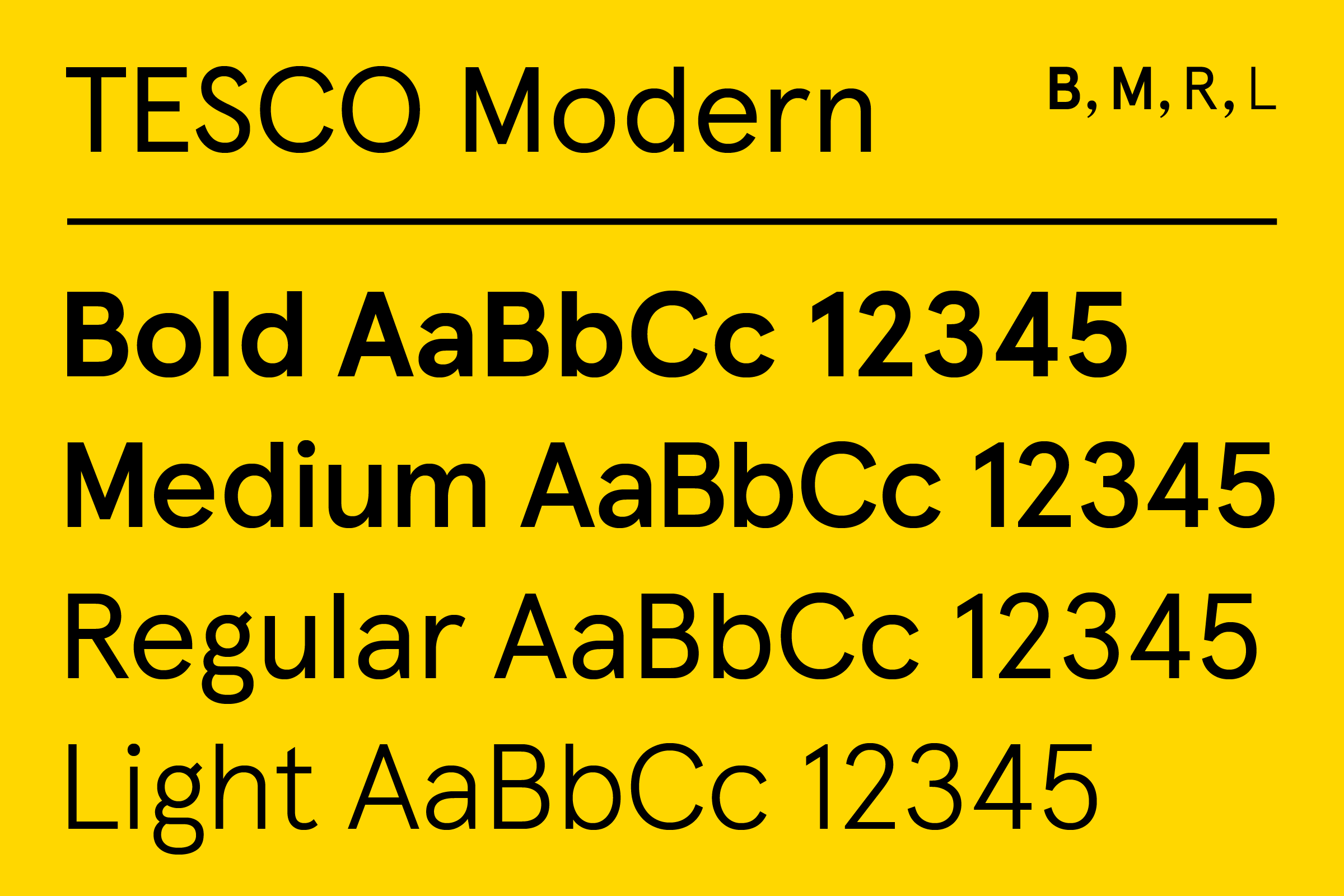
Envisioned from the start as a diverse super-family of consonant typologies, drawing began with a ground-up reenvisioning of Colophon’s own Aperçu font, resulting in the sans-serif Tesco Modern. This was followed by a condensed version of the same in order to cater to industry-specific spatial constraints. Riffing on Tesco’s own 1960s–1995 slab serif wordmarks, Tesco Slab was composed to align with the structure of the preceding Modern. More free in form and directly supporting Tesco’s Finest™ line, a classical serif was drawn to round out the Latinate cuts. And lastly, Tesco Modern Thai was completed to support the 200+ locations of Tesco Lotus stores throughout Thailand.
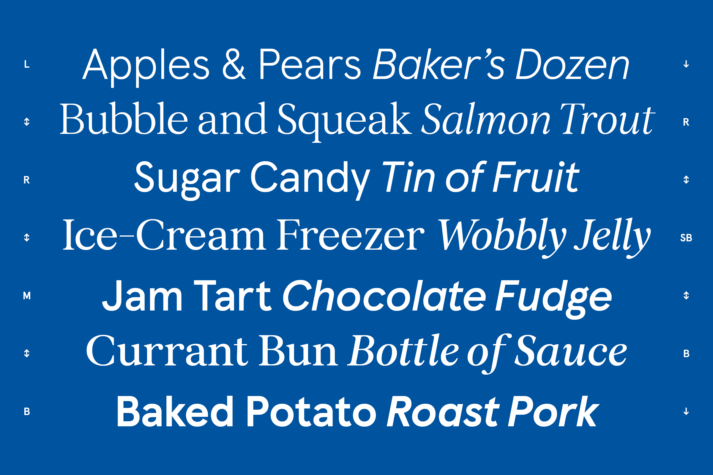
Italic counterparts were rendered across 15 weights, with straightforward obliques supporting Modern, Condensed, and Slab styles, and a true italic to complement the more refined Tesco Serif. While Modern, Condensed, and Slab styles feature Light, Regular, Medium and Bold weights that all mathematically relate to one another, Serif weights slot comfortably in-between these, prompting an entirely different typographic texture when applied to Tesco’s higher-end product range.


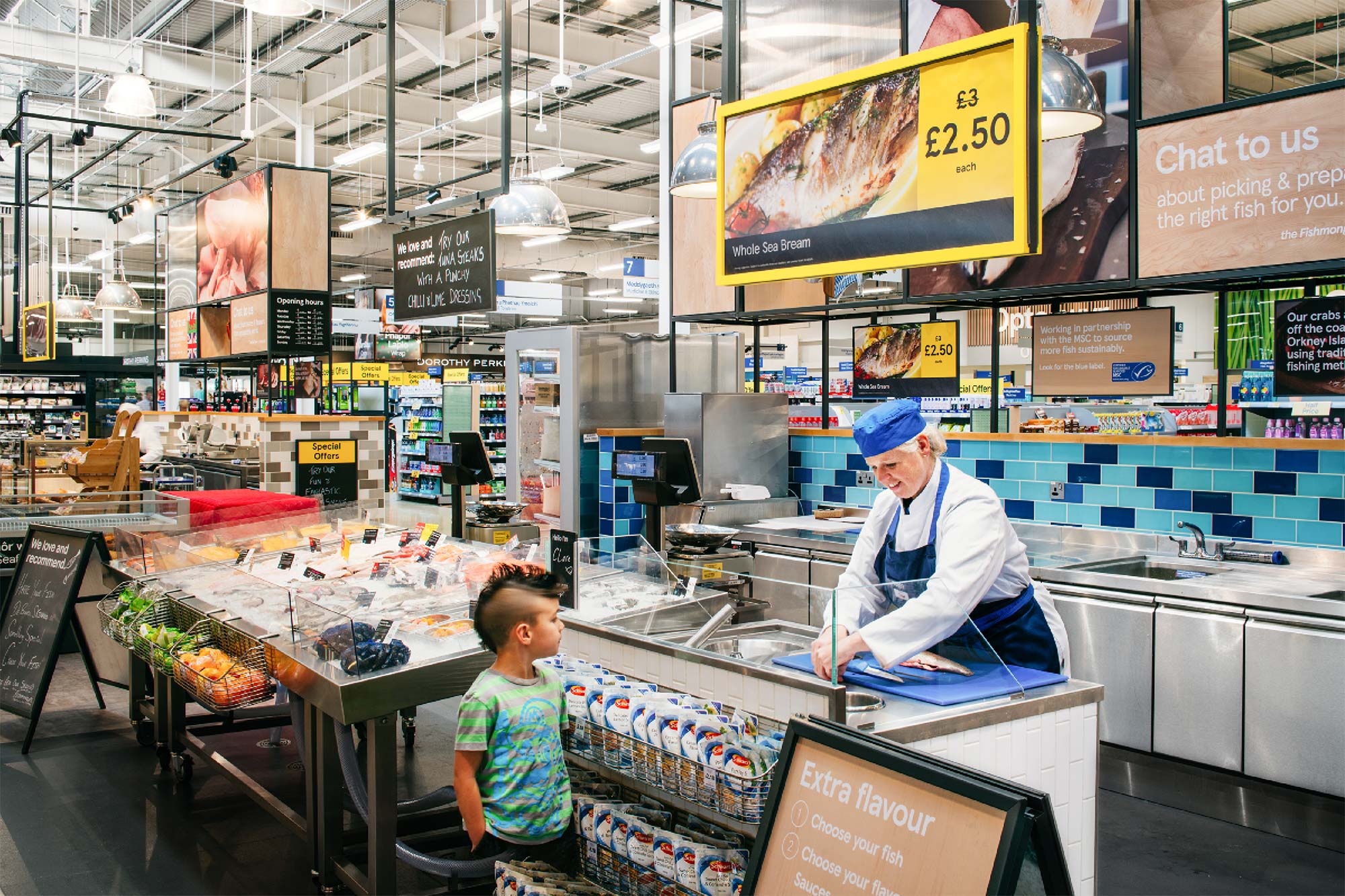
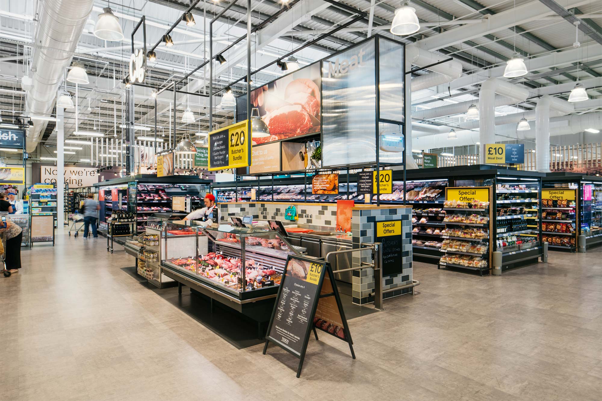
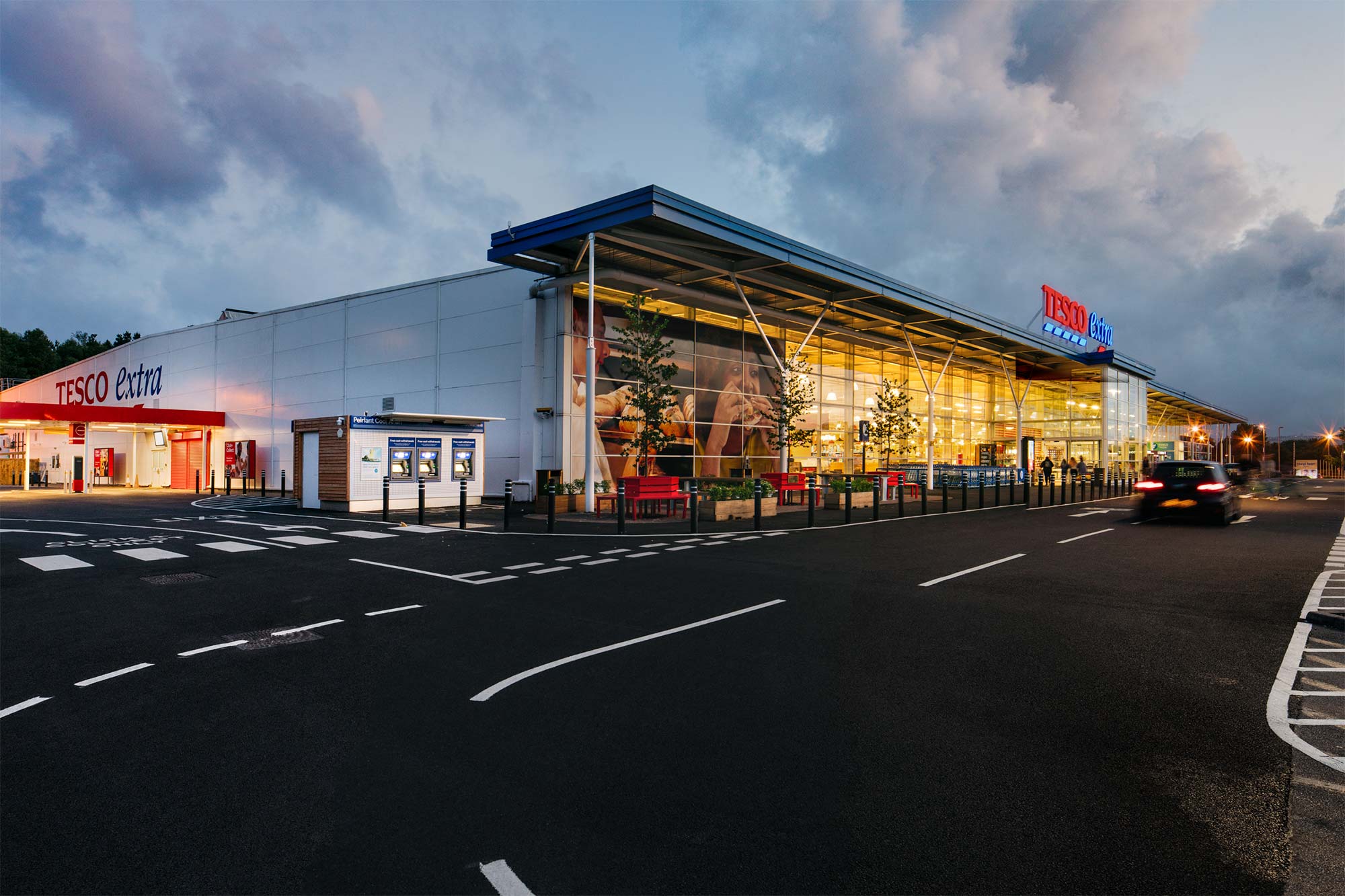
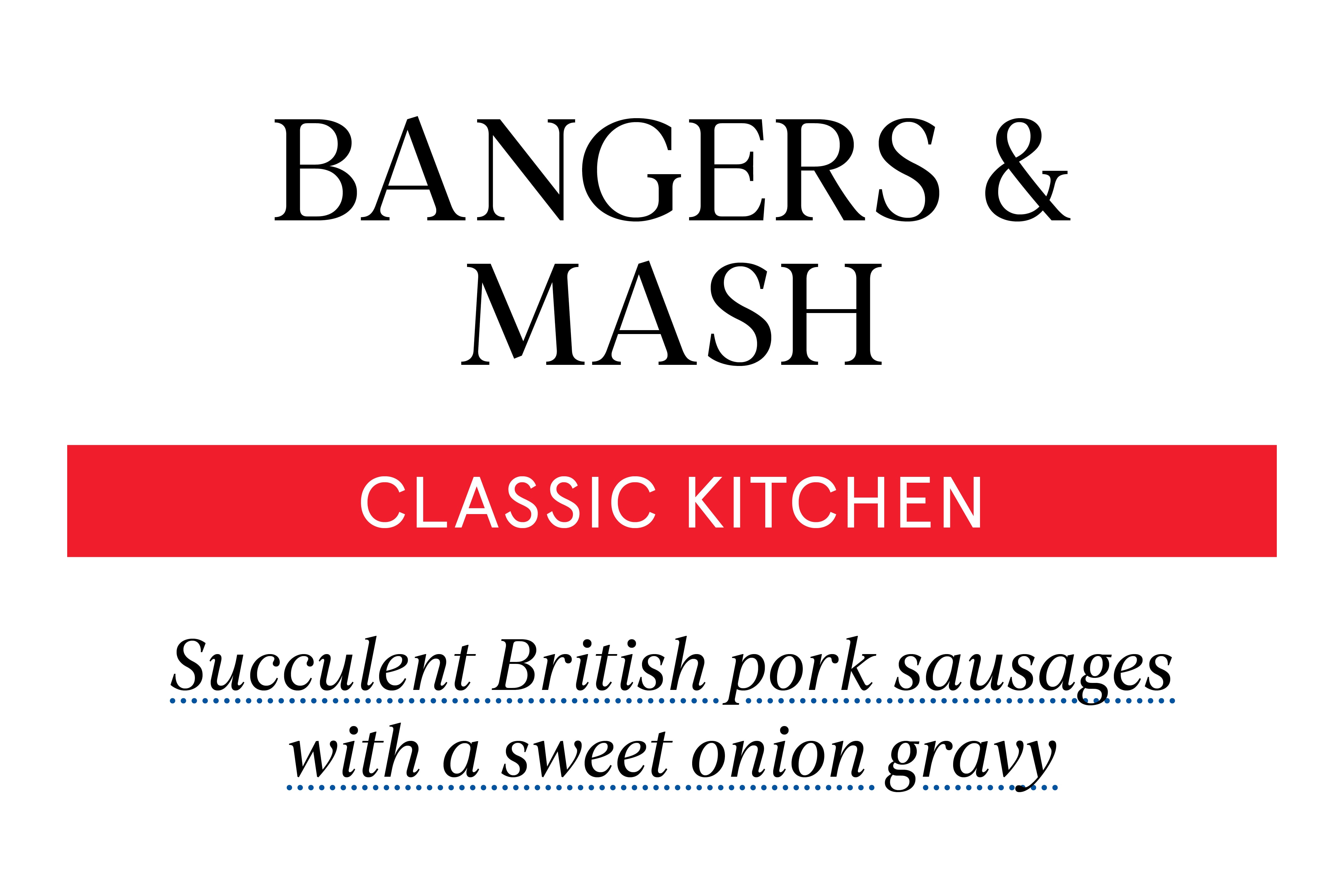
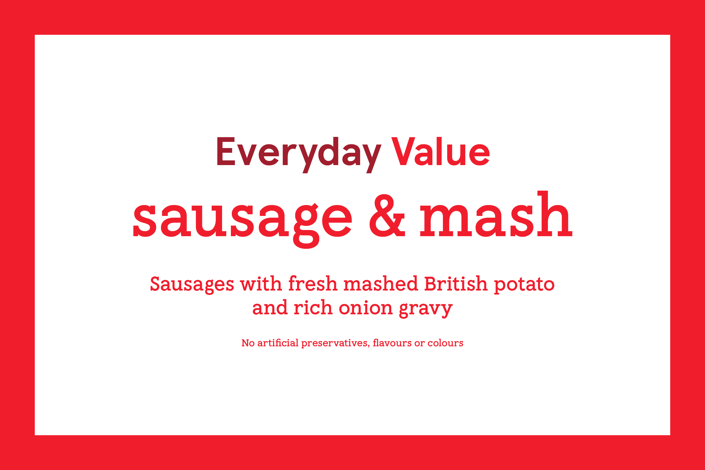
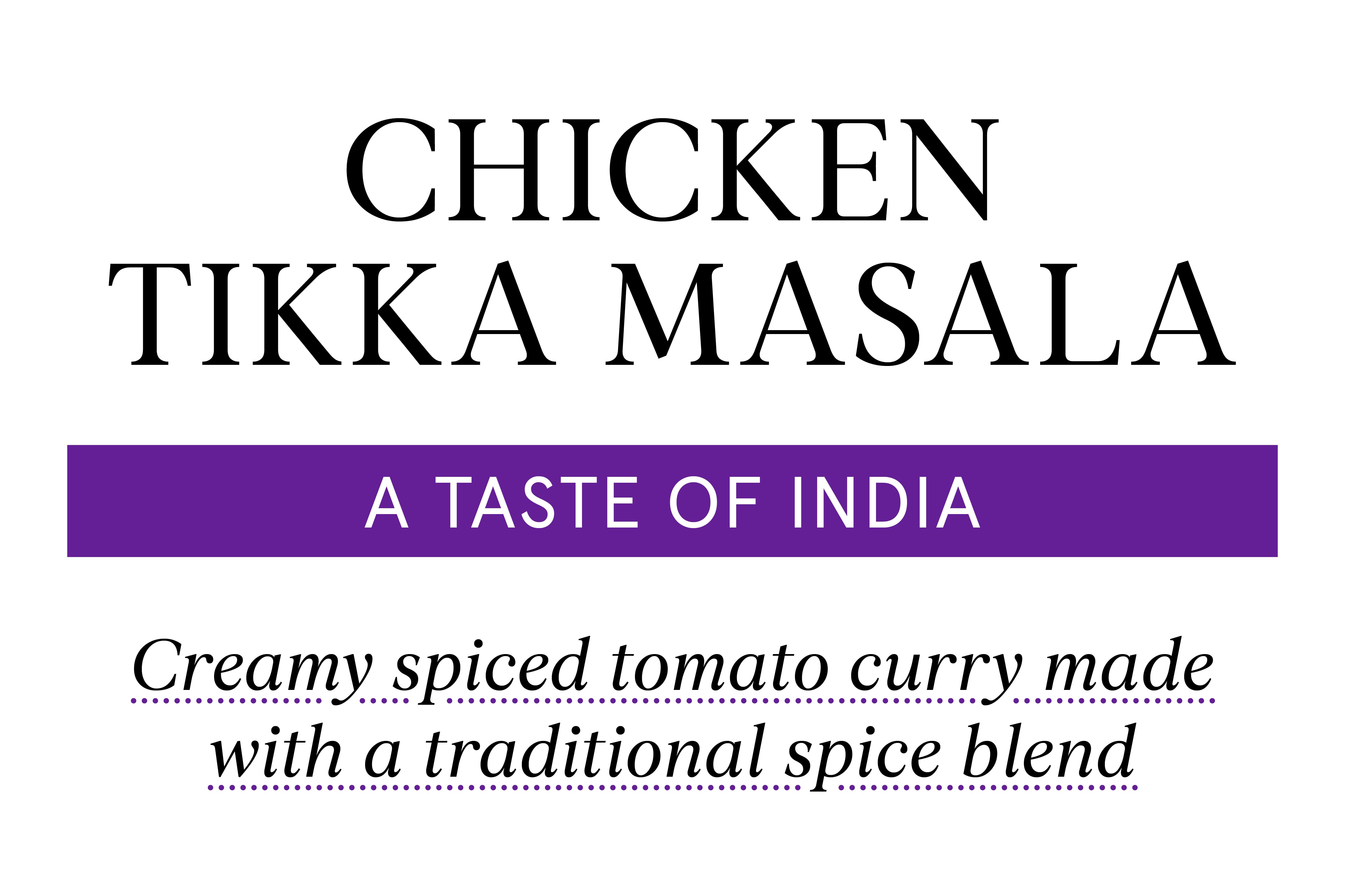
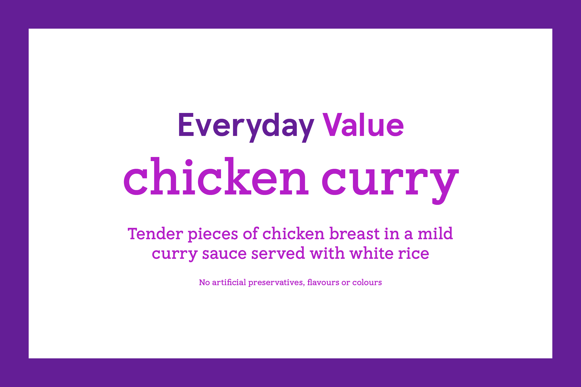
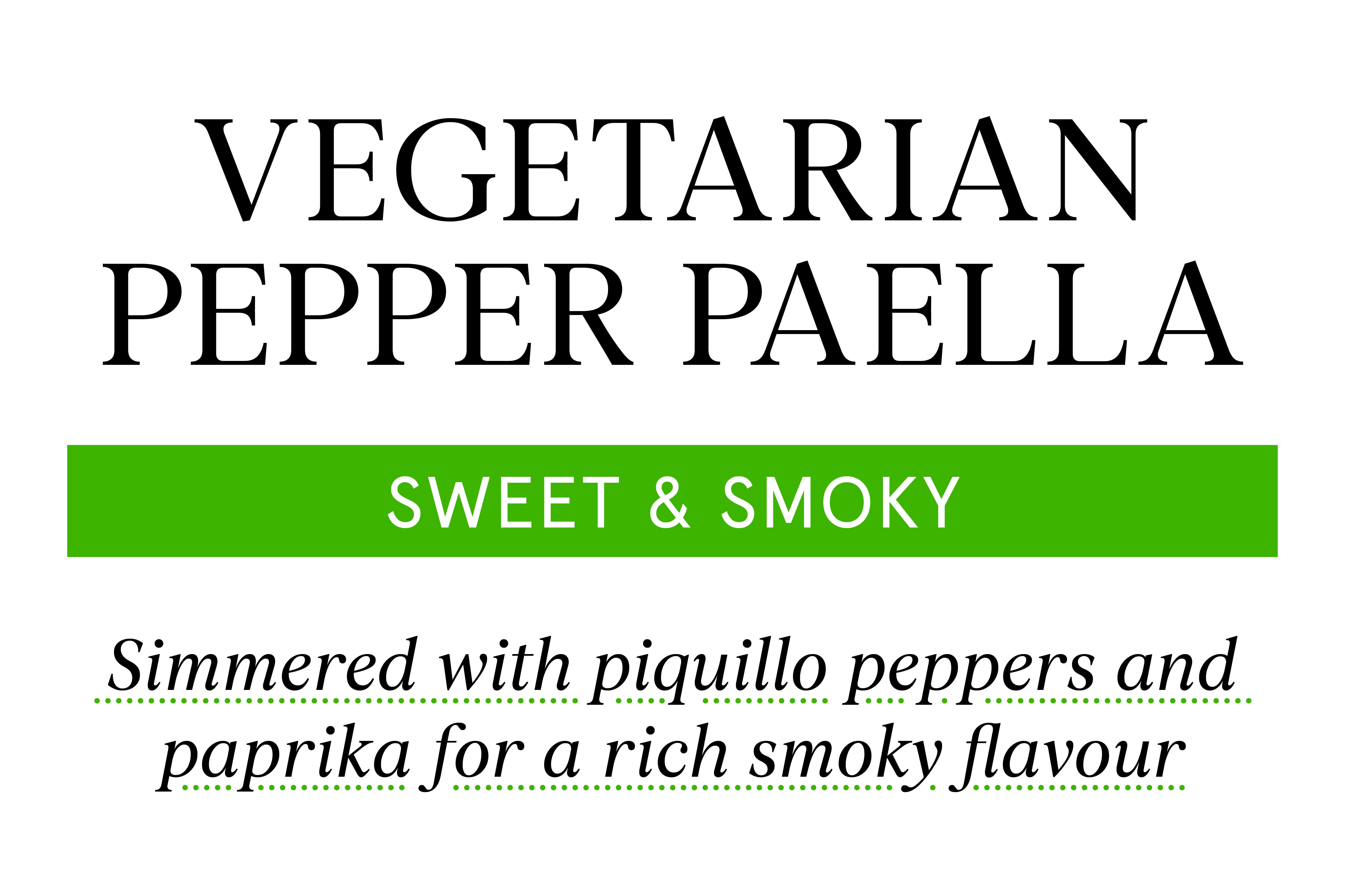
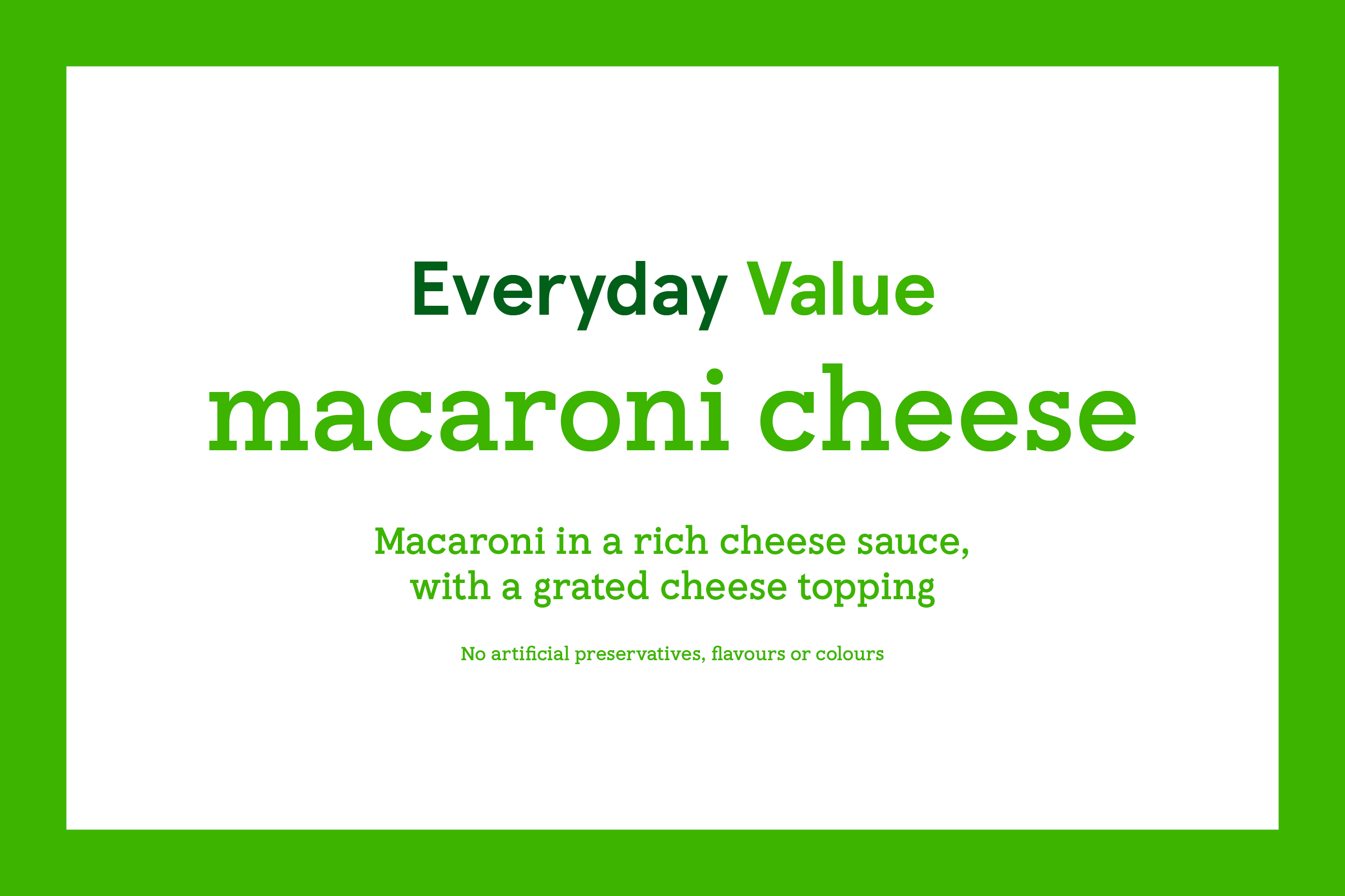
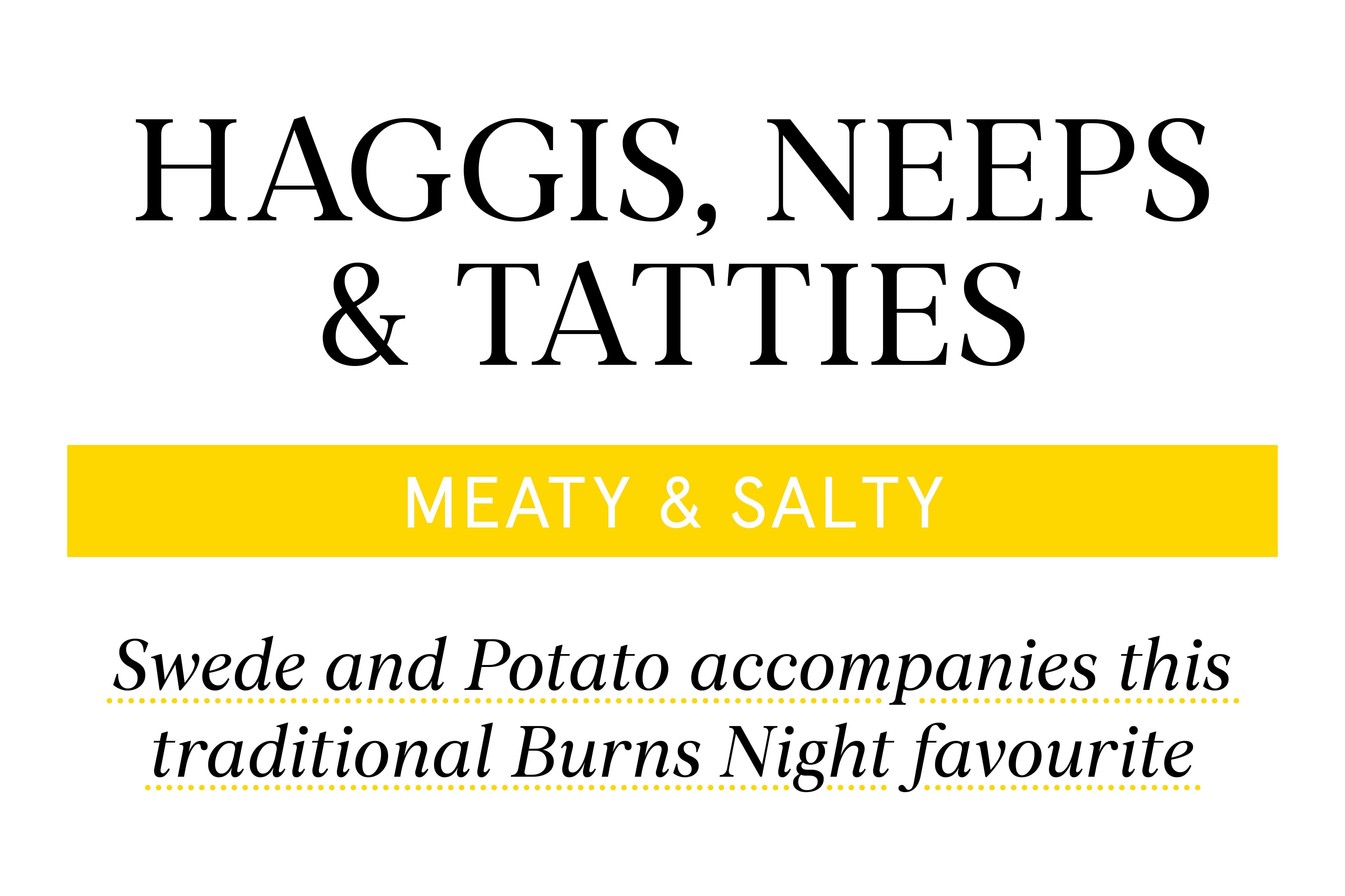
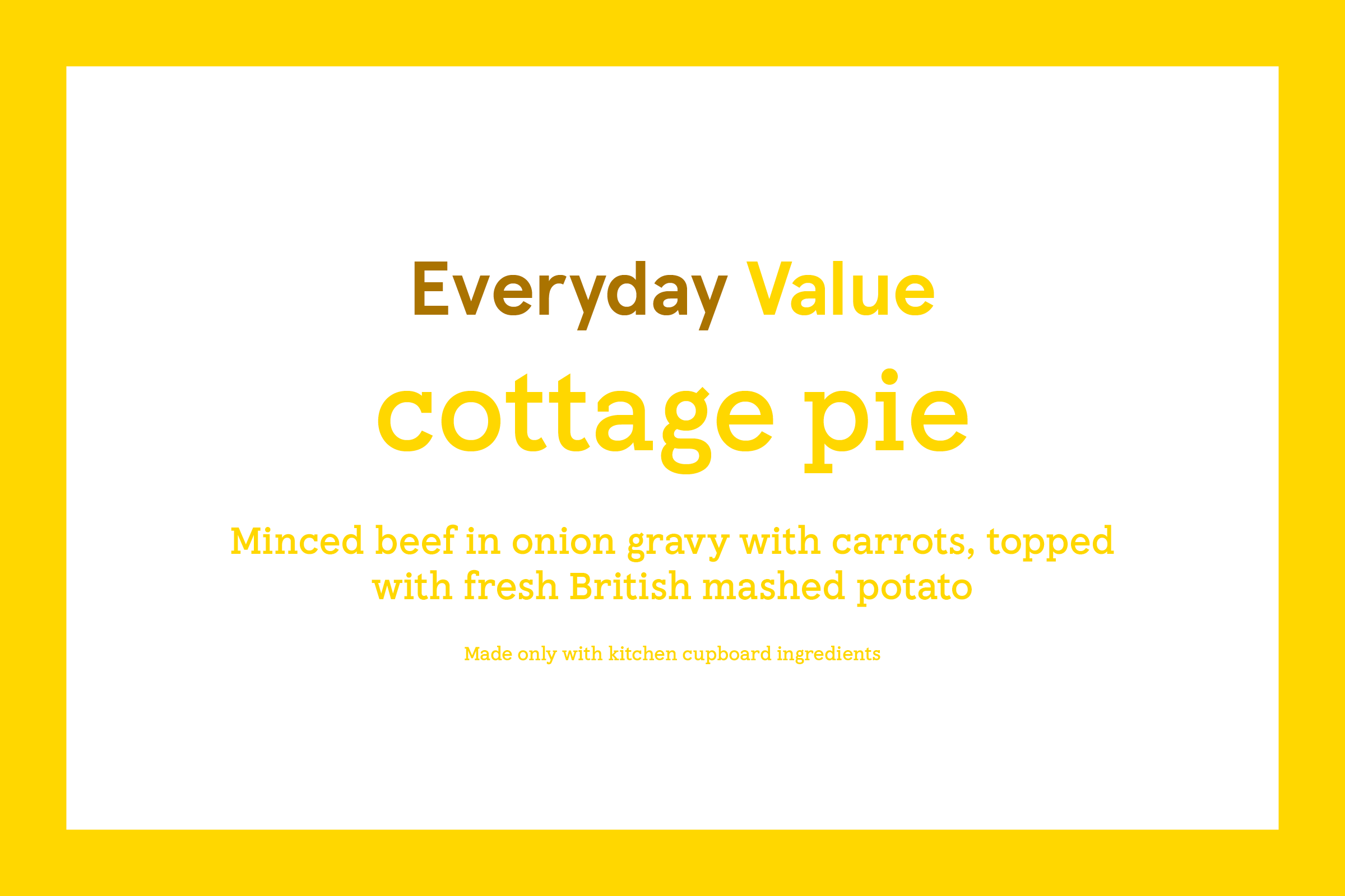
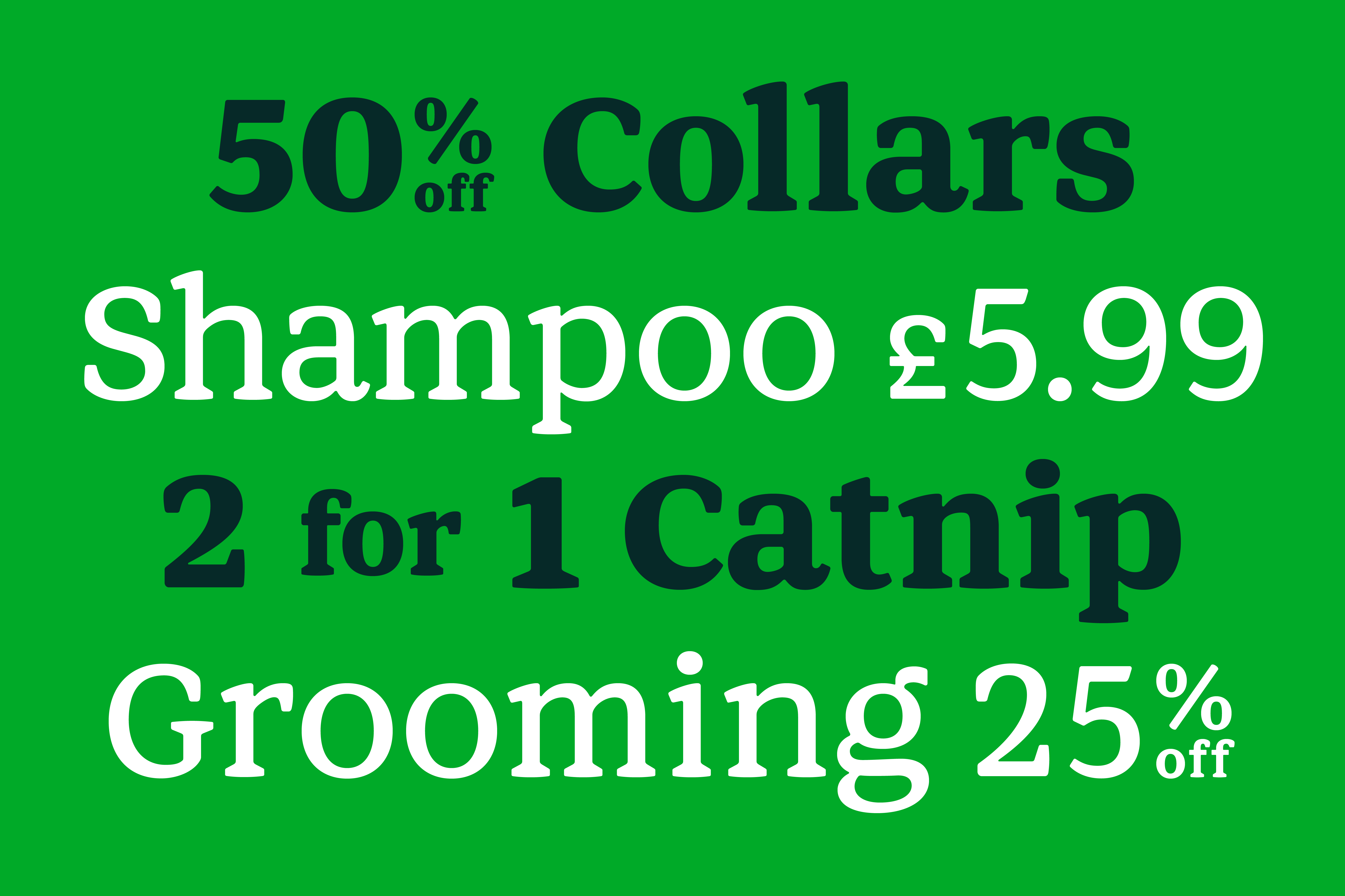
Among other applications, a common internal testing ground for various drawings was in mock-ups of would-be retail scenarios: what quicker way to understand the functionality and proficiency of the type than to apply it to everyday marketplace environments?
We came to quickly understand what did and didn’t work in the realms of both style and legibility. Early assesments of numerals and pricing conventions led us to re-visit the underlying structures of Aperçu’s original ‘3’, ‘6’, and ‘9’, creating characters that were more identifiable at very small sizes (6 pt. and below) and more proprietray to the commissioner. In addition, particularly idosyncratic characters (namely an original two-storey question mark) were eschewed in favour of forms that would eventually call less attention to themselves.
Indeed, casual trips to the market began to take on entirely new meaning, and a loose metaphor took shape around the relationship between a profusion of type styles and the plethora of cuisines that can found in the aisles of a given Tesco. From Apples & Pears to Roast Pork (Light to Bold; Upright to Italic), an abundance of typographic ingredients now gives the grocer’s in-house designers great freedom and dexterity in the realm of visual flavouring.
From the polished, archetypal Tesco Serif to the historic, editorial Tesco Slab, each unique style that constitutes a part of the extended typographic family harmonizes with the other based on the underlying construction of the company’s core typeface: the staid and contemporary Tesco Modern.
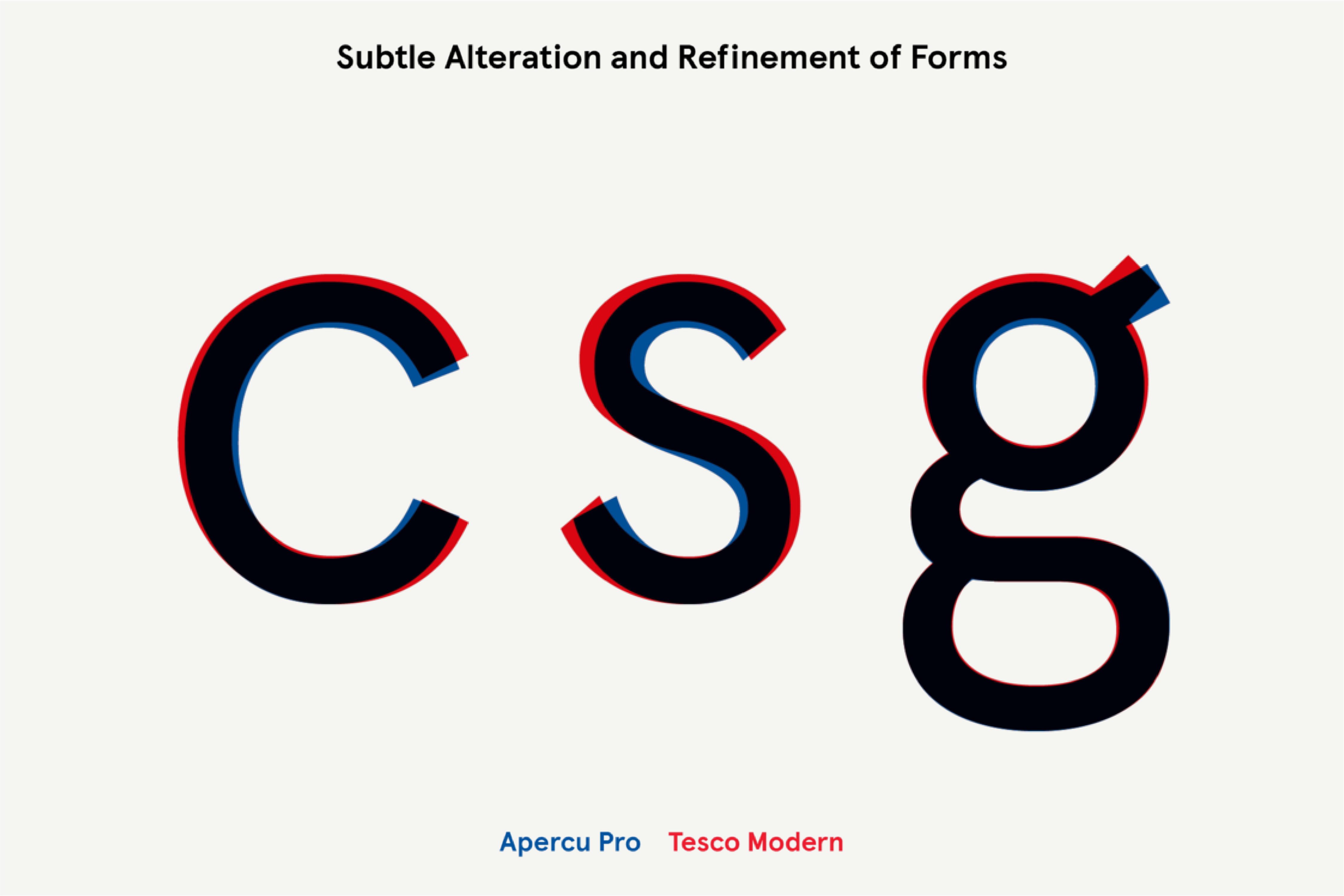
To ensure the dependable foundation of these sequential drawings and gestures, a holistic re-drawing of the already-in-use Aperçu focused on its specificity to Tesco and its would-be implementation across countless digital platforms. The new drawings offered up an increased x-height and, along with it, heightened legibility; overall character trajectories were altered in favor of open terminals, whose widened apertures increase readbility and allow the eye to more readily identify negative space...
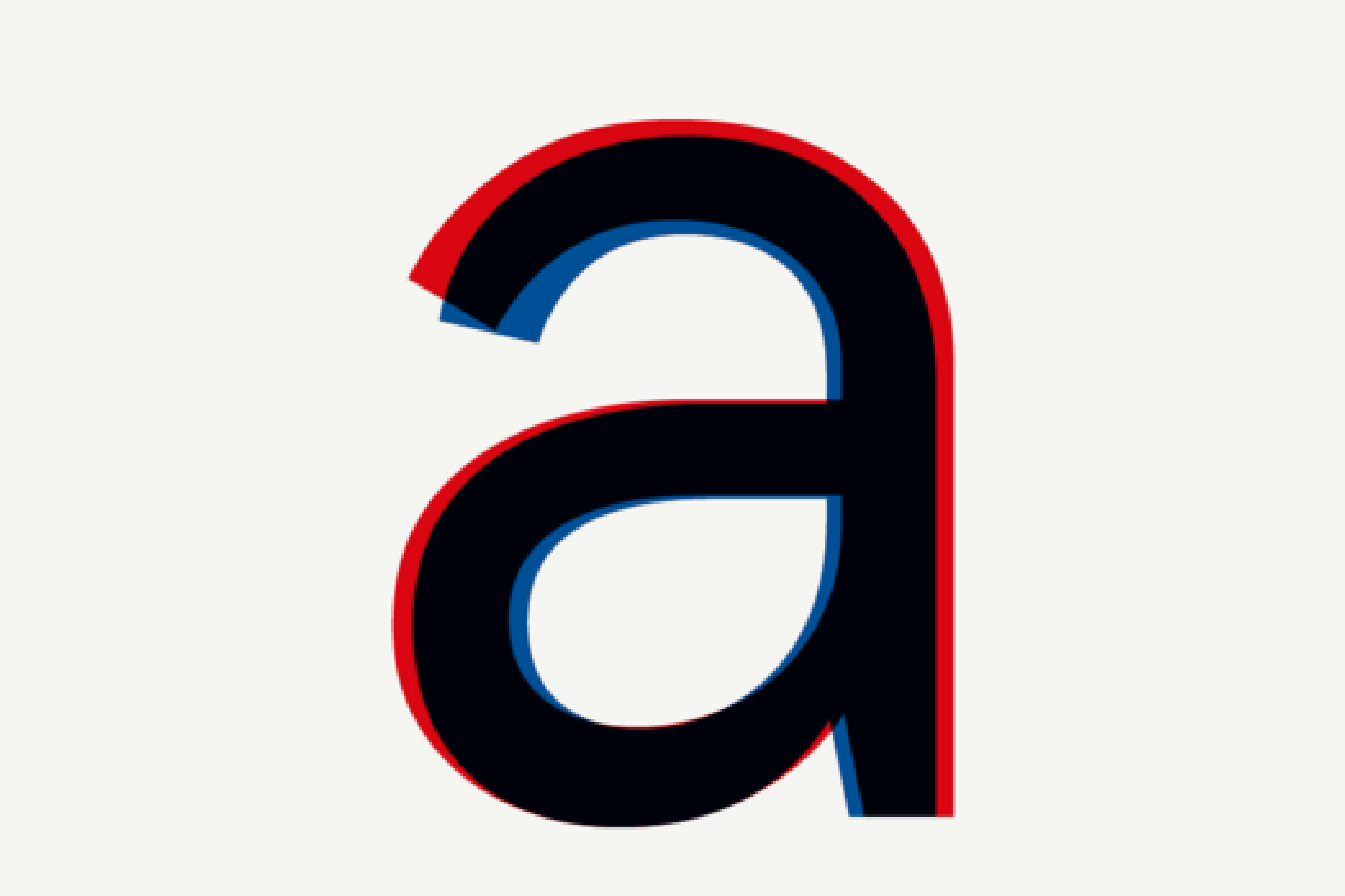
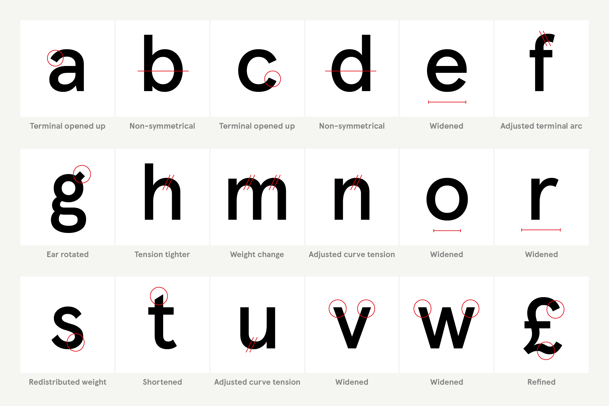


... formerly near-symmetrical counters in letterforms like b, d, and o were shifted to increase character-to-character distinctiveness; a number of glyphs were widened to accommodate expanded openings while enhancing the overall stature of certain letter-pairings and -series; spacing was optimized in line with broad changes elsewhere, and was adjusted overall to allow for default breathability. This exhaustive redesign became the framework upon which complementary styles were arranged.
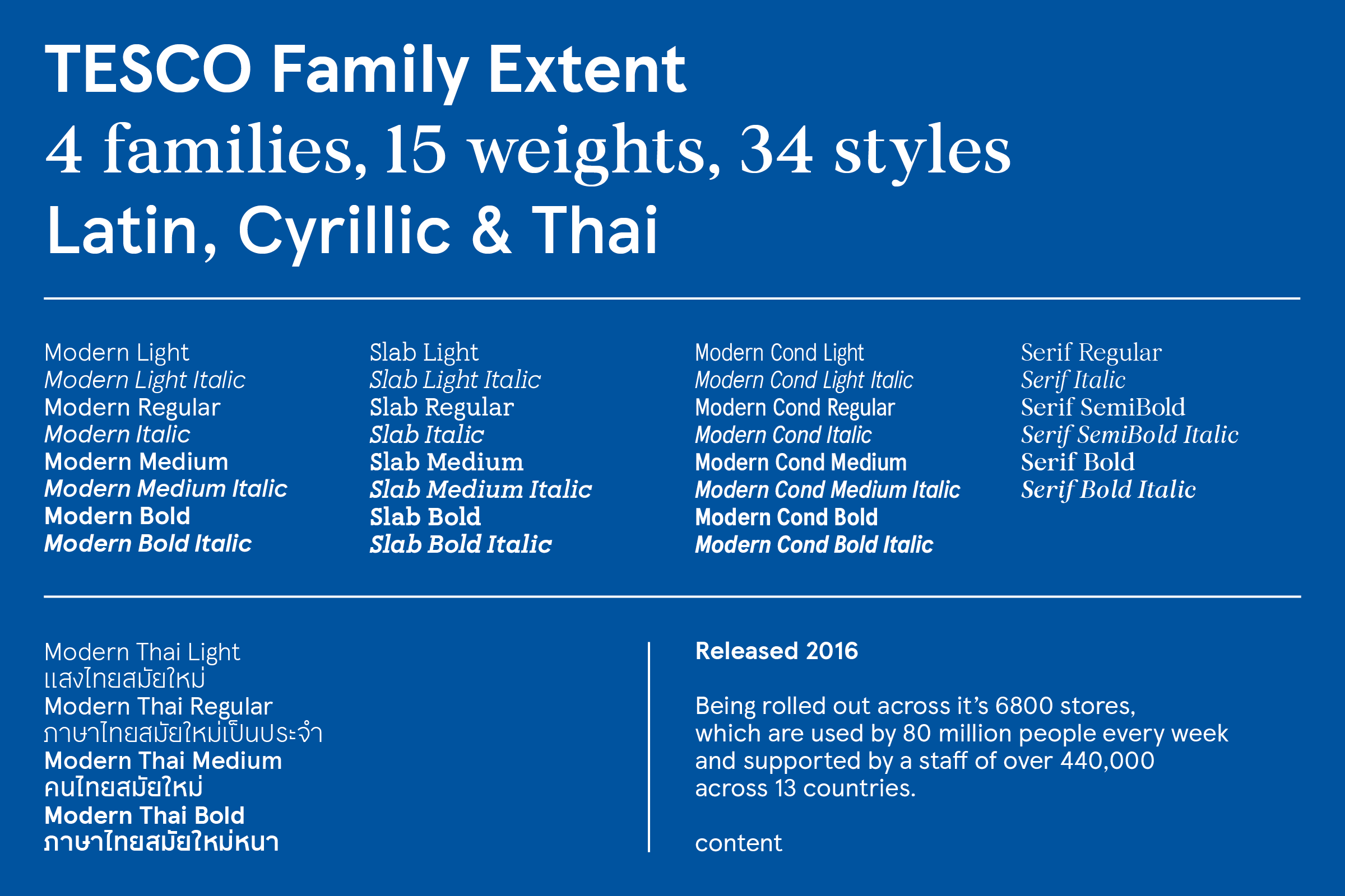
Among those styles, Tesco Modern Thai was constructed for side-by-side English / Thai settings, which allows the grocer’s new typographic palette to flourish beyond Latinate confines and across the many Tesco Lotus markets throughout Thailand. Careful consultation with Bangkok-based type designers continues Colophon’s tradition of close collaboration with regional experts, facilitating cross-alphabet, multi-lingual brand cohesion for international and global entities.
