Ubisoft
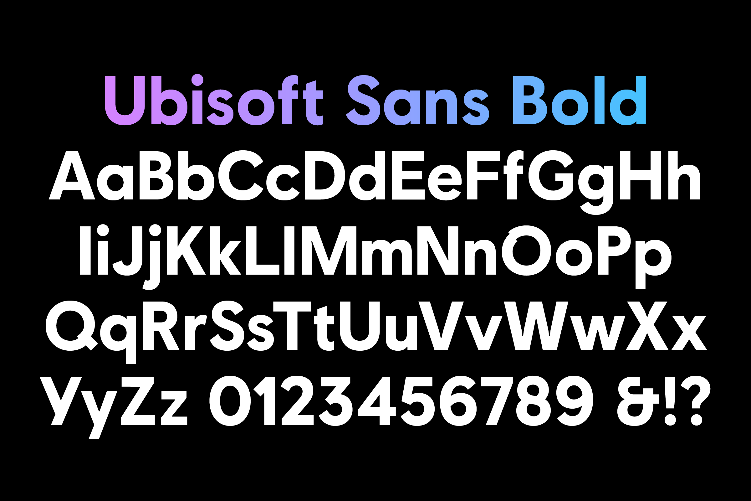
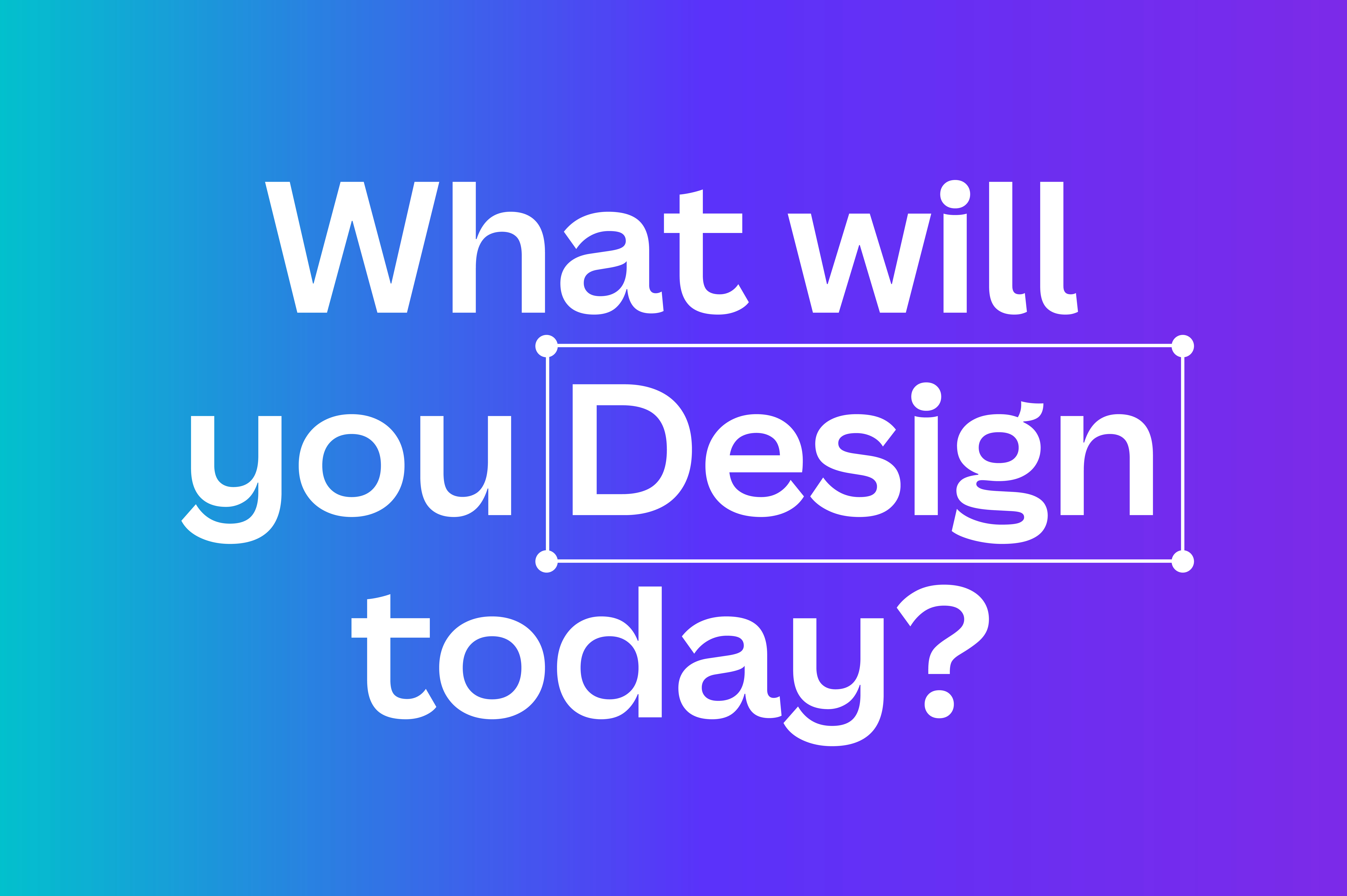
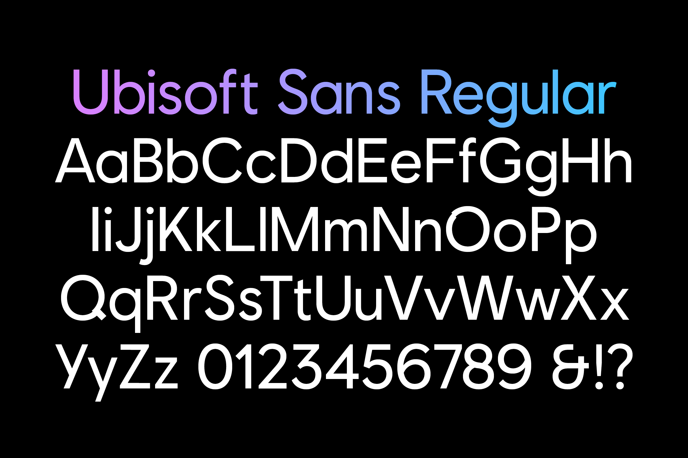
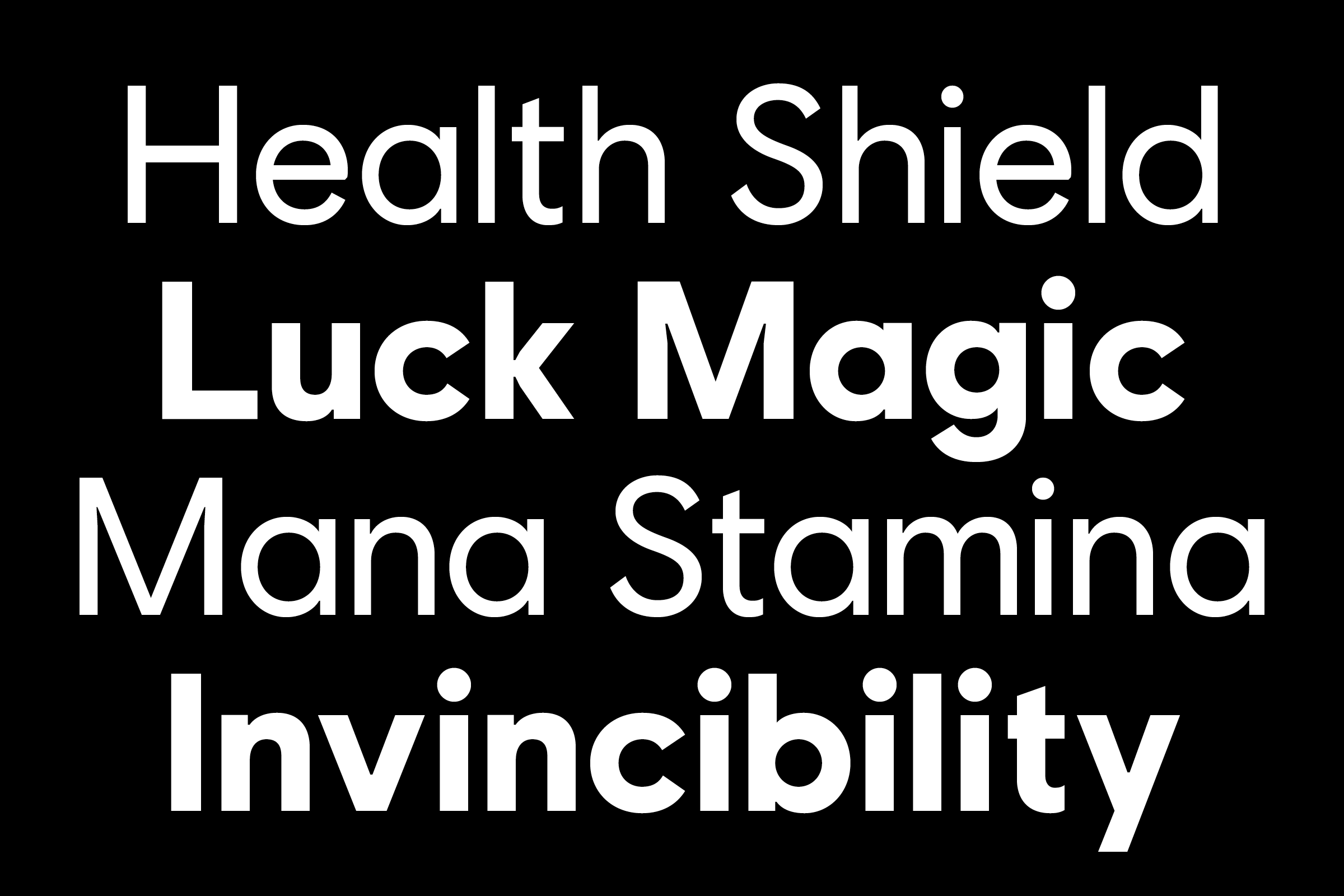
Working closely with the London office of Method, a global design firm, we were commissioned to produce a bespoke two-cut type family for Ubisoft. The French video game publisher's output includes a wide range of world-known game titles such as Assassin’s Creed, Rayman and Just Dance.
- Typeface
- Ubisoft Sans
- Comissioner
- Method, London
- Year
- 2017
- Styles
- 2 Styles: Regular and Bold
- Coverage
- Adobe Latin-2 Encoded
- Classification
- Sans Serif
- URL
- ubisoft.com
- method.com
Our collaboration with Method led us to take existing reference points that had been presented to the client, and to develop upon these. Method and Ubisoft's briefing asked us to resonate tones of humanity into a geometric sans-serif, taking visual cues from the re-designed and stripped back aesthetic of the companies new logo.
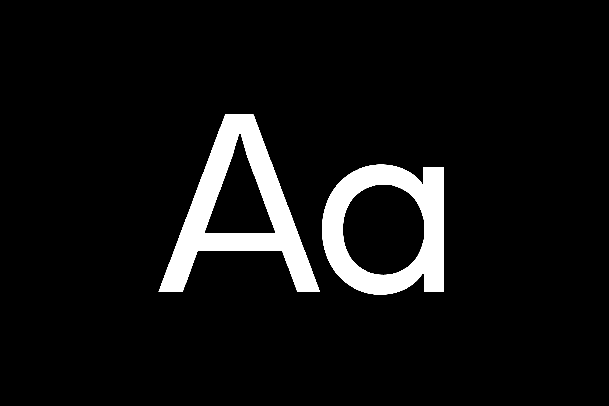
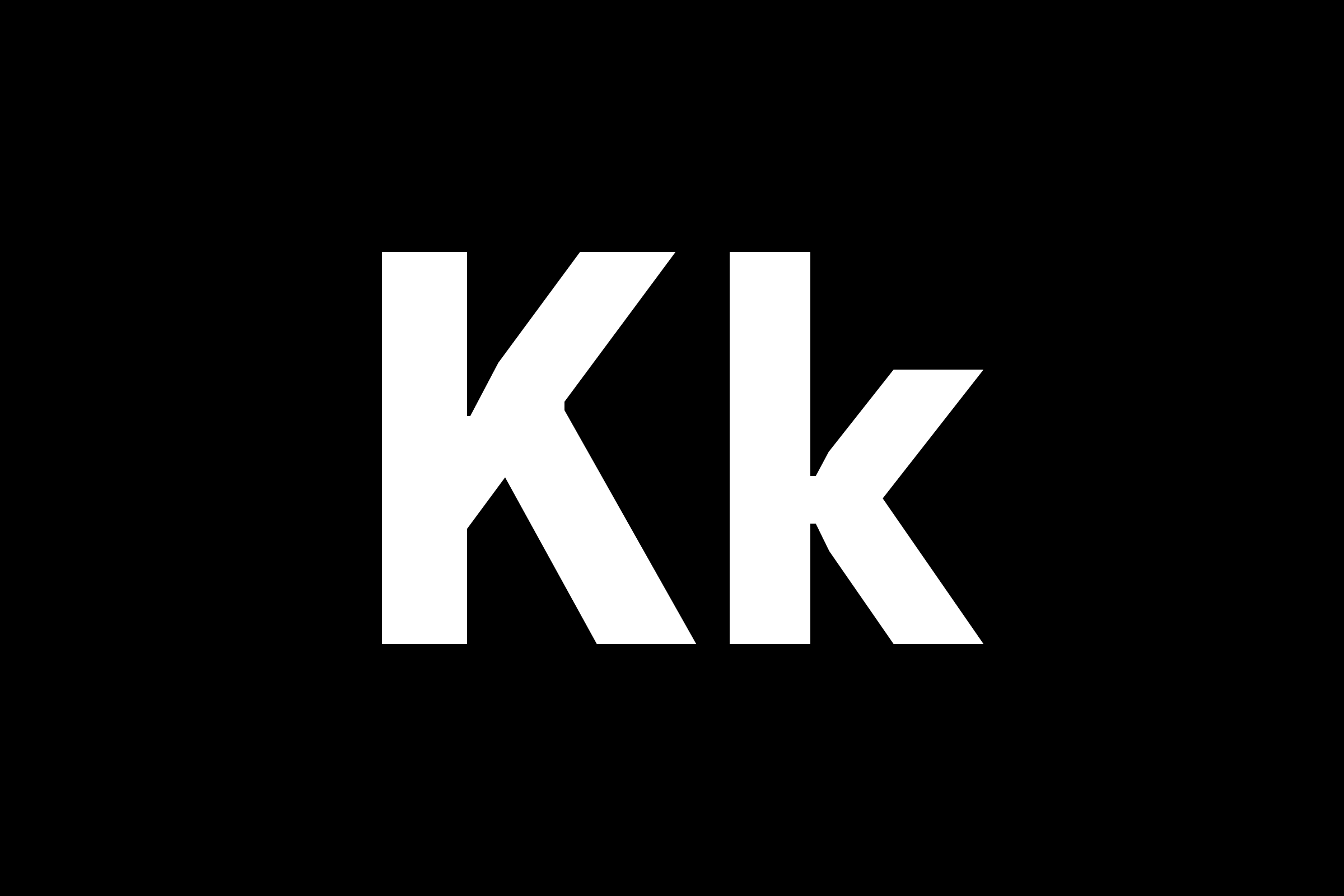
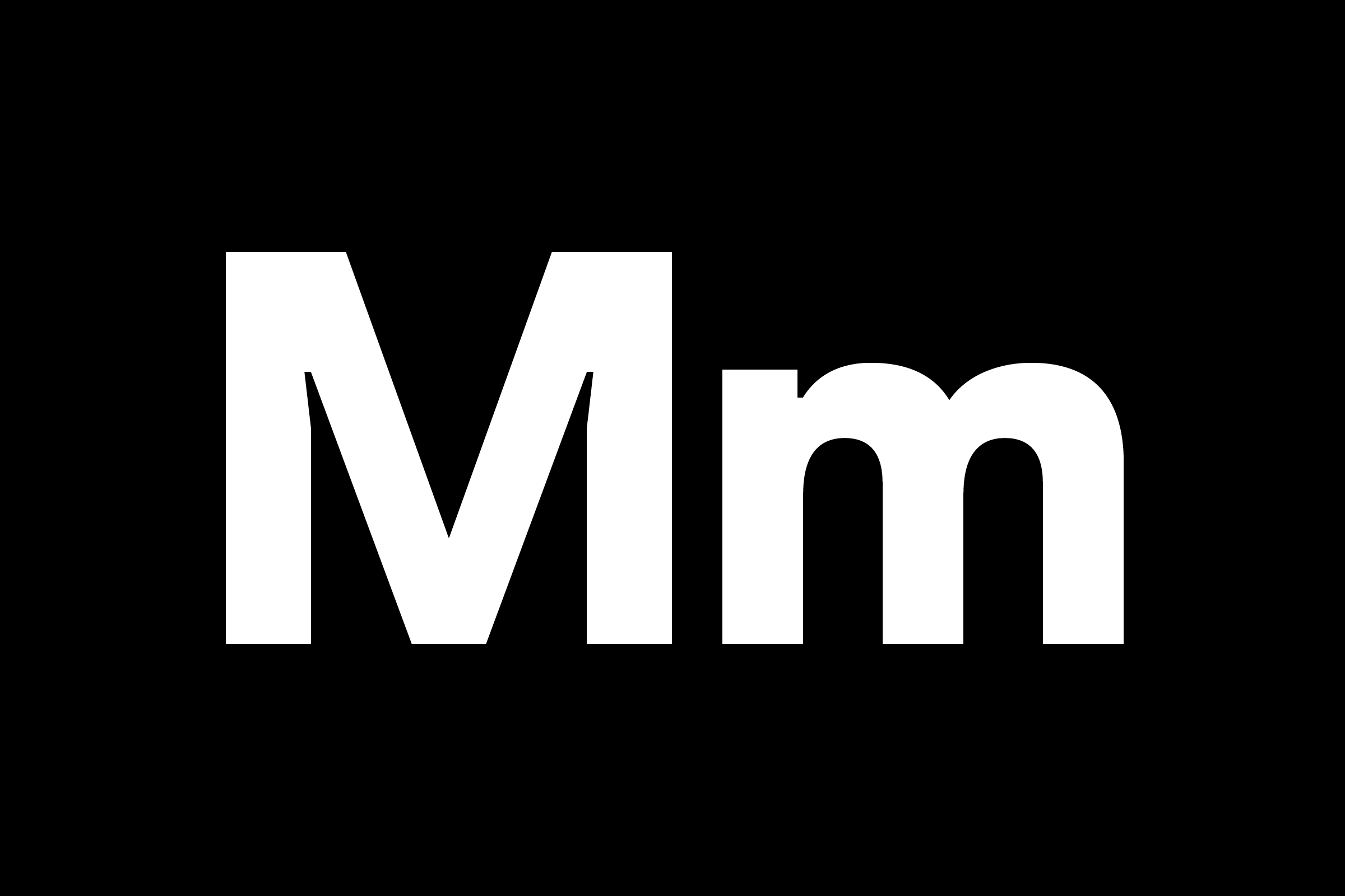
Simplistic, geometric forms were used in the base construction of the letterforms, accompanied by more human, gestural movements in curved forms. These two genre defining traits were paired with micro details placed in the form of ink-trap ‘notches’ in the apexes of letterforms, giving assertion to the typefaces digital applications.
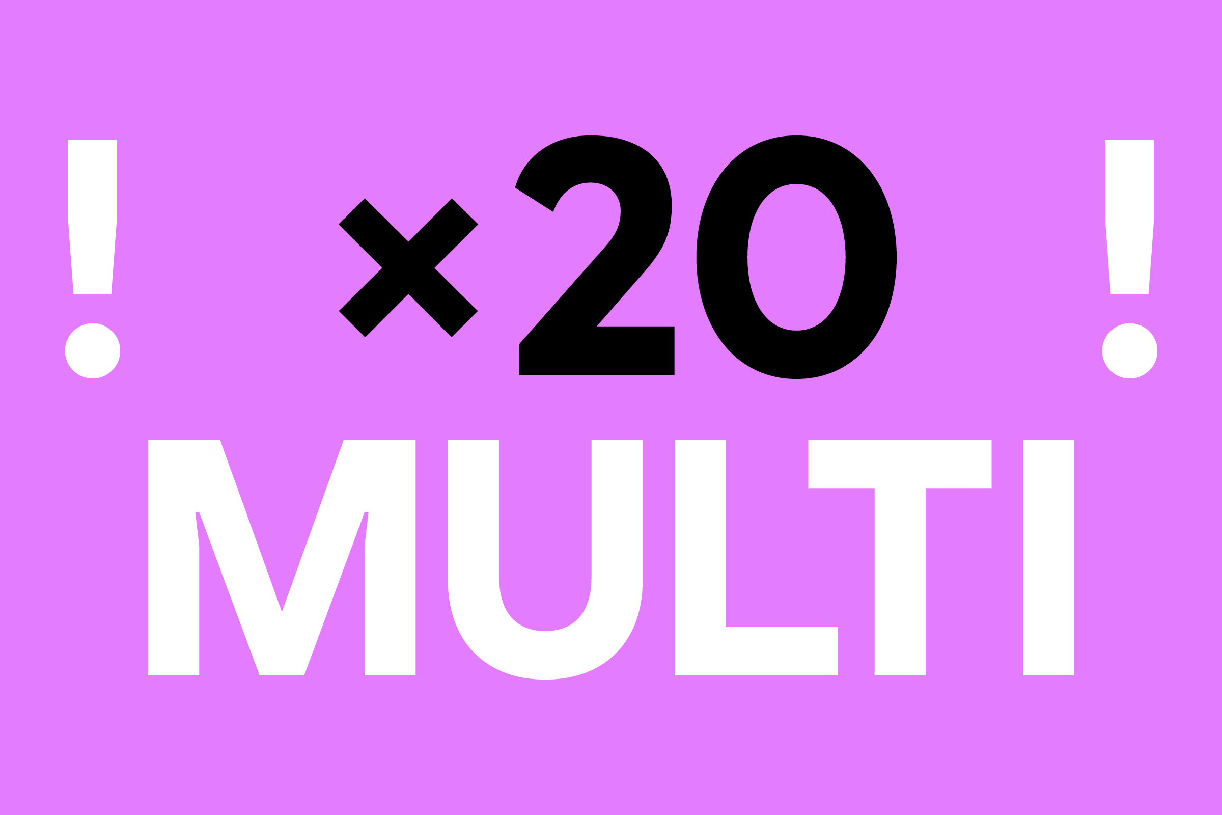
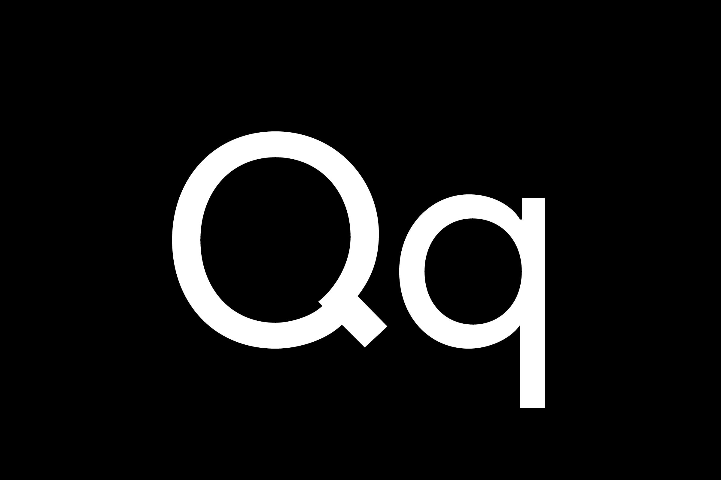
By utilising the oscillating motions of the logo, and inputting these into the typeface, it allowed us to create definition and ownership within the brand typeface. This ‘swirled’ gesture was applied to the uppercase Q and alternate O, and these extra tools were set as stylistic sets, that would allow the client further expression as and when required.
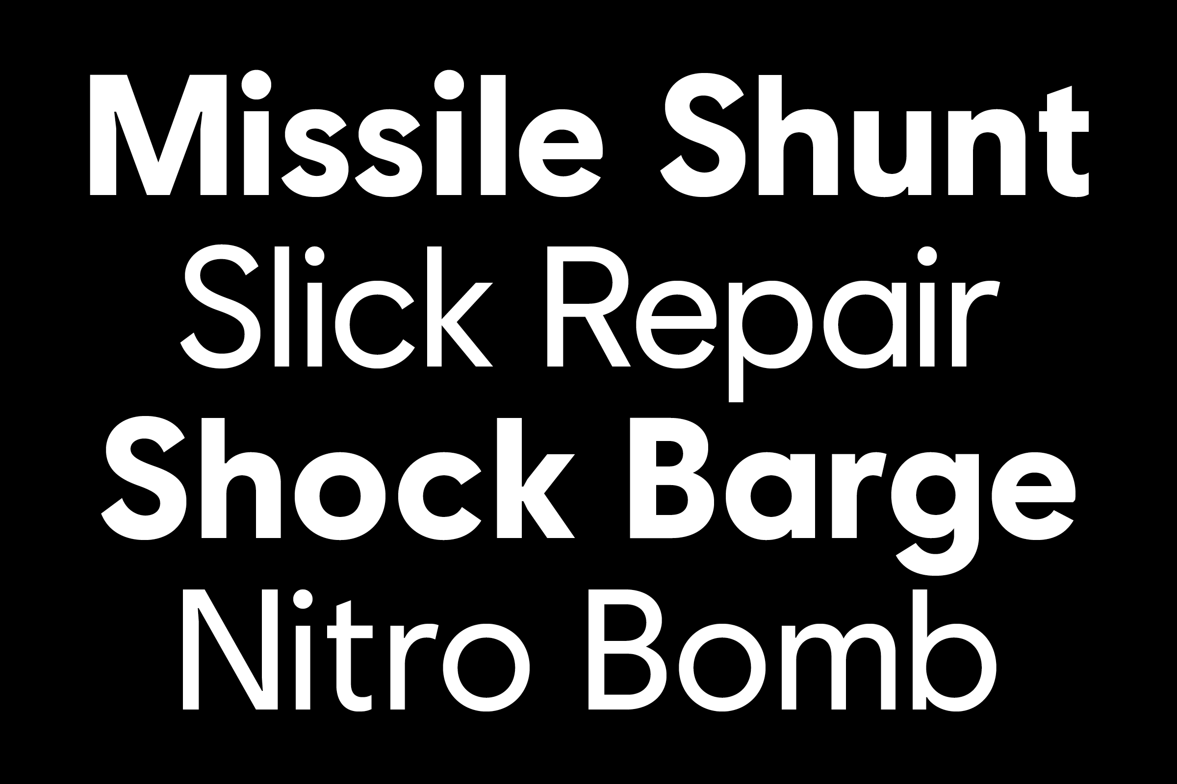
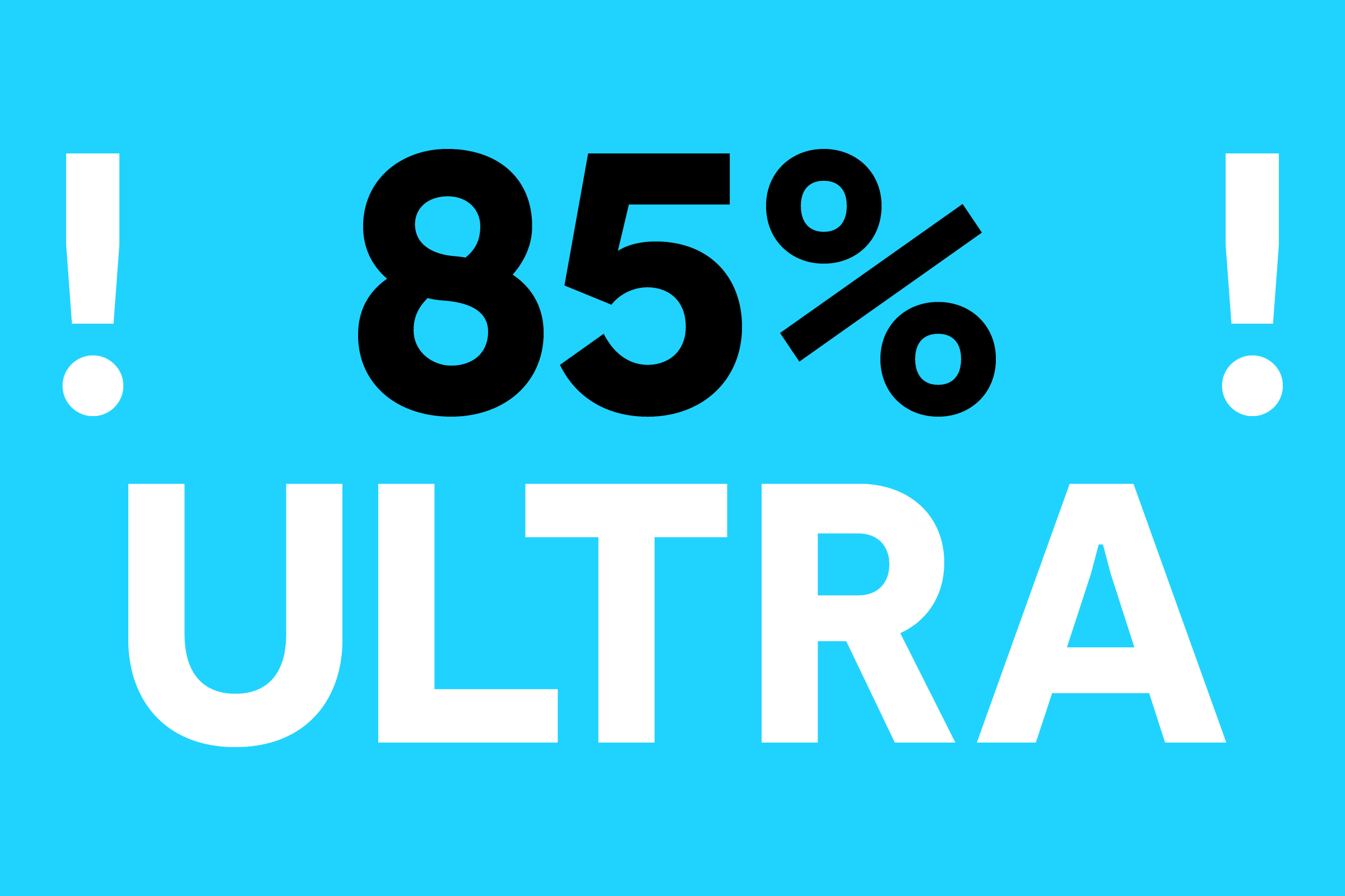
The typeface was applied to a vast range of touchpoints for the rebrand over the course of the summer of 2017. Culminating in the launch of the new Ubisoft brand with the accompanying typeface, at E3 in Los Angeles, the world’s biggest annual gathering of the video game industry.
)
)
