Very Polite
Whilst visiting Vancouver, Canada, Colophon was introduced to Very Polite Studio through a mutual contact. Visiting the offices of Very Polite, an understanding of mutual respect and a dialogue for collaboration began between the parties. Very Polite luckily were also visiting London, and both parties spoke further about a possible collaboration and the creation of a type family or families that would be able to represent the Very Polite brand.
- Typeface
- Sorry Sans, Not Sorry Serif
- Comissioner
- Very Polite Agency, Vancouver
- Year
- 2019
- Styles
- 2 Styles
- Coverage
- Adobe Latin-2
- Classification
- Sans Serif Serif Display
- URL
- weareverypolite.com
)
)
The brief to Colophon from Very Polite open but stipulated to create two contrasting typefaces, that would encompass the agency's ethos and allow them to express through the distinct styles. Very Polite explained, “We are casual when we talk, but formal when it comes to business (thank you very much). We are polite in communication, but bold in our intentions. We are a business first – but take our pleasure seriously.” Colophon’s initial sketches consisted of a variety of different aesthetic directions that could be mixed and matched to create the juxtaposition and contrast required for the agency's intended usage.

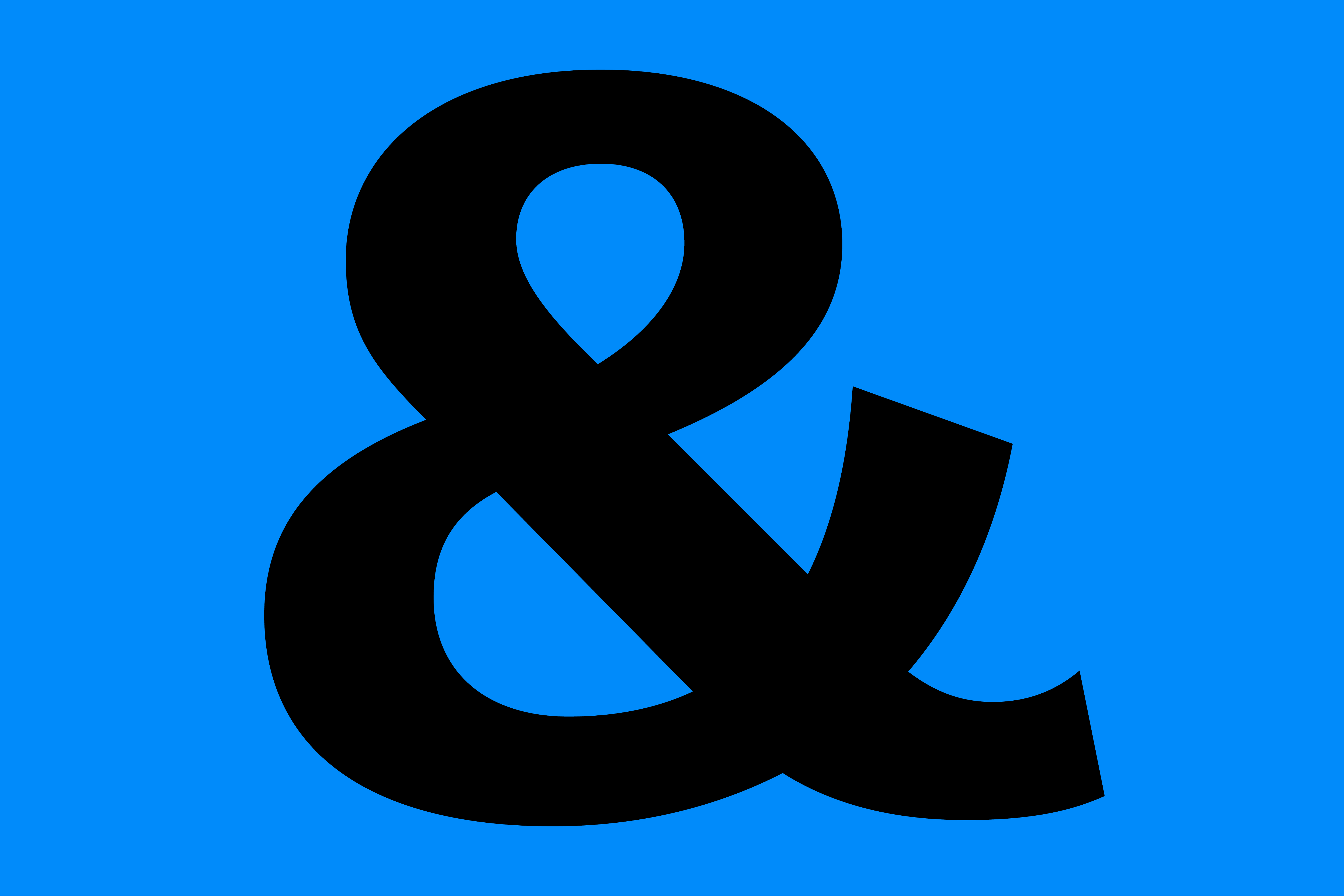


Very Polite chose from the variety of directions based on the atmosphere and feeling of the typeface’s intention. For example, Very Polite briefed the Serif to take on the feeling “reminiscent of a 1970s Japanese Donut Shop”. This relationship and collaboration is quite rare between commissioner and collaborator, and allowed for extensive back and fourth between Very Polite and Colophon.
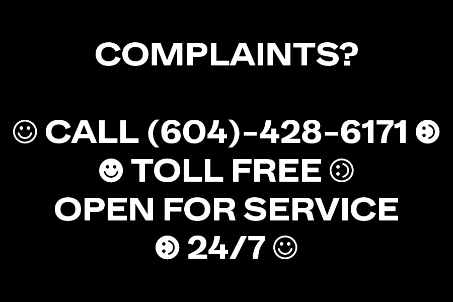
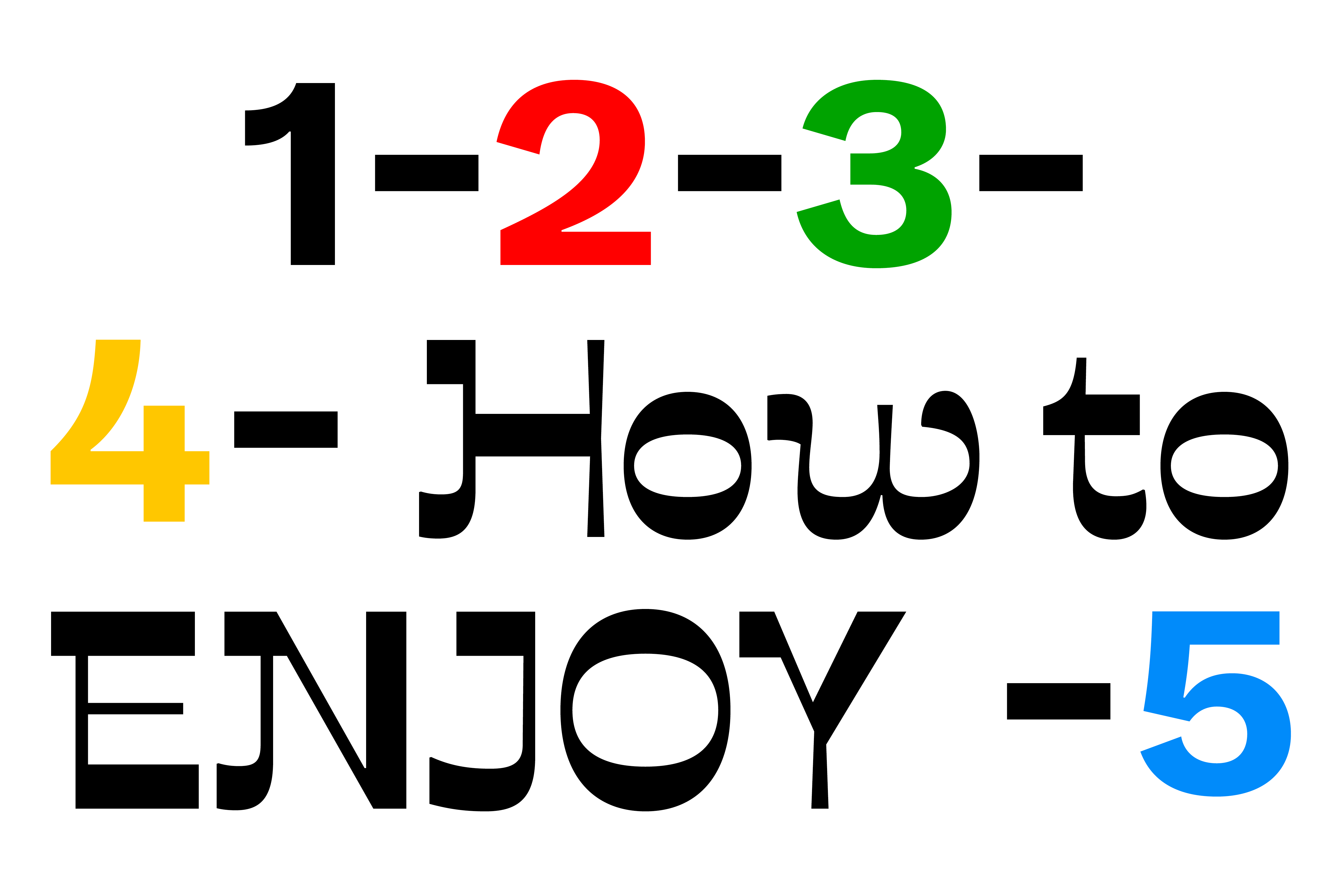
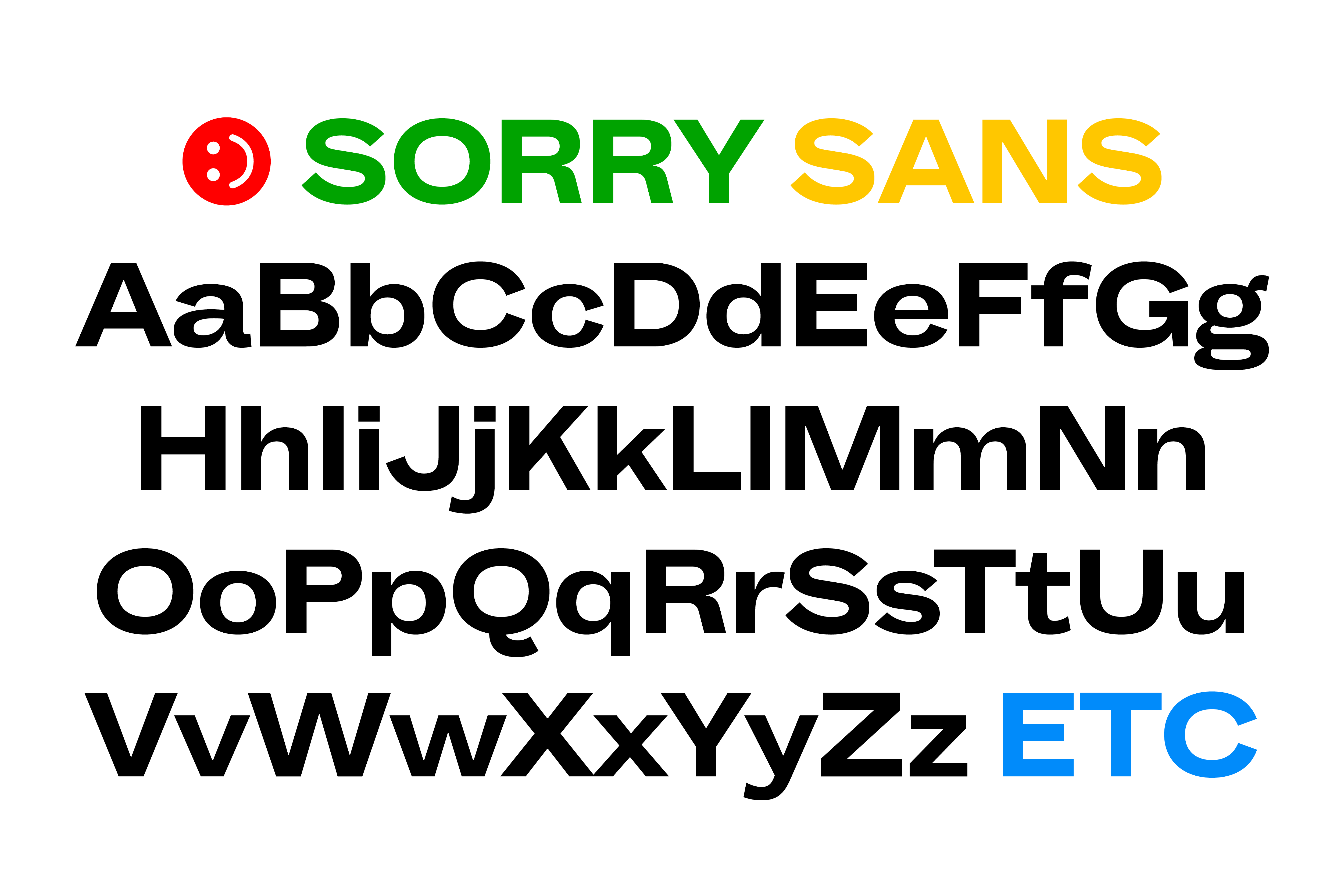
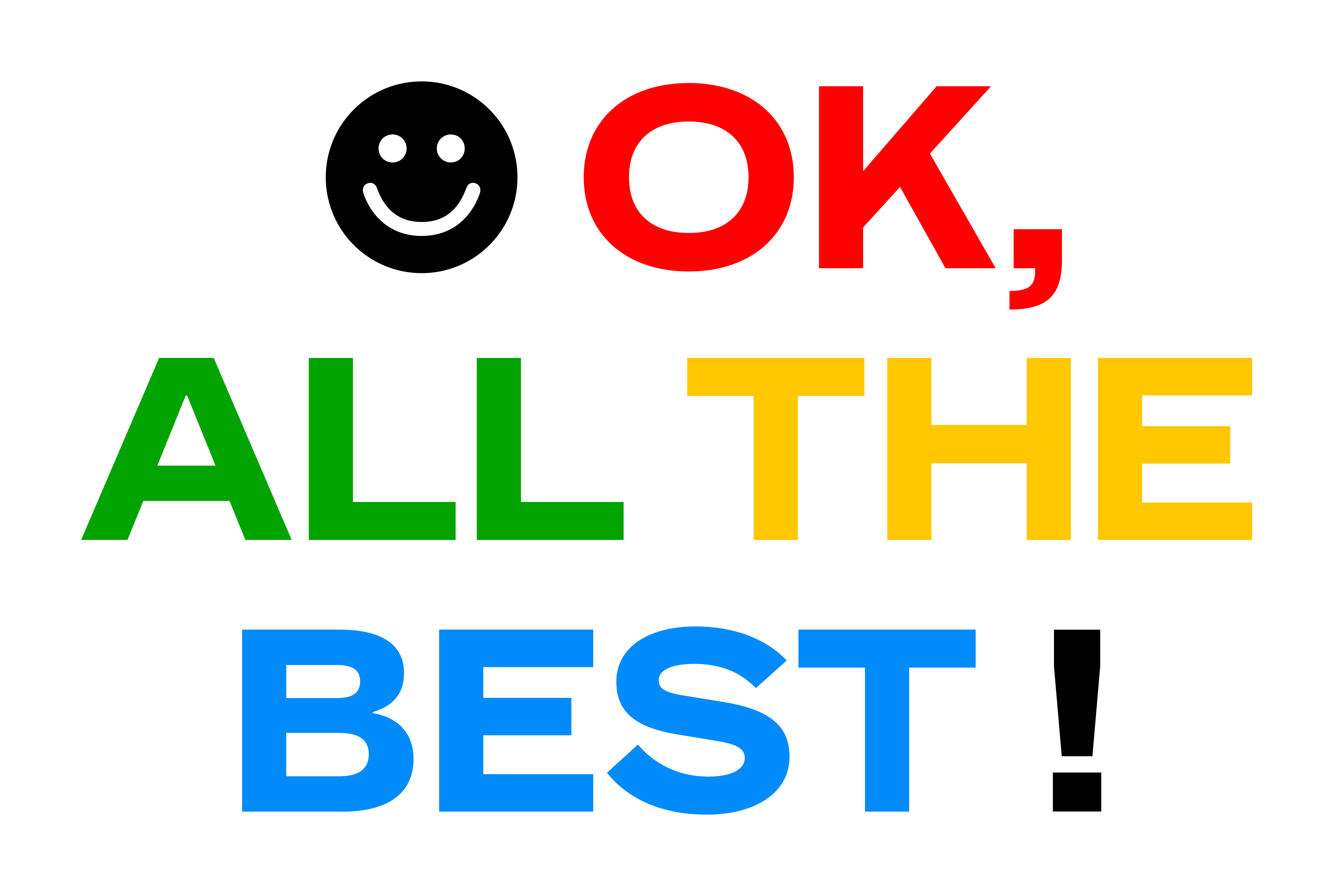
On one side Sorry Sans referenced, Franklin Gothic, Grotesque No 8, a sturdy Bold Sans Serif. Colophon began looking at split personalities in the UPPERCASE & lowercase within the same typeface. The UPPERCASE has mono-linear weighting and displays a conventional sans serif structure whereas lowercase show gestural moments and is more expressive and playful throughout.
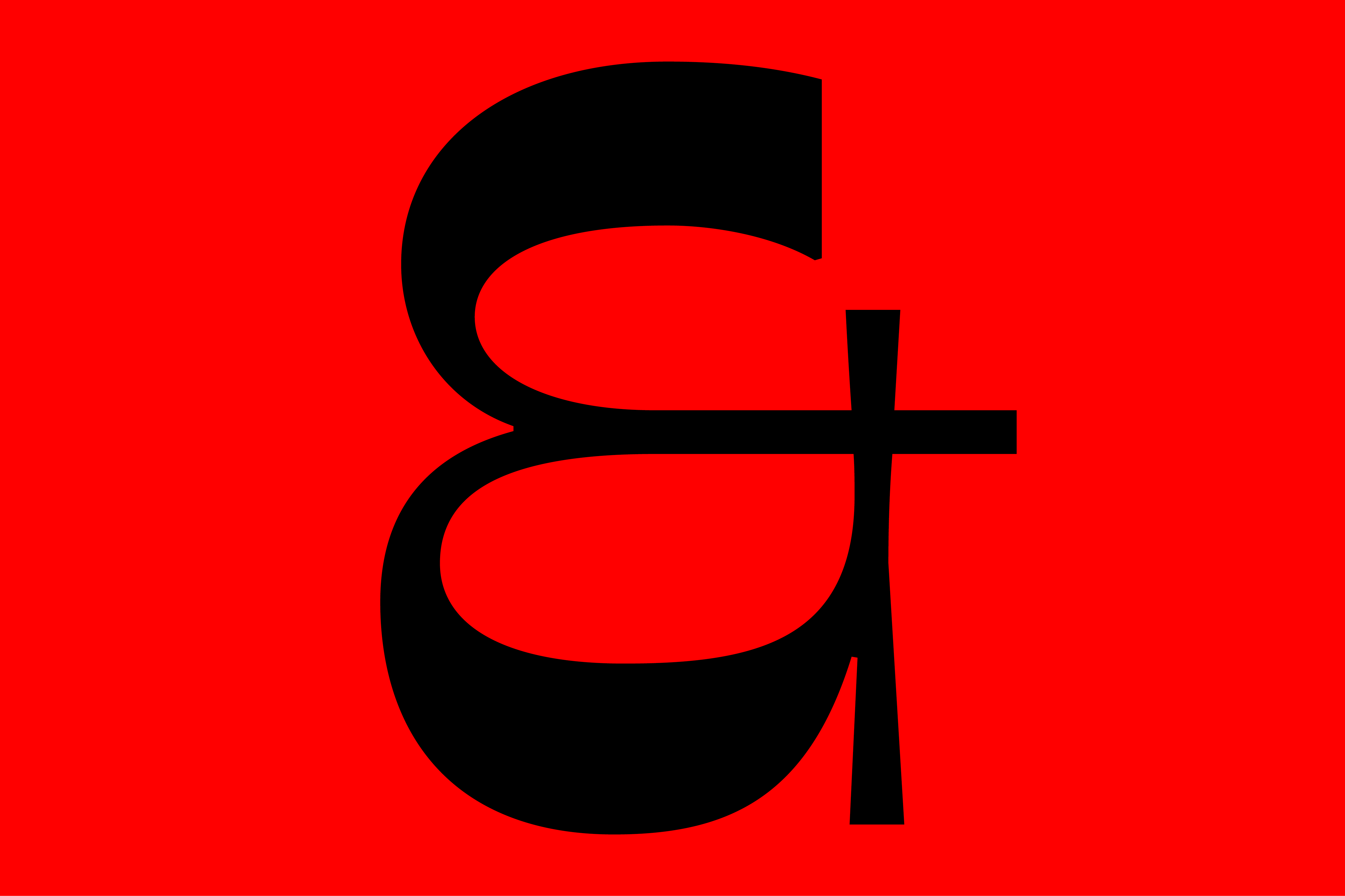
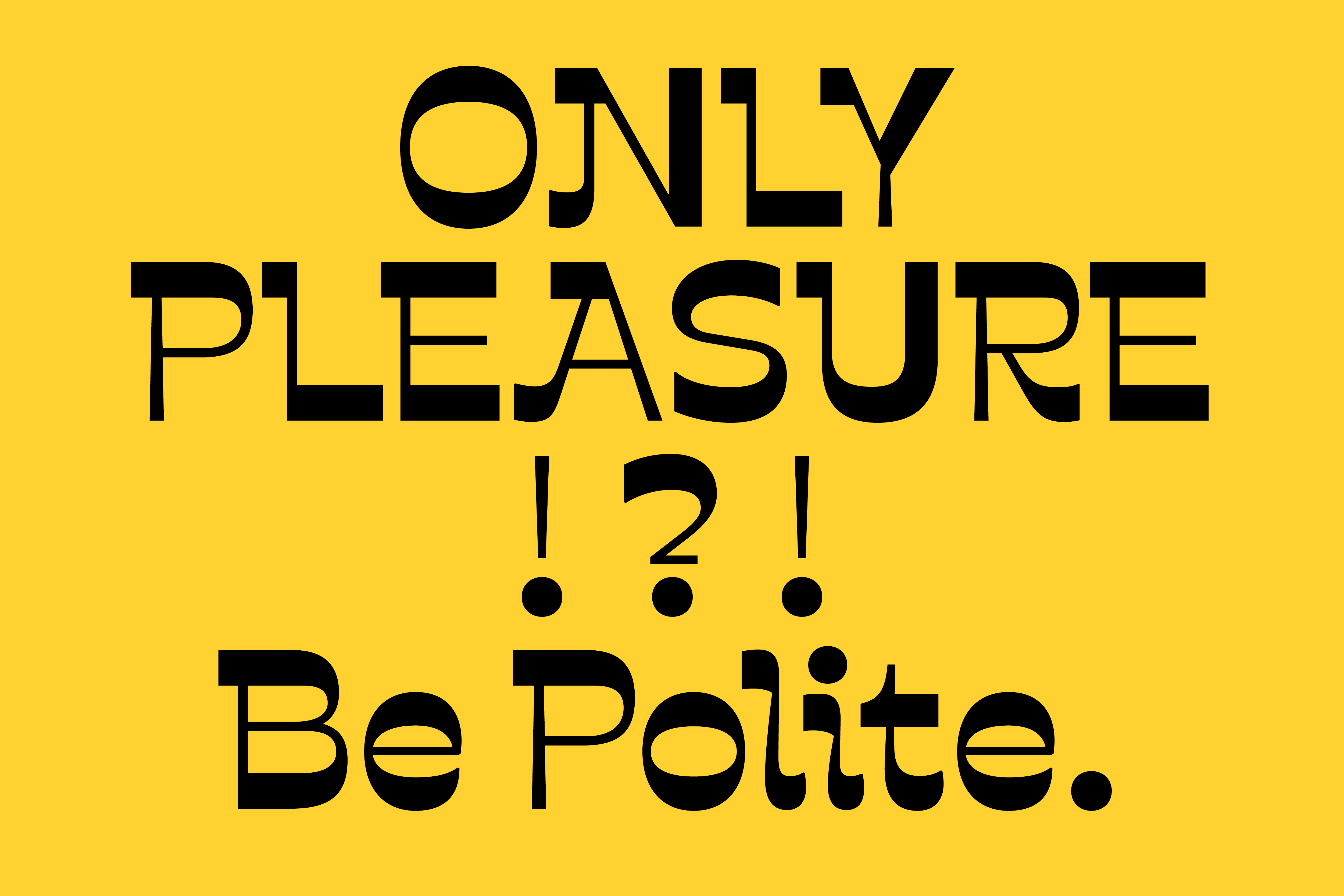


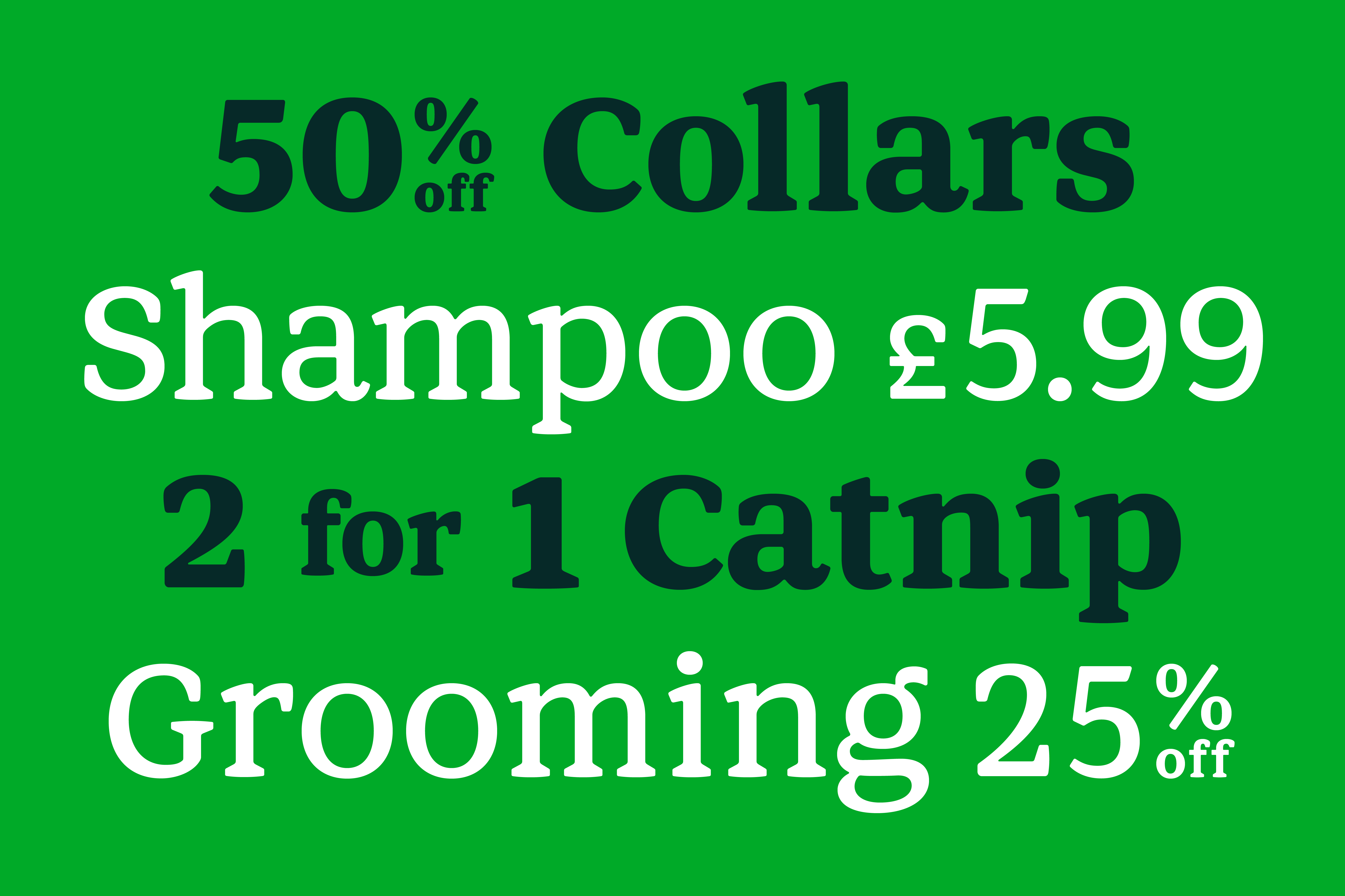
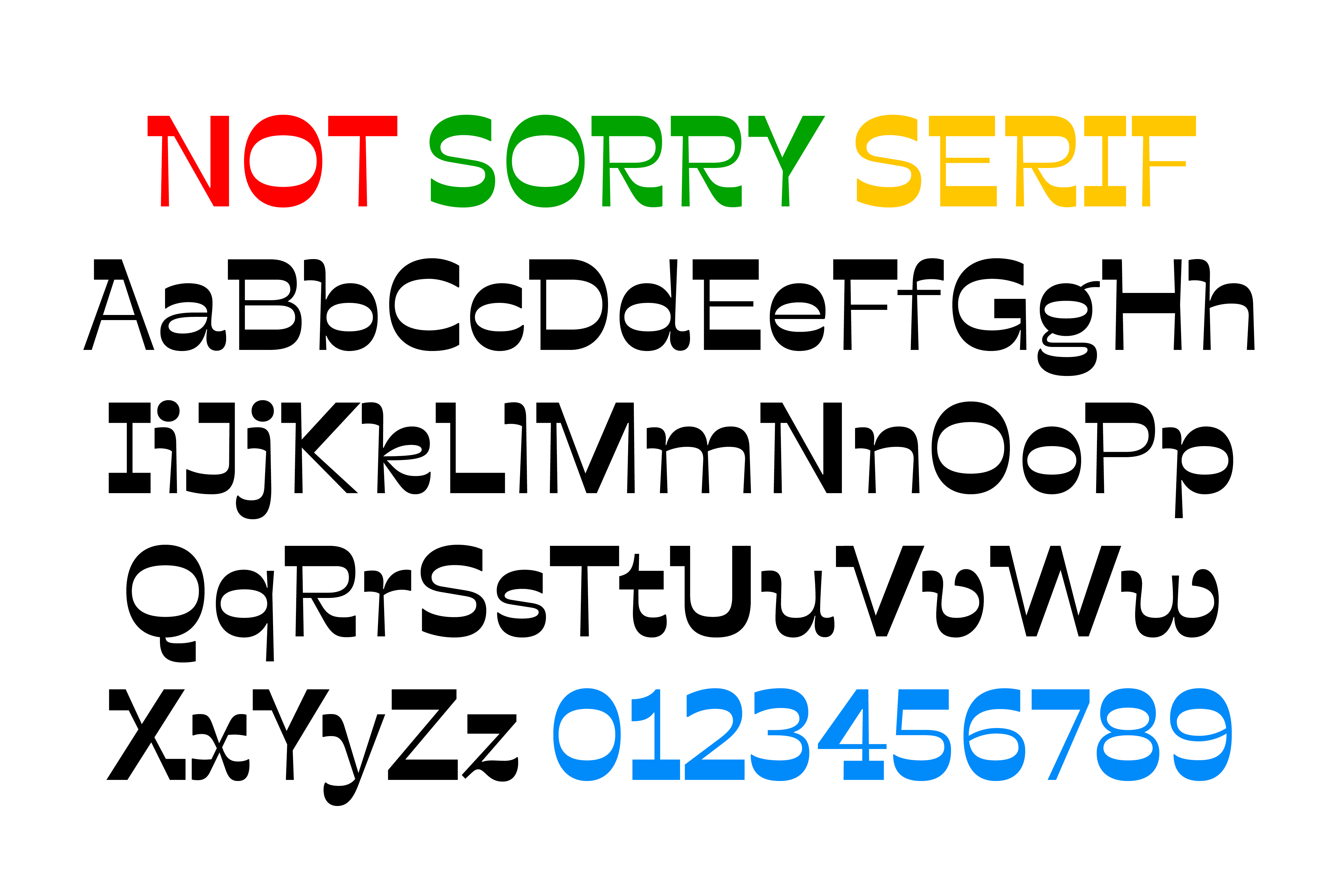
Whilst the Serif, Not Sorry Serif, utilises unusual and reversed stroke contrast, alongside flared stroke endings to create a warm and gestural appearance. As Very Polite described it “... kind of like a Milton Glaser poster telling you to have a nice day.”
The two styles are radically different but complement each other well (for example, vertical metrics have been adjusted so that they optically appear of similar size when the point size is the same).
)
)
